

 Aktualisieren
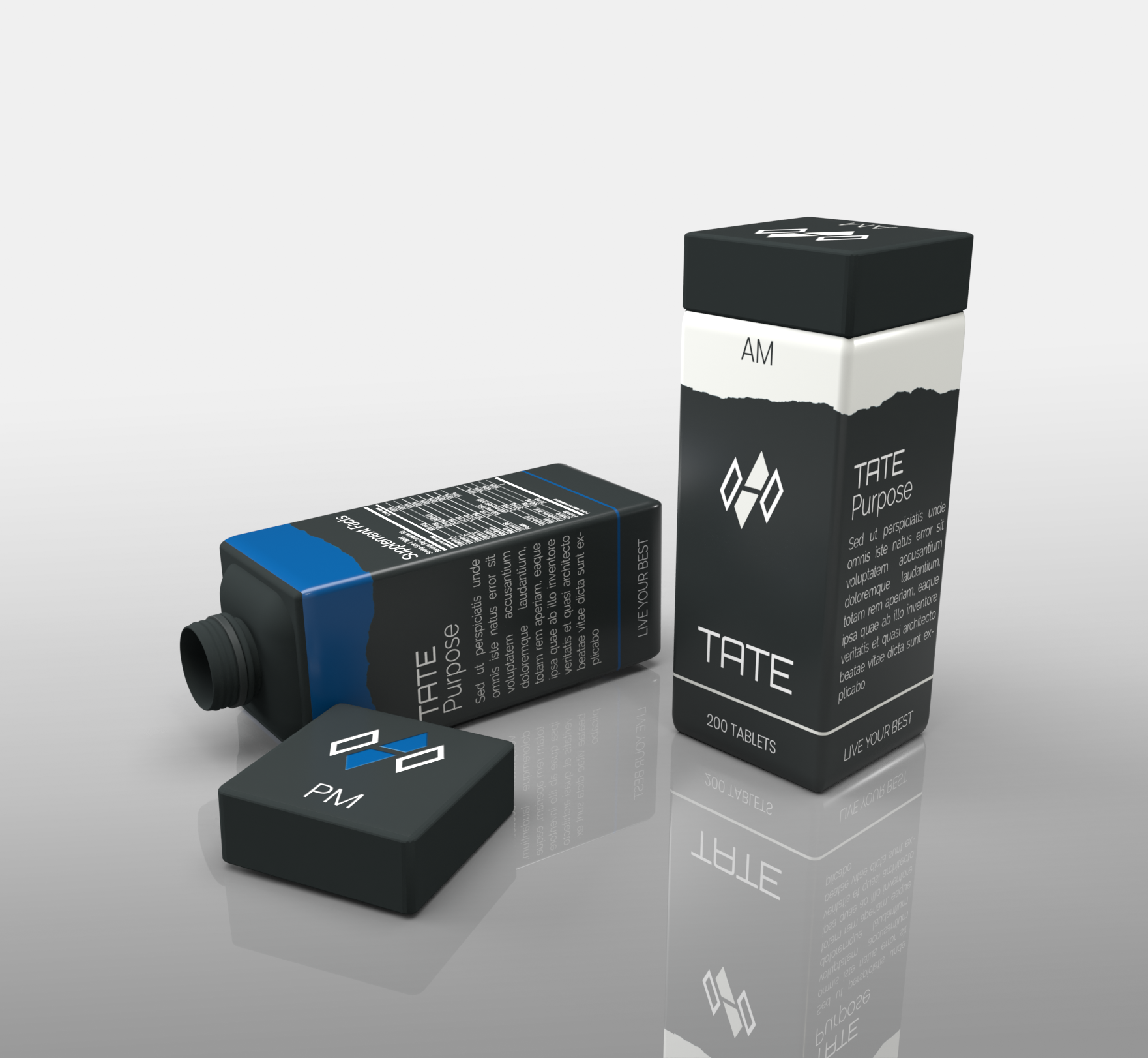
Distinctinctive and nordic inspired container design for a new started health and active brand.
Wollen Sie auch einen Job wie diesen gewinnen?
Dieser Kunde bekam 16 Verpackungs-Designs von 8 Designern. Dabei wurde dieses Verpackungs-Design Design von SimonWhitaker als Gewinner ausgewählt.
Kostenlos anmelden Design Jobs finden
-
 €170
€170
-
 16 Designs
-
 8 Designer
Verpackungs-Design Kurzbeschreibung
Our company name is TATE and stands for "Take action, To Elevate". Our goal is to provide a no BS approach to Supplementation and specific problem solving products.
As a Danish based brand our key words is: "Minimalism", "clear lines", "Nordic colours i.eg. and as seen in canvas", "Purity", "simplicity", "design", "Functionality", "health", "clarity" and "calm".
This design is aimed at a two container product (AM) for "night" and (PM) for "day".
Design is focused on a rectangular shape with a rectangular shape lid that screws on to a uniform and harmonious design.
Colour wise we are most into matte "earth colors that can also be seen in canvas.
These can be singular or a mix in the design but we kindly ask to stay away from "bright and shiny" colours.
Logos and scriptures will be added as a 2D effect, with exception for the lid logo which we would to see retracted into the lid itself.
In a rendering design we would like two containers next to each other seen from different angles where one lid is screwed off and one is screwed on.
In addition we would like a single container rendering showing only PM and only AM.
Happy designing
Claus & Dannie - TATE
Zielmarkt/( -märkte)
European and North american markets.
Target: Male and Female age group 18-50.
Industrie/Einheitstyp
Health Product
Zu verwendende Schriftarten


Sehen und fühlen
Jeder Schieber zeichnet eine der Charakteristiken der Marke des Kunden aus sowie den Stil, den euer Logo widerspiegeln sollte.
Elegant
Fett
Spielerisch
Ernst
Traditionel
Modern
Sympatisch
Professionell
Feminin
Männlich
Bunt
Konservativ
Wirtschaftlich
Gehobenes
Anforderungen
Muss haben
- Clear and distinctive profile
Matte colours
uniform and harmonious shape (rectangular base)
inspired by earth minerals colours and contours.
Schön zu haben
- 3D visual effect in rendering to better get a feel of the product
Sollte nicht haben
- Shiny colours or material indicators.