

 Aktualisieren
My personal Training Business (1-on-1 & Online service) needs an edgy/motivating logo design.
Wollen Sie auch einen Job wie diesen gewinnen?
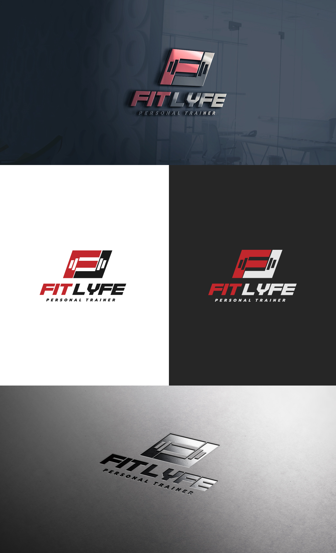
Dieser Kunde bekam 55 Logo-Designs von 28 Designern. Dabei wurde dieses Logo-Design Design von GLDesigns als Gewinner ausgewählt.
Kostenlos anmelden Design Jobs finden
-
 US$150
-
 55 Designs
-
 28 Designer
Logo-Design Kurzbeschreibung
I need a design for my personal (health/fitness) training business called "Fit Lyfe." I work with everyday people aiming to improve their health (physically/mentally), reconstructing their life-habits, and unlocking their true potential. I would like the design to be Black (primary)/Red (secondary).....OR Black (primary)/White(secondary).
I'd like the final design to relay the "power to overcome."
I think I want the "F" and the "L" of "Fit Lyfe" to stand out more than the rest of the word. The design can be somewhat edgy, but bold/motivational to the eye. Open to other ideas though!
Someone created this logo about a month back (attached file below), but it just doesn't do it for me. I think the barbell to the right of the text is too plain and looks like something that was created off Paint on windows '98.
The "F" & "L" stand out, but that's about it.... the remaining font of the words don't match the first letters either.
I want this to be something that I can place on shirts/merchandise too :)
Zielmarkt/( -märkte)
-Male & female
-All ages
-anyone looking to Improve their quality of life through fitness
Industrie/Einheitstyp
Personal Trainer
Logo Text
Fit Lyfe
Logo Stile, die Sie interessieren können
Emblem-Logo
Logo eingeschlossen in einer Form



Wortmarke-Logo
Word oder namensbasiertes Logo (nur Text)


Sehen und fühlen
Jeder Schieber zeichnet eine der Charakteristiken der Marke des Kunden aus sowie den Stil, den euer Logo widerspiegeln sollte.
Elegant
Fett
Spielerisch
Ernst
Traditionel
Modern
Sympatisch
Professionell
Feminin
Männlich
Bunt
Konservativ
Wirtschaftlich
Gehobenes
Anforderungen
Muss haben
- Black + Red
OR
Black + White
Schön zu haben
- The "F" & "L" of FitLyfe to stand out more than the rest. They can be merged together or apart. Making sure that it has that edgy (but easy to read) motivational look.
(updated...)
I'm liking the designs so far that place the "F" & "L" together in some sort of a shape (box, triangle, etc) with some sort of emblem through or in it (weight, fitness oriented shape, etc)
