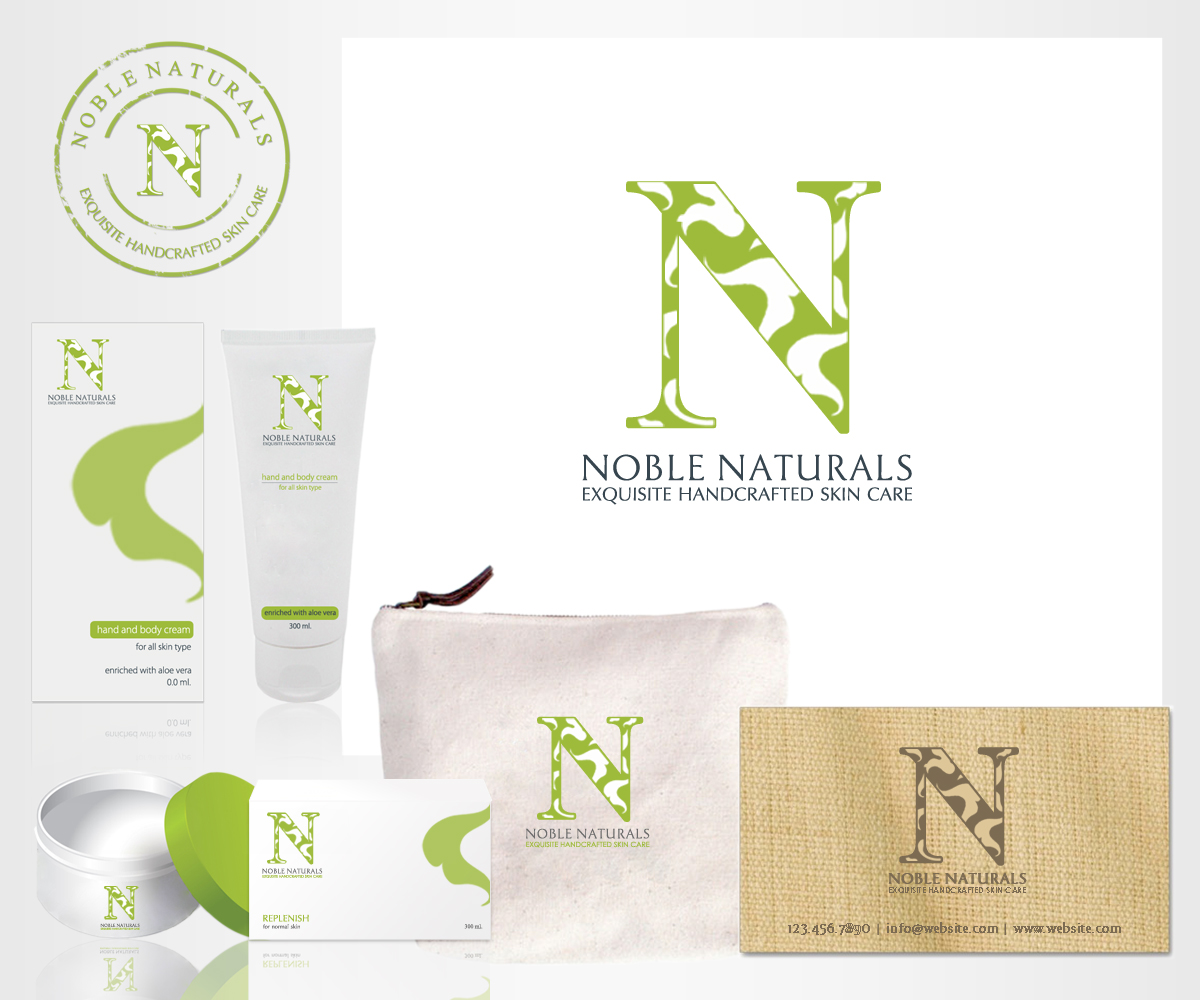
Noble Naturals/ Exquisite Handcrafted Skin Care
Wollen Sie auch einen Job wie diesen gewinnen?
Dieser Kunde bekam 72 Logo-Designs von 18 Designern. Dabei wurde dieses Logo-Design Design von m_designs als Gewinner ausgewählt.
Kostenlos anmelden Design Jobs finden-
 US$200
-
 72 Designs
-
 18 Designer
Logo-Design Kurzbeschreibung
I am launching my fine hand crafted skin care line under a new name (formerly Life in Lavender) which includes my last name. I am interested in having a non gender logo. I have worked with two designers on this project already, and they keep missing it! I am attaching the logo I now have. I think the green/black is too masculine...maybe a charcoal "N" with a smaller serif? The tagline should be in serif but condensed so that it fits better underneath. And the leaves are too crowded and should look less like clip art, or add more leaves and reverse the "N" out?
Those are my thoughts but I am not a designer.
Aktualisierungen
Project Deadline Extended
Reason: There are a couple of designs I really like. I will send separate messages to you.
Added Saturday, February 01, 2014
Project Deadline Extended
Added Monday, February 03, 2014
Zielmarkt/( -märkte)
Age 45-75, Income bracket of $100,000 up
Logo Text
Noble Naturals/Exquisite Handcrafted Skin Care
Logo Stile, die Sie interessieren können
Pictorial / Combination-Logo
Ein reales Objekt (Text optional)
Abstraktes Logo
Begrifflich / symbolisch (Text optional)
Sehen und fühlen
Jeder Schieber zeichnet eine der Charakteristiken der Marke des Kunden aus sowie den Stil, den euer Logo widerspiegeln sollte.
Elegant
Fett
Spielerisch
Ernst
Traditionel
Modern
Sympatisch
Professionell
Feminin
Männlich
Bunt
Konservativ
Wirtschaftlich
Gehobenes
Anforderungen
Muss haben
- I think the green/black is too masculine...maybe a charcoal "N" with a smaller serif? The tagline should be in serif but condensed so that it fits better underneath. And the leaves are too crowded and should look less like clip art, or add more leaves and reverse the "N" out?
Schön zu haben
- I think the green/black is too masculine...maybe a charcoal "N" with a smaller serif? The tagline should be in serif but condensed so that it fits better underneath. And the leaves are too crowded and should look less like clip art, or add more leaves and reverse the "N" out?
- Those are my thoughts but I am not a designer.