

 Aktualisieren
fitness and lifestyle coaching business that needs a logo design
Wollen Sie auch einen Job wie diesen gewinnen?
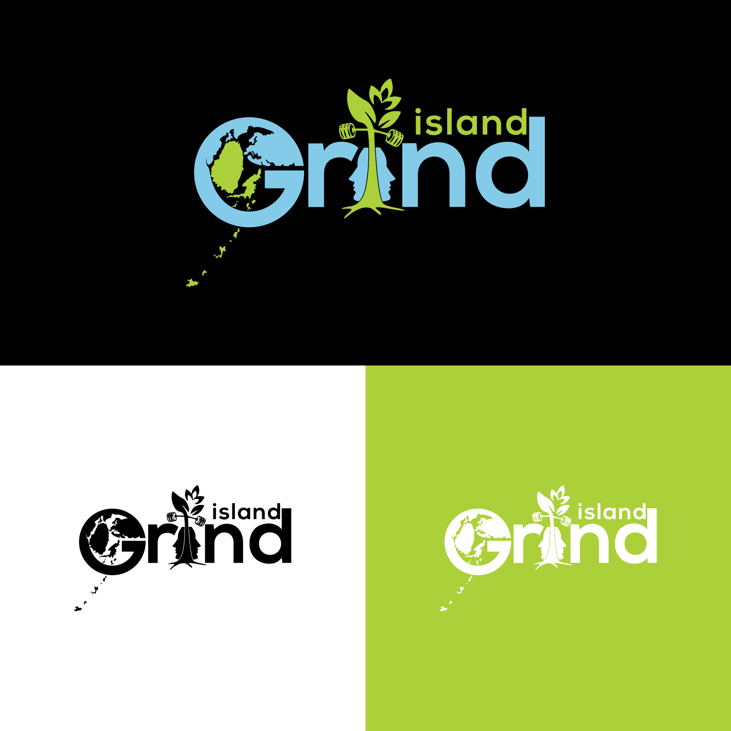
Dieser Kunde bekam 48 Logo-Designs von 15 Designern. Dabei wurde dieses Logo-Design Design von veni 6 als Gewinner ausgewählt.
Kostenlos anmelden Design Jobs finden
-
 C$130
C$130
-
 48 Designs
-
 15 Designer
Logo-Design Kurzbeschreibung
So the design is for my logo i already have my logo which is represented in the pictures below i want it to mainly remain the same like everything should stay like the colours and the design but i want a few changes made to it. They are:
The letter G in the word grind
So the first change I want to make is with the letter G of the word grind I love the current style of the G. But I want to make a change to it, so I want to make the Letter G itself to be a little wider and bigger so that I can draw things in the draw like the world map I want it to look earthy like these examples I want G to look like these in the photos below:
The second thing
The rock
The second thing I want to change is the shape of the rock, that the tree in island grind is growing out of I still want the tree growing out of it the same way. But what I want the shape of the rock to be in the shape of a man’s face with the split in it the same way and the tree growing out of it.
3rd Thing
The islands
The last thing that I wanted to change was the chain of islands that are coming out of the G. I really like them, the only thing is that I want is them to represent my actually chain of islands where I’m from so I’ll send you a pic of my actually island chin and we can those the new chain of island. This how my actually chain of island look in photos below
Industrie/Einheitstyp
Fitness
Logo Text
island grind
Logo Stile, die Sie interessieren können
Wortmarke-Logo
Word oder namensbasiertes Logo (nur Text)


Zu verwendende Schriftarten

Sehen und fühlen
Jeder Schieber zeichnet eine der Charakteristiken der Marke des Kunden aus sowie den Stil, den euer Logo widerspiegeln sollte.
Elegant
Fett
Spielerisch
Ernst
Traditionel
Modern
Sympatisch
Professionell
Feminin
Männlich
Bunt
Konservativ
Wirtschaftlich
Gehobenes
Anforderungen
Muss haben
- Its must look like the orginal logo i want everything the same in the logi j ust the changes that i asked for
Schön zu haben
- The letter G
So the first change I want to make is with the letter G of the word grind I love the current style of the G. But I want to make a change to it, so I want to make the Letter G itself to be a little wider and bigger so that I can draw things in the draw like the world map I want it to look earthy like these examples I want G to look like these in the photos below:
The second thing
The rock
The second thing I want to change is the shape of the rock, that the tree in island grind is growing out of I still want the tree growing out of it the same way. But what I want the shape of the rock to be in the shape of a man’s face with the split in it the same way and the tree growing out of it.
3rd Thing
The islands
The last thing that I wanted to change was the chain of islands that are coming out of the G. I really like them, the only thing is that I want is them to represent my actually chain of islands where I’m from so I’ll send you a pic of my actually island chin and we can those the new chain of island. This how my actually chain of island look in photos


