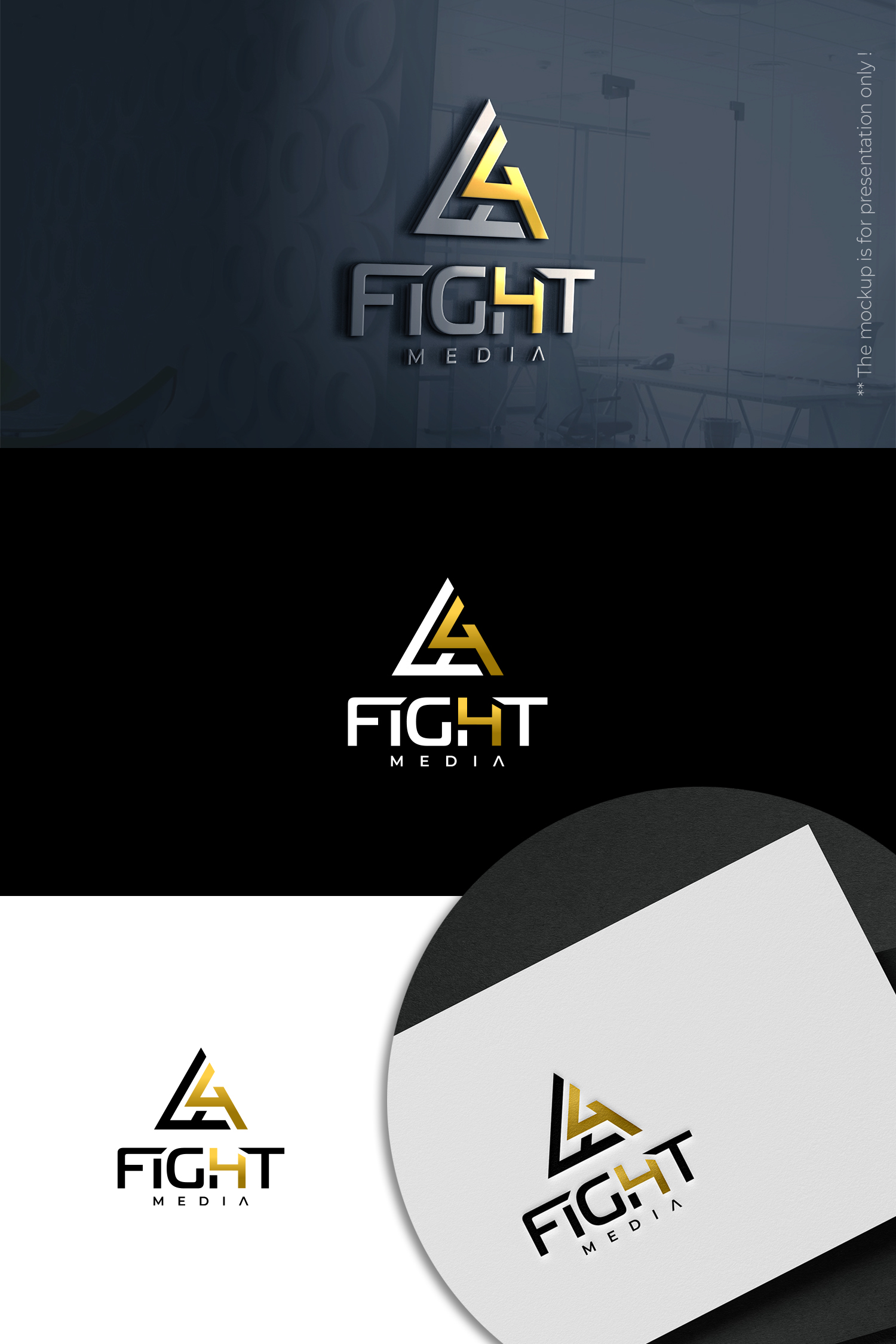
Combination Mark Logo for Media company with focus on athletic and financial industry.

Wollen Sie auch einen Job wie diesen gewinnen?
Dieser Kunde bekam 269 Logo-Designs von 69 Designern. Dabei wurde dieses Logo-Design Design von designbysy als Gewinner ausgewählt.
Kostenlos anmelden Design Jobs findenLogo-Design Kurzbeschreibung
We need a logo design for a new media company based in New Jersey called Fight4 Media. We film and create documentary style content to help individuals and brands tell their stories to the world. Our motive and goal is to tell impactful stories those of success and failure through brands to motive the world to fight for what they believe in. We would like to see designs that use the color gold. The final design should communicate success, achievement and triumph. Other possibly helpful info: The founders of the brand are boxers and investors looking to work mainly with athletes, sporting brands, and people within the financial industry. There will be merch alongside the brand so I was thinking a combination mark for versatility, but I am open to all idea. You all are the professionals. Thank you in advance.
Aktualisierungen
Need extra days to review
Zielmarkt/( -märkte)
Athletic and Financial Brands
Industrie/Einheitstyp
Media
Logo Text
Fight4
Logo Stile, die Sie interessieren können
Pictorial / Combination-Logo
Ein reales Objekt (Text optional)
Sehen und fühlen
Jeder Schieber zeichnet eine der Charakteristiken der Marke des Kunden aus sowie den Stil, den euer Logo widerspiegeln sollte.
Elegant
Fett
Spielerisch
Ernst
Traditionel
Modern
Sympatisch
Professionell
Feminin
Männlich
Bunt
Konservativ
Wirtschaftlich
Gehobenes
Anforderungen
Schön zu haben
- After seeing a good amount of the logos I received so far one thing that stood out to me as an eye sore has been the number 4 being seperate from the word FIGHT. I was thinking of combining the letter H and Number 4 to eliminate the standalone 4.
Also when the word FIGHT is in all caps the size of the letters G and H overpower the rest of the letters in the word. Above i tried to sketch out a way to minimize how much space the letters G ang H take up.
If the word media it used, I would like it to be used in very minimal if it is used at all.
These are really bad sketches, but I wanted to help anyway that I can.
Sollte nicht haben
- I do not want a play button to be included in the logo design or name.