App Icon - Many Sizes - iPhone, iTunes, Android + Market
Wollen Sie auch einen Job wie diesen gewinnen?
Dieser Kunde bekam 38 Icon-Designs von 5 Designern. Dabei wurde dieses Icon-Design Design von Sergio Medina als Gewinner ausgewählt.
Kostenlos anmelden Design Jobs finden- Garantiert
-
 C$140
C$140
-
 38 Designs
-
 5 Designer
Icon-Design Kurzbeschreibung
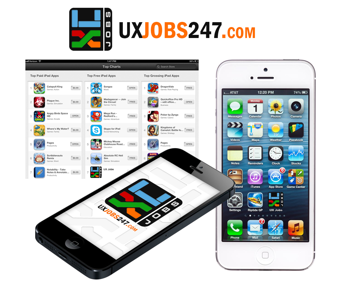
http://uxjobs247.com You can see the current logo we use. But I don't want to use that same icon unless you can make it look really cool. Use colours from corporate parent company logo, attached.
On larger versions I will probably want to add text. Like website address, email, tag line etc.
*** start with 80 x 80 version for submissions ***
- application logo [x2]:
* 330 x 59 px
- iPhone app icons (with NO transparent background):
* 29 x 29 px
* 57 x 57 px
* 58 x 58 px
* 80 x 80 px
* 114 x 114 px
* 120 x 120 px
- AppStore and iTunes icons:
* 512 x 512 px
* 1024 x 1024 px
- iPhone launch screens [x3]:
* 320 x 480 px
* 640 x 960 px
* 640 x 1136 px
- Android app icons (with NO transparent background):
* 48 x 48 px
* 72 x 72 px
* 96 x 96 px
- Android market icon:
* 512 x 512 px
Aktualisierungen
The icon does not HAVE to match the website logo. I'm trying to use the corporate parent logo colours to make the app icon stand out.
Providing previous of how it might look in different settings will help. Wish list, app store details page, screenshot of how it might look like in a group of random apps.
Added Wednesday, January 29, 2014
Zielmarkt/( -märkte)
Young professionals in User Experience field. So your design has to take that into account.
Industrie/Einheitstyp
It Company
Sehen und fühlen
Jeder Schieber zeichnet eine der Charakteristiken der Marke des Kunden aus sowie den Stil, den euer Logo widerspiegeln sollte.
Elegant
Fett
Spielerisch
Ernst
Traditionel
Modern
Sympatisch
Professionell
Feminin
Männlich
Bunt
Konservativ
Wirtschaftlich
Gehobenes
Anforderungen
Muss haben
- Design and colours that make it stand out in a crowded screen.
- Clarity at most smaller resolutions.