VAI Capital, a new impact Investment / financial advisory firm, seeks high-impact logo!
Wollen Sie auch einen Job wie diesen gewinnen?
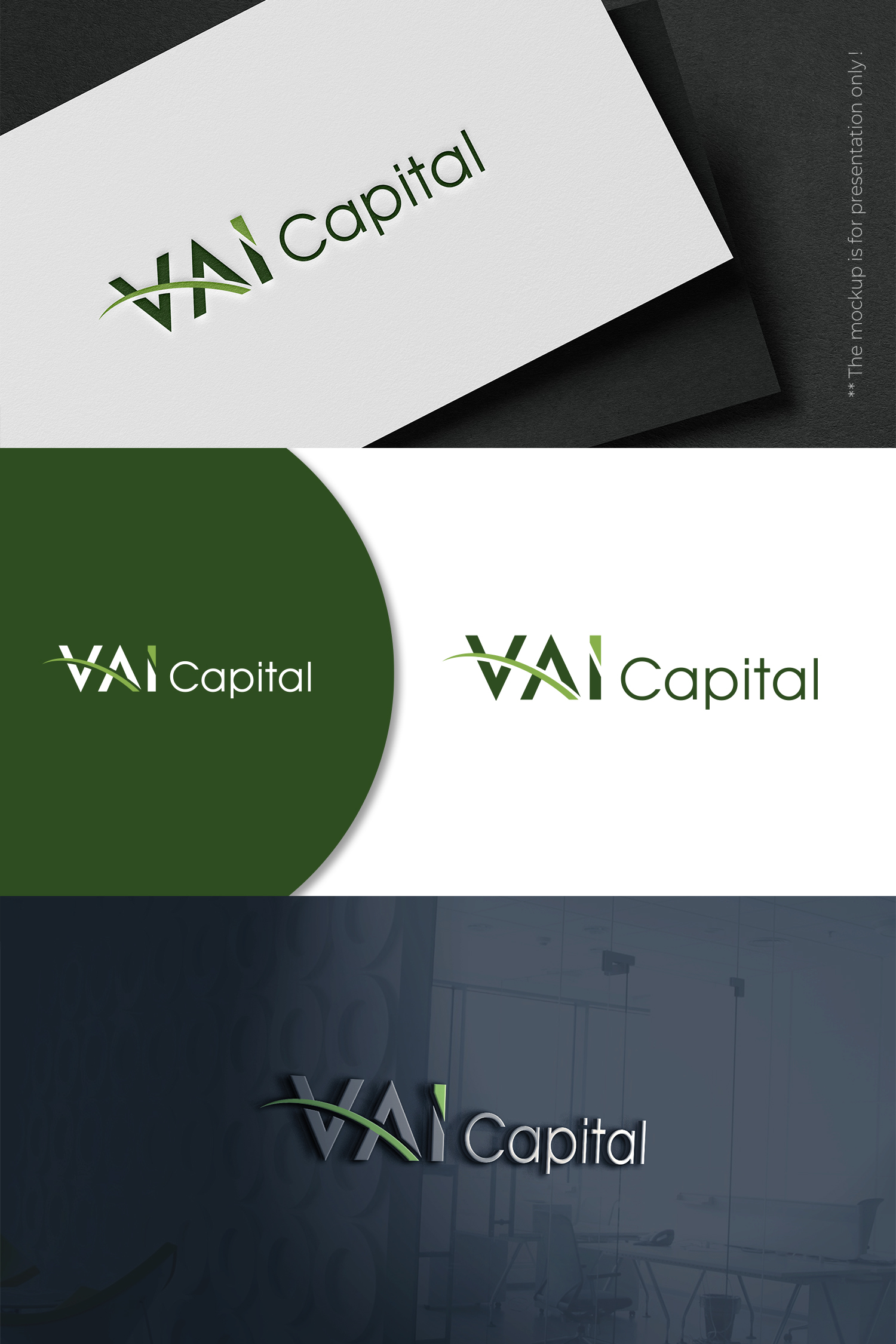
Dieser Kunde bekam 185 Logo-Designs von 64 Designern. Dabei wurde dieses Logo-Design Design von designbysy als Gewinner ausgewählt.
Kostenlos anmelden Design Jobs finden-
 €110
€110
-
 185 Designs
-
 64 Designer
Logo-Design Kurzbeschreibung
We need a logo design for a new financial advisory and fund management firm based in Switzerland. We currently have the name and website www.f2cpartners.com, but have recently renamed the firm VAI Capital.
We need a logo that is simple, legible and elegant, it must inspire confidence and professionalism / competence, it can be bold and should have pure lines. We have an existing colour scheme (HEX2A4C09;88B04B) which it would be good to stick to, but we are open to alternatives. We will need a square version and a rectangular version. Capital is the part of the name that is shared by many other firms in similar lines of business, so VAI is the part to focus on (to which most prominence should be given).
We focus on investments in low-carbon transport (e.g. electric vehicles) but we do not want the logo to be too explicit about the scope. VAI was chosen for its meaning in italian ("Go"!), something that for us is a rallying cry to take action towards positive impact (mobilising capital to this end), while also making a subtle reference to our focus on transport (movement).
Aktualisierungen
Gathering more feedback
Zielmarkt/( -märkte)
Primary targets: Institional investors (asset owners such as pension funds, asset managers, family offices etc), infrastructure project developers, public / local government authorities (who are hosts to projects in which we will arrange investment)
Industrie/Einheitstyp
Investment Banking
Logo Text
VAI Capital (or in the square version just VAI if you feel that this is more powerful)
Logo Stile, die Sie interessieren können
Abstraktes Logo
Begrifflich / symbolisch (Text optional)
Wortmarke-Logo
Word oder namensbasiertes Logo (nur Text)
Lettermark-Logo
Kurzwort oder Buchstaben-Logo (nur Text)
Sehen und fühlen
Jeder Schieber zeichnet eine der Charakteristiken der Marke des Kunden aus sowie den Stil, den euer Logo widerspiegeln sollte.
Elegant
Fett
Spielerisch
Ernst
Traditionel
Modern
Sympatisch
Professionell
Feminin
Männlich
Bunt
Konservativ
Wirtschaftlich
Gehobenes
Anforderungen
Muss haben
- One square version and one rectangual version (see examples of those for the old company name and logo attached for reference). The logos should be appropriate for a white background as a priority and should be transparent ("see-through" so that the colour of the background is visible "through" the logo / around the elements of the logo). Most likely background (primary colour) is white, but if the logo is placed on a coloured background this will most likely be on a shade of green.
Sollte nicht haben
- Pictures of cars of vehicles - reference to the theme if any should be subtle / inferred