New olive oil brand needs a logo design
Wollen Sie auch einen Job wie diesen gewinnen?
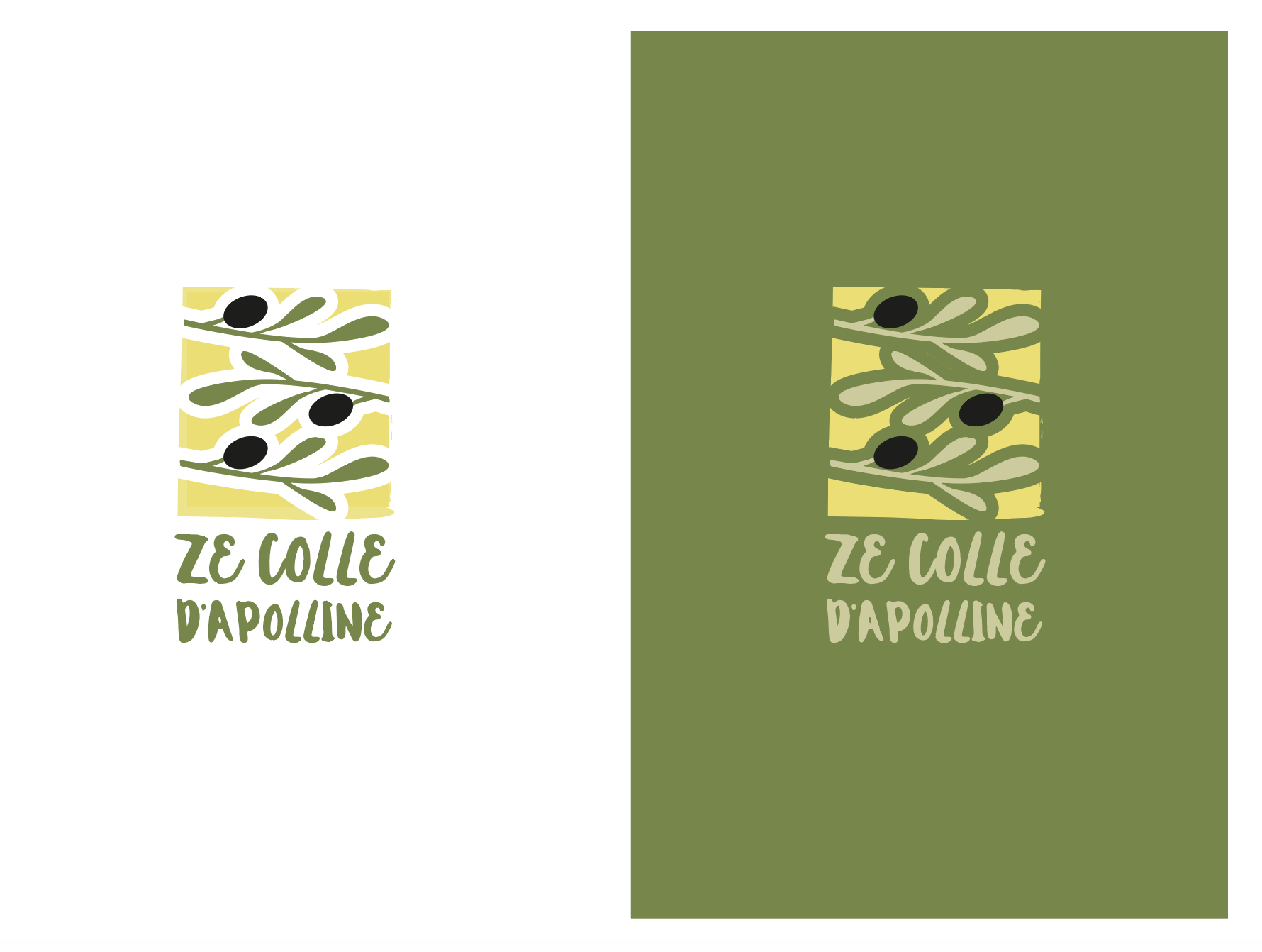
Dieser Kunde bekam 92 Logo-Designs von 35 Designern. Dabei wurde dieses Logo-Design Design von wonderland als Gewinner ausgewählt.
Kostenlos anmelden Design Jobs finden-
 €110
€110
-
 92 Designs
-
 35 Designer
Logo-Design Kurzbeschreibung
Our first harvest of organically cultivated black olives from France was just pressed into olive oil. It's a family hobby for now - while the harvest ramps up, we will mostly bottle & gift it to friends. The brand name is Ze Colle d'Apolline. (a.k.a. La Colle d'Apolline, which means Apolline's Hill. The "Ze" is a wink to the way French people pronounce "The." (We are an American - French family.) The olive grove is on a gently sloping hill in the back country of Nice with a view of the Mediterranean, the mountains and the medieval city of St. Paul de Vence in the distance. We do not want the logo to be classic provençal or figurative in style. The design should be contemporary, stylish, abstract, bold & colorful (think Marimekko or Matisse cut outs). The color palette we're looking at is inspired by our natural surroundings: the blue Azur of the sky & sea, the green of the olive trees, and the yellow of the bright sun. (see the blue, green & yellow in the Matisse upload). Black and white are good too, especially because Nice olives are black; not green. The brand logo should reflect the olive oil's characteristics: authentic (100% AOP Huile d'Olive de Nice, organic), aromatic (the olives are pressed young which gives a slightly peppery taste with notes of fresh green almonds), and spirited (like the young olives and the modern, iconic, sculptural house next to the olive grove).
The brand logo will be printed as a label / sticker on a standard glass 50 cl tall & narrow bottle. (see uploaded file)
Zielmarkt/( -märkte)
Foodies who appreciate organic small batch olive oil and a modern design aesthetic.
Logo Text
Ze Colle d'Apolline
Logo Stile, die Sie interessieren können
Emblem-Logo
Logo eingeschlossen in einer Form
Pictorial / Combination-Logo
Ein reales Objekt (Text optional)
Abstraktes Logo
Begrifflich / symbolisch (Text optional)
Zu verwendende Schriftarten
Andere Schriftarten erwünscht:
- I am open, but I am looking for a bold & spirited personality that stands out from the clutter. No cursive or script fonts.
Farben
Vom Kunden ausgewählte Farben für das Logo Design:
Sehen und fühlen
Jeder Schieber zeichnet eine der Charakteristiken der Marke des Kunden aus sowie den Stil, den euer Logo widerspiegeln sollte.
Elegant
Fett
Spielerisch
Ernst
Traditionel
Modern
Sympatisch
Professionell
Feminin
Männlich
Bunt
Konservativ
Wirtschaftlich
Gehobenes
Anforderungen
Muss haben
- 1/ The name "Ze Colle d'Apolline," read as 1 entity, and an emblematic/ graphic design in a holistic "stacked" (or portrait) logo lock-up.
Why? The N°1 usage will be on a 50 cl tall & narrow bottle. (see uploaded image) So it means we'll need your creative genius and graphic talent to ensure the name is legible and reads as 1 entity even if it might need to be on more than 1 line.
Font Design Direction: Please experiment with the font - we'd like it to be bold, spirited and iconic.
Graphic Design Direction: Good inspiration are the Matisse Cut Outs and the Marimekko roses because they are abstract, simple, modern, bold yet playful and reminiscent of nature. The other Matisse upload has good color references for the blue, green and yellow palette we like. Black & white are fair game too.
Schön zu haben
- This logo will be printed on a sticker for the 50 cl tall & narrow bottle uploaded for this project. The logo, transposed onto this bottle would be very helpful for judging key practical considerations.
Sollte nicht haben
- 1/ We do not want a classic, traditional, provençal "olive tree" design. There are too many olive oils with a figurative or stylized olive tree. We are looking for a design that has more personality, with the potential to be iconic.
2/ Key Watch-Out: It's important that the "Z" not be mistaken for an "L" .. which can happen when using script / cursive fonts. If people read Ze as "Le" they won't get the joke, and it's grammatically incorrect because "colle" is feminine. e.g. "La" not "Le"