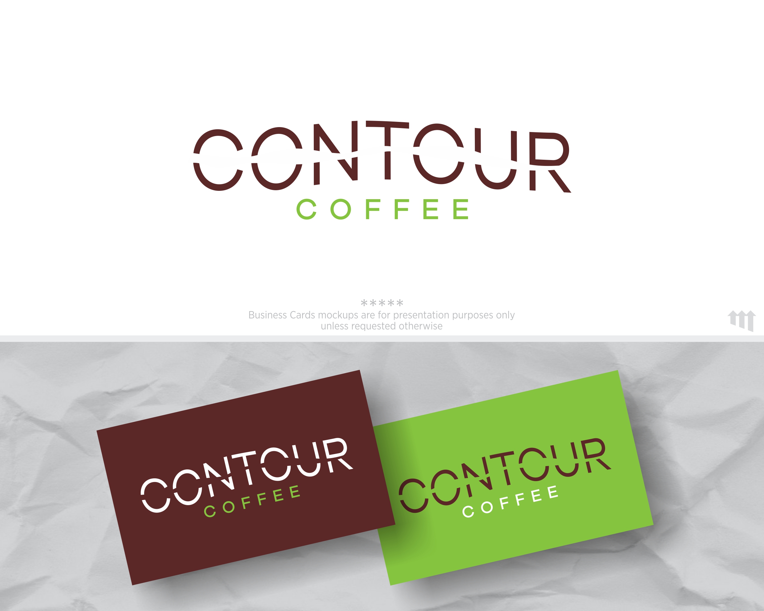
Contour Coffee: Colorado Coffee Roaster logo with Topographic Map Inspiration
Wollen Sie auch einen Job wie diesen gewinnen?
Dieser Kunde bekam 39 Logo-Designs von 17 Designern. Dabei wurde dieses Logo-Design Design von MBARO als Gewinner ausgewählt.
Kostenlos anmelden Design Jobs finden- Garantiert
-
 US$150
-
 39 Designs
-
 17 Designer
Logo-Design Kurzbeschreibung
We are a 42 year old coffee who is rebranding to reach a wider market. We roast a wide range of coffee from around the world and sell it to retail outlets, cafes, and restaurants.
Our logotype must standout on crowded shelves, window stickers "we proudly serve Contour Coffee" and coffee pot wraps.
Just like a topographic map, the challenge here is to present the name of our company that is instantly recognizable as the right way to go…to great coffee)
Zielmarkt/( -märkte)
Health, Educated, urban and suburban coffee drinkers who appreciate clean and modern design.
Logo Text
Contour Coffee
Logo Stile, die Sie interessieren können
Pictorial / Combination-Logo
Ein reales Objekt (Text optional)
Wortmarke-Logo
Word oder namensbasiertes Logo (nur Text)
Zu verwendende Schriftarten
Andere Schriftarten erwünscht:
- font files attached
Sehen und fühlen
Jeder Schieber zeichnet eine der Charakteristiken der Marke des Kunden aus sowie den Stil, den euer Logo widerspiegeln sollte.
Elegant
Fett
Spielerisch
Ernst
Traditionel
Modern
Sympatisch
Professionell
Feminin
Männlich
Bunt
Konservativ
Wirtschaftlich
Gehobenes
Anforderungen
Muss haben
- The words Contour Coffee in it.
VERSION in BLACK, VERSION IN COLOR
We like typography and designs that use type in non-linear ways.
Inspired by topographic maps. See the pdf for image examples.
Colors drawn from mapping - browns, greens, etc.
This wonderful tension between the flowing organic lines of a map contour - and the bold clarity of the type. Don't feel like you need to keep the type on a horizontal line, but it really is a tension.
Schön zu haben
- The design fits inside a compact shape - square, circular, rectangle. Nothing too spread out. However, a variation that works on a website or banner ad would is good.
Sollte nicht haben
- Gradients. I hate logos with color gradients. This logo should work well in black and white as well as it does in colors.
Topo maps have gridlines - as shown in the screen shot. I don't want an actual map.
Also, the maps shown use ariel and trebuchet MS fonts - don't use those or any fonts used in the actual maps provided for inspiration.