Logo Project. Make it match our other two logos. Easy!
Wollen Sie auch einen Job wie diesen gewinnen?
Dieser Kunde bekam 59 Logo-Designs von 35 Designern. Dabei wurde dieses Logo-Design Design von Atec als Gewinner ausgewählt.
Kostenlos anmelden Design Jobs finden- Garantiert
-
 US$150
-
 59 Designs
-
 35 Designer
Logo-Design Kurzbeschreibung
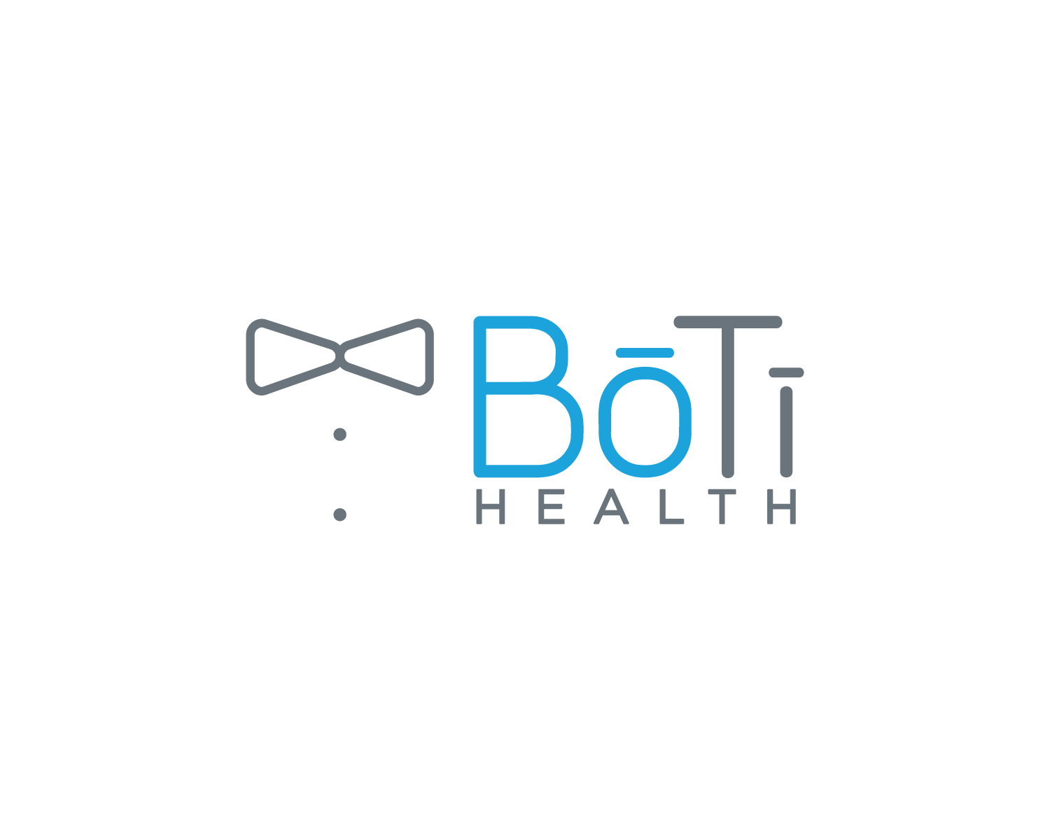
Design a logo for a company called Bo Ti Health. Bo Ti is pronounced "Bow Tie". The logo should match the two logos we have for our main products. We are a health care company that does home based chronic disease care like allergies, depression, anxiety, arthritis, diabetes, heart disease, etc. Our clinicians go to our our clients homes. We call our clinicians "Butlers". That is why our company is called Bo Ti (like a Butler Bow Tie). We are very compassionate and want to manage the health care affairs of the family. The logo should include a Bow Tie like the one in Allergy Butler. Our main two services are called Allergy Butler and Blues Butler (the logos are below).
Our corporate colors are: #00A4E4 (light blue) and secondarily #6A737B (grey). The look should be clean using a very similar font (sans serif type) as our Allergy Butler logo (pay attention to the "B" and "t").
In the "Bo Ti" word, a straight accent line should appear over the "O" and the "i" so it looks modern and phonetically spelled.
Our services are high touch and personal. Every treatment is customized to each patient. We do this by using the latest research and technology. We make healthcare easy, elegant, and it feels more like going to a spa than it does going to a clinic. Our patient experience is way better than a traditional doctors office.
Zielmarkt/( -märkte)
Working moms ages 30-42. They are dual income earners with little time and they want the best for their children and husbands. They drive nice SUV's not Mini Vans or cars. They shop at Target and Nordstroms, not Walmart.
Industrie/Einheitstyp
Healthcare
Logo Text
Bo Ti Health
Logo Stile, die Sie interessieren können
Abstraktes Logo
Begrifflich / symbolisch (Text optional)
Wortmarke-Logo
Word oder namensbasiertes Logo (nur Text)
Zu verwendende Schriftarten
Sehen und fühlen
Jeder Schieber zeichnet eine der Charakteristiken der Marke des Kunden aus sowie den Stil, den euer Logo widerspiegeln sollte.
Elegant
Fett
Spielerisch
Ernst
Traditionel
Modern
Sympatisch
Professionell
Feminin
Männlich
Bunt
Konservativ
Wirtschaftlich
Gehobenes
Anforderungen
Muss haben
- straight accent line over the "o" and the "i". Should include some kind of bow tie the same or similar to the one in our Blues Butler and Allergy Butler logos. I'm looking forward to seeing how you can deal with the accent lines over the "i". See the attached file to see what we mean with the accents over the "o" and "i".
Schön zu haben
- Same colors as our other logos and use the same font. Pay attention to the capital "B" and lower case "t".