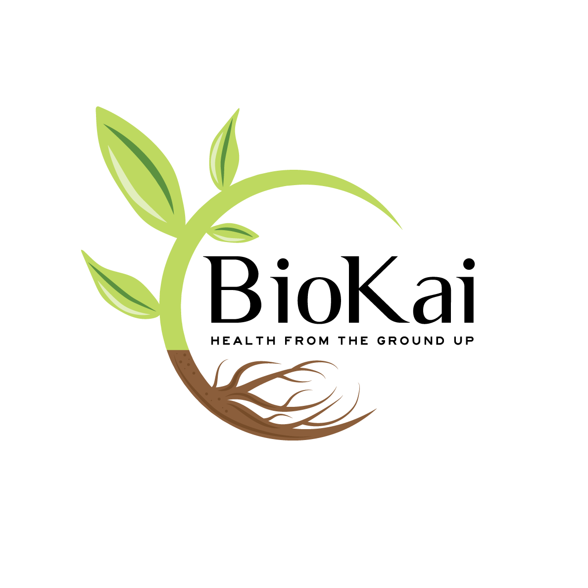
Soil Consultant and Composting Business needs a logo design

Wollen Sie auch einen Job wie diesen gewinnen?
Dieser Kunde bekam 101 Logo-Designs von 51 Designern. Dabei wurde dieses Logo-Design Design von Kimh als Gewinner ausgewählt.
Kostenlos anmelden Design Jobs finden- Garantiert
Logo-Design Kurzbeschreibung
We need a logo design for a new company based in New Zealand. It is called "BioKai - Health from the Ground Up".
It is a sister company from KoruKai Herb Farm (www.korukai.co.nz, thanks LogoPorn for the awesome logo).
We are wanting to educate people on the benefits of healthy soil to grow nutritious food filled with nutrient, antioxidants, phytochemicals to keep and make us healthy (health from the soil). The soil organisms and diversity play here a crucial role to foster our own human microbiome as well.
At the start we are offering education and consultancy for farmers, growers and people wanting to grow their own food - how to make compost, how to look after the soil microorganisms etc.
We want to extend this to supply compost innocultants and other products that help people and make their job easier.
We would like to see designs that are visually similar to KoruKai Herb Farm's design to visualize the connection of the two companies.
We would like to see the colour green.
The final design should communicate healthy plants/seedlings growing in healthy soil.
Zielmarkt/( -märkte)
Farmers, Growers, Gardeners
Industrie/Einheitstyp
Gardening
Logo Text
BioKai - Health from the Ground Up
Logo Stile, die Sie interessieren können
Pictorial / Combination-Logo
Ein reales Objekt (Text optional)
Zu verwendende Schriftarten
Andere Schriftarten erwünscht:
- Luxia, Highway Gothic expanded
Sehen und fühlen
Jeder Schieber zeichnet eine der Charakteristiken der Marke des Kunden aus sowie den Stil, den euer Logo widerspiegeln sollte.
Elegant
Fett
Spielerisch
Ernst
Traditionel
Modern
Sympatisch
Professionell
Feminin
Männlich
Bunt
Konservativ
Wirtschaftlich
Gehobenes
Anforderungen
Muss haben
- A pictoral logo with green and maybe a seedling growing etc.
A brown earthy colour would be good to have.
Text: BioKai - Health from the Ground Up
BioKai should be spelled like that "BioKai"
We want people to see that BioKai is a sister company from KoruKai so the look should be similar but still different enough to be visually different at a glance. We want the pictoral to be unique and not similar or the same as the KoruKai one. The writing can be similar to KoruKai's logo.
Schön zu haben
- We like designs that are clean and clear and not overly playful. We like designs that concentrate on the important parts and not add any unnecessary things.
You can play with fonts or use Luxia and Highway Gothic Expanded.
Sollte nicht haben
- Unnecessary additions that are confusing or overly playful.
Do not add tillage lines from an agricultural field as this is not what we promote with BioKai.