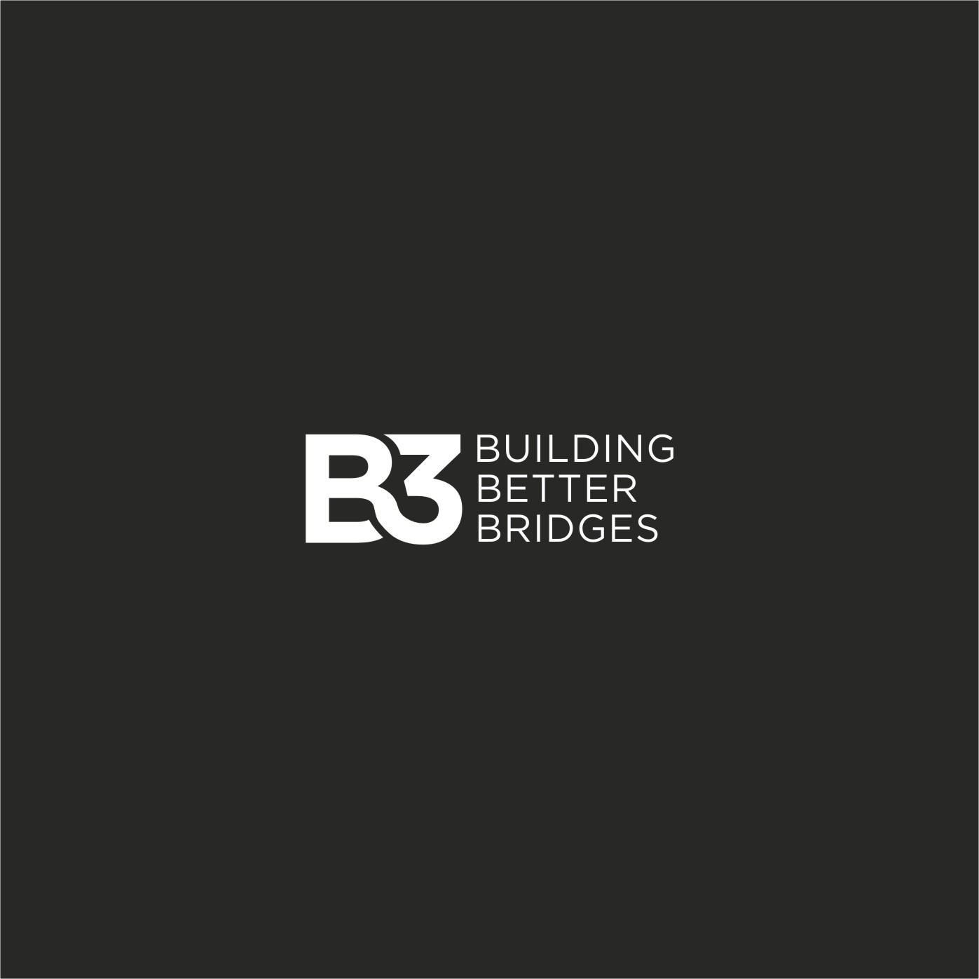
Modern, minimal, tech friendly logo for a business group in education is needed.

Wollen Sie auch einen Job wie diesen gewinnen?
Dieser Kunde bekam 298 Logo-Designs von 144 Designern. Dabei wurde dieses Logo-Design Design von RanaShreeya als Gewinner ausgewählt.
Kostenlos anmelden Design Jobs finden- Garantiert
Logo-Design Kurzbeschreibung
Brief for "B3 Building Better Bridges" logo design
Business type:
The brand is going to represent a business group with a social approach and focused on education and a diversity of different lines of business. More than a regular company, we see ourselves as a Community.
Logo text:
B3 is the main logo text; Building Better Bridges is the tagline that has to be included as part of the logo.
Business mission:
A community that builds better bridges for an equitable and self sufficient world.
Brief description of the business:
B3 will be the name of our brand for our community. We want to build a community mainly with social and educational products but also with businesses around through Mergers & Acquisitions to support the main cause of the community and make it sustainable and scalable. We need to have a modern, minimal, tech friendly logo that represents it.
Building Better Bridges is the tagline because of the strategic alliances we want to achieve in many different areas.
Target audience:
The schools and other business units will have their own user- facing brands. B3 - Building Better Bridges will be a corporate brand, such as P&G, so we want to reach and be appealing to stakeholders such as Silicon Valley investors, national and international government entities and other diverse strategic partners.
Color and font preferences:
We don't have a specific color palette, but we believe we can try something that creates contrast. We want a modern logo and to think long term.
Symbols (These are just suggestions, we are totally open for proposals)
We have two different shapes that we suggest:
1. The INFINITY symbol, because we think our mission and exponential approach can create an infinite numbers of possibilities in the lives of our community members. (This symbol could be used in a different and innovative way)
2. The CIRCLE, because we think the business model of our group can create a VIRTUOUS CIRCLE among the business units and their members.
What do we want to convey?
We want to be perceived as something formal but friendly. We want to be perceived "related" to the tech industry... not a part of it, but that we understand their industry. We want to be that brand that feels welcoming and exciting.
Zielmarkt/( -märkte)
B3 - Building Better Bridges will be a corporate brand, such as P&G, so we want to reach and be appealing to stakeholders such as Silicon Valley investors, national and international government entities and other diverse strategic partners.
Logo Text
B3 (Main text) Building Better Bridges (Tagline)
Logo Stile, die Sie interessieren können
Abstraktes Logo
Begrifflich / symbolisch (Text optional)
Lettermark-Logo
Kurzwort oder Buchstaben-Logo (nur Text)
Zu verwendende Schriftarten
Sehen und fühlen
Jeder Schieber zeichnet eine der Charakteristiken der Marke des Kunden aus sowie den Stil, den euer Logo widerspiegeln sollte.
Elegant
Fett
Spielerisch
Ernst
Traditionel
Modern
Sympatisch
Professionell
Feminin
Männlich
Bunt
Konservativ
Wirtschaftlich
Gehobenes
Anforderungen
Muss haben
- We don't have a specific color palette, but we believe we can try something that creates contrast. We want a modern logo and to think long term.
Schön zu haben
- Symbols (These are just suggestions, we are totally open for proposals)
We have two different shapes that we suggest:
1. The INFINITY symbol, because we think our mission and exponential approach can create an infinite numbers of possibilities in the lives of our community members. (This symbol could be used in a different and innovative way)
2. The CIRCLE, because we think the business model of our group can create a VIRTUOUS CIRCLE among the business units and their members.