eComm site focused on premium accessories for Peloton fitness equipment
Wollen Sie auch einen Job wie diesen gewinnen?
Dieser Kunde bekam 161 Logo-Designs von 77 Designern. Dabei wurde dieses Logo-Design Design von GLDesigns als Gewinner ausgewählt.
Kostenlos anmelden Design Jobs finden- Garantiert
-
 US$490
-
 161 Designs
-
 77 Designer
Logo-Design Kurzbeschreibung
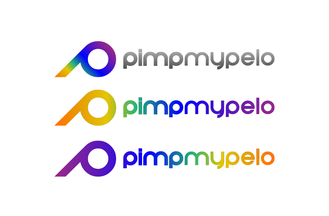
Looking for a logo & corresponding wordmark. This is a new brand, but obviously the inspiration should align with the values and personality of Peloton. Ideally the wordmark would have a visual separate of the 'pimp' from the 'mypeloton', with the ultimate objective for the 'pimp' part to be used as a highly-recognizable brand mark....think headbands, fitness apparel, etc.
We need to not step on Peloton's wordmark or logo, but incorporating a graphical fitness element would be good. Doesn't need to be a bike or treadmill.
I threw together a somewhat cliched attempt at a wordmark, but maybe it illustrates the general look I have in mine. Font & logo should be friendly, modern, lowercase. Feeling of speed. maybe the "m" can be formed into a heart (but still look like an 'm'). The focus should be in the 'pimp' bit of the wordmark, as that will be used on it's own once there's brand recognition, but the 'mypelo' should of course maintain a consistent design.
Aktualisierungen
Went on vacation/holiday
Zielmarkt/( -märkte)
This is a new brand under the umbrella of an existing sucessful ecomm company retailing to a similar audience. Pimpmypelo is focused on retailing high-quality accessories to Peloton users (i.e. Bike, Tread, or Digital). The demographic is broad, typically 35-65, but the 25-34 age group is the fastest growing, even split male/female. Two-thirds of Bike users are between 25-44. Living in cities and the burbs, they are generally collage-educated and with disposable income. The majority of Peloton users are in the US, but they also have a strong presence in the UK, Germany and now Australia. Key words for Peloton, and therefore this brand: Inclusive, Teamwork, Success, Technology, Community.
Industrie/Einheitstyp
Fitness
Logo Text
pimpmypelo
Zu verwendende Schriftarten
Sehen und fühlen
Jeder Schieber zeichnet eine der Charakteristiken der Marke des Kunden aus sowie den Stil, den euer Logo widerspiegeln sollte.
Elegant
Fett
Spielerisch
Ernst
Traditionel
Modern
Sympatisch
Professionell
Feminin
Männlich
Bunt
Konservativ
Wirtschaftlich
Gehobenes
Anforderungen
Schön zu haben
- Since the logo may be applied to apparel, something that's not too complex, to make it easy to emboss with cotton.
Sollte nicht haben
- Please present designs as a flat logo on a white background. No mock-ups, no embossing/debossing, 3D effect (for now!). No logo's with weights, kettlebells, or any other obvious strength-training equipment.