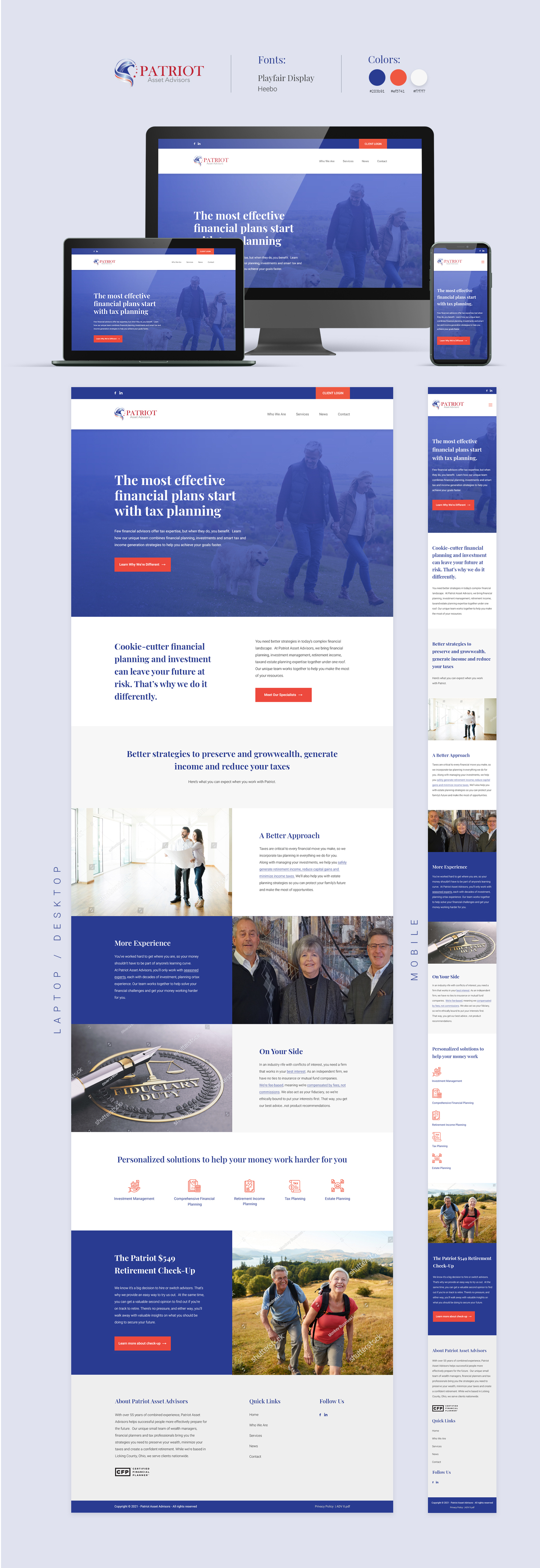
Professional, polished website design for boutique wealth management firm
Wollen Sie auch einen Job wie diesen gewinnen?
Dieser Kunde bekam 75 Wordpress-Designs von 16 Designern. Dabei wurde dieses Wordpress-Design Design von PP² als Gewinner ausgewählt.
Kostenlos anmelden Design Jobs finden- Garantiert
-
 NZ$320
-
 75 Designs
-
 16 Designer
WordPress-Design Kurzbeschreibung
Hello, thank you for your interest. PLEASE READ THE BRIEF BEFORE SUBMITTING THE DESIGN.-
PLEASE USE THE ATTACHED HOME PAGE COPY FOR THIS DESIGN.
We are looking for a professional, polished design that helps portray trust and credibility for a well-established independent wealth management firm. We have copy we've written for the home page and we'd like the design and imagery to play up the copy, so there's a better chance someone will read it all. So the headlines etc should all be easy to read and the design should draw the eye towards them. For colors, again trust is important so probably blue as a dominant color, but you can also use gray, green, etc. We'd like to avoid too much use of the color red (due to financial, association with loss). SO PLEASE AVOID USE OF THE COLOR RED. We also like bright orange or yellow for call to action buttons.
Please keep the design EASY TO MAINTAIN in wordpress as well.
I have attached home page copy as well as logo files.
Here's some sites that we like so feel free to use as inspiration:
https://www.edelmanfinancialengines.com/, https://retirementmattersillinois.com/
https://linscomb-williams.com/, https://investfortomorrow.com/, https://rockhousefinancial.com/
As another option/idea, I like the idea of a simple format with a clean image similar to this for the home page: https://www.gettyimages.co.nz/detail/photo/calculator-falling-royalty-free-image/97970454?adppopup=true
Just an idea.
Also please be sure to incorporate the CFP /Certified Financial Planner logo as well, farther down the page is fine.
Thank you for your help! Feel free to contact me with any questions.
Aktualisierungen
Need extra days to review
Need a couple of days before selecting a winner
Gathering more feedback
Zielmarkt/( -märkte)
Individuals aged 48-62 who are looking to maximize their wealth, such as business owners, executives, engineers, successful tradespeople, etc.
Industrie/Einheitstyp
Finance--wealth management
Zu verwendende Schriftarten
Sehen und fühlen
Jeder Schieber zeichnet eine der Charakteristiken der Marke des Kunden aus sowie den Stil, den euer Logo widerspiegeln sollte.
Elegant
Fett
Spielerisch
Ernst
Traditionel
Modern
Sympatisch
Professionell
Feminin
Männlich
Bunt
Konservativ
Wirtschaftlich
Gehobenes
Anforderungen
Muss haben
- Professional and polished, Call to action buttons must be clear and stand out, headlines must be clear and stand out, also text must be big enough to be easily readable by most people
Sollte nicht haben
- Anything casual, frilly, etc.