

 Aktualisieren
Design a Single YouTube Thumbnail image (16:9)
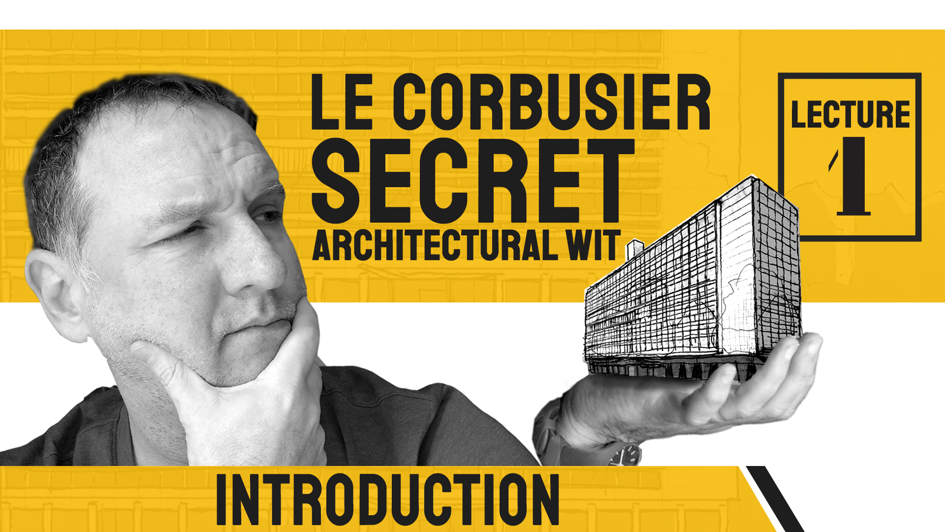
Wollen Sie auch einen Job wie diesen gewinnen?
Dieser Kunde bekam 50 Beschilderungs-Designs von 9 Designern. Dabei wurde dieses Beschilderungs-Design Design von Mikai!13 als Gewinner ausgewählt.
Kostenlos anmelden Design Jobs finden
- Garantiert
-
 US$110
-
 50 Designs
-
 9 Designer
Schilder-Design Kurzbeschreibung
This project is for a single image, perhaps saved as .psd or .tiff. The proportions of Youtube's thumbnail images is 16:9. Take my file of the face and hand (holding the building) and re-layout the words and fonts to be professional and attractive-looking. You're welcome to try different fonts, layouts, colors, etc. I don't know which letters should be upper or lower case. You can flip the imafe, resize, reposition etc. I tend to prefer minimal designs, that have a touch of professionalism, but still are interesting enough to have you click on it. It is the Introduction image for a YouTube historical lecture series. The overall title of the lectures is, "Le Corbusier's Secret Architectural Wit" or "Le Corbusier Secret Architectural Wit." And this particular video is "Lecture 1: Introduction."
I want it to not look too cute because I would want to keep my dignity in front of my friends, family and colleagues who will eventually see it on YouTube. My target audience are architect, architecture students, history buffs, and those who love art and art history. My daughter's idea to have the thought bubble looking at the face in the architecture...
Zielmarkt/( -märkte)
architects, architecture students, history buffs, college-educated
Industrie/Einheitstyp
Architecture/Architectural History/Historian
Zu verwendende Schriftarten

Andere Schriftarten erwünscht:
- maybe a seriffed font, but I doubt it...
Sehen und fühlen
Jeder Schieber zeichnet eine der Charakteristiken der Marke des Kunden aus sowie den Stil, den euer Logo widerspiegeln sollte.
Elegant
Fett
Spielerisch
Ernst
Traditionel
Modern
Sympatisch
Professionell
Feminin
Männlich
Bunt
Konservativ
Wirtschaftlich
Gehobenes
Anforderungen
Muss haben
- Two sets of texts. Person (me) looking at building (studying it for its wit)
Schön zu haben
- There is a second image file that can be substituted for the blocky building. The image doesn't necessarily have to be in the hand... ***ADDITION TO ORIGINAL BRIEF**** Le Corbusier is associated with a very specific (though not particularly nice) color pallete. I include it in the files below. I'm not saying they need to be included in the design, but sometimes, publications on the architect that are glaringly different from these colors, can feel a bit "off."
Sollte nicht haben
- I'm not fond of "artistic filters" over the photo of the person. Also, black and white image of the person is likely better than the color one.


