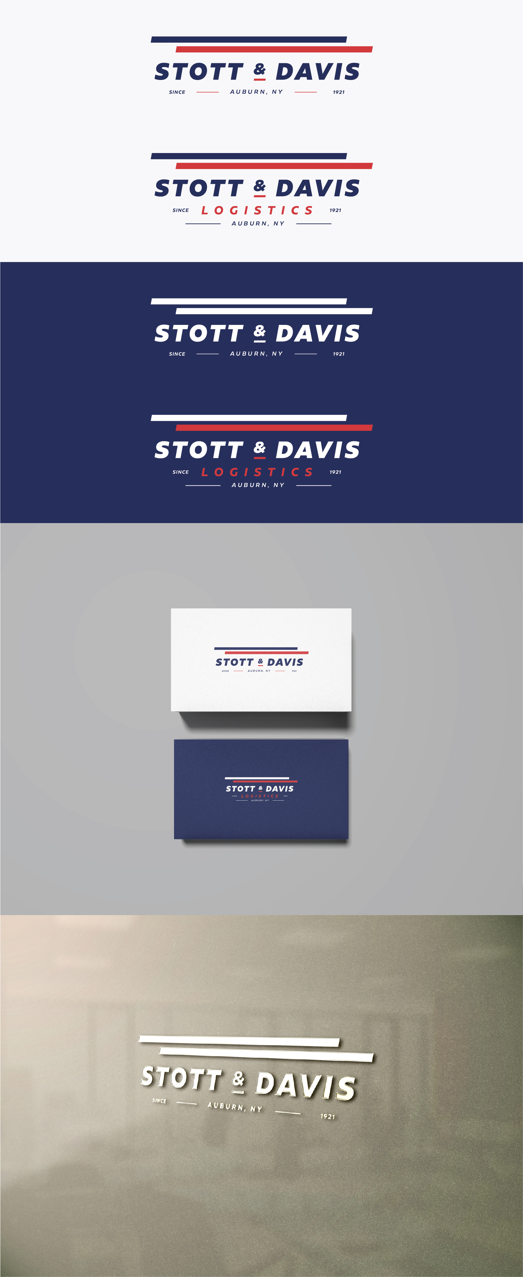
Classic Take On An Old Logistics Company Logo From 1921!
Wollen Sie auch einen Job wie diesen gewinnen?
Dieser Kunde bekam 66 Logo-Designs von 36 Designern. Dabei wurde dieses Logo-Design Design von IMilenovic als Gewinner ausgewählt.
Kostenlos anmelden Design Jobs finden- Garantiert
-
 US$250
-
 66 Designs
-
 36 Designer
Logo-Design Kurzbeschreibung
There have been multiple logos over the years that have never made their way to digital format. Everything is a take on a classic theme that was developed in 1921 and never truly updated. And we don't want it "updated" because we love that old vintage feel, yet we do need something new, and we do need digital versions for our new website, stationery etc... and whatever else we want to put it on. How can you keep its character while giving it a tiny facelift to remove the wrinkles?
Here's a snippet of the company's bio.
"Stott and Davis Logistics is an asset-based 3PL company that develops, implements, and manages tailored supply chain solutions. Family-owned and operated since 1921, Stott and Davis Logistics offers a full slate of transportation services, including truckload freight, warehousing, distribution, LTL consolidation, and container import/export services."
It's boring, maybe, but it's a genuine, honest family-run company that has seen its fair share of ups and downs over the years yet weathered them out over its century run.
The puzzle is this.
Go through the images provided and see if you can get a feel for this company.
Then understand your dilemma, "How can I take the current logo and give it a polish into something modern without losing its vintage character."
Make a simple multiuse design that doesn't wow us and make it feel like we rebranded our company. Honestly, we want to be seen as the same guy we've always been but in the best shape of his life.
The slight hitch is that the current logo isn't really defined. It's like slightly different on the stationary, a digital file someone created off that stationary, an old business folder of a previous subsidiary, and then on signage on the side of the building. So treat the current logo as a culmination of all four. Make sense? Nope. Probably not, but that's why design is like a puzzle you have to solve.
Aktualisierungen
Need extra days to review
Zielmarkt/( -märkte)
My customers which are small bushinesses, mostly conservative. I'm generalizing here but you get the point.
Industrie/Einheitstyp
Logistics
Logo Text
One with "Stott & Davis Logistics" and one with just "Stott & Davis"
Logo Stile, die Sie interessieren können
Wortmarke-Logo
Word oder namensbasiertes Logo (nur Text)
Lettermark-Logo
Kurzwort oder Buchstaben-Logo (nur Text)
Zu verwendende Schriftarten
Farben
Vom Kunden ausgewählte Farben für das Logo Design:
Sehen und fühlen
Jeder Schieber zeichnet eine der Charakteristiken der Marke des Kunden aus sowie den Stil, den euer Logo widerspiegeln sollte.
Elegant
Fett
Spielerisch
Ernst
Traditionel
Modern
Sympatisch
Professionell
Feminin
Männlich
Bunt
Konservativ
Wirtschaftlich
Gehobenes
Anforderungen
Muss haben
- The same color scheme.
Schön zu haben
- Just remember this isn't a rebranding. I like to see things with a white background.
Sollte nicht haben
- I don't want to limit you and I love creativity but I'm doing this for a conservative company that hasn't changed their logo ever really. So don't go crazy because I won't be able to sell it even if I like it.