Supplement Company Needs a Label Design
Wollen Sie auch einen Job wie diesen gewinnen?
Dieser Kunde bekam 23 Etikett-Designs von 7 Designern. Dabei wurde dieses Etikett-Design Design von Graphic Storm als Gewinner ausgewählt.
Kostenlos anmelden Design Jobs finden-
 US$120
-
 23 Designs
-
 7 Designer
Etikett-Design Kurzbeschreibung
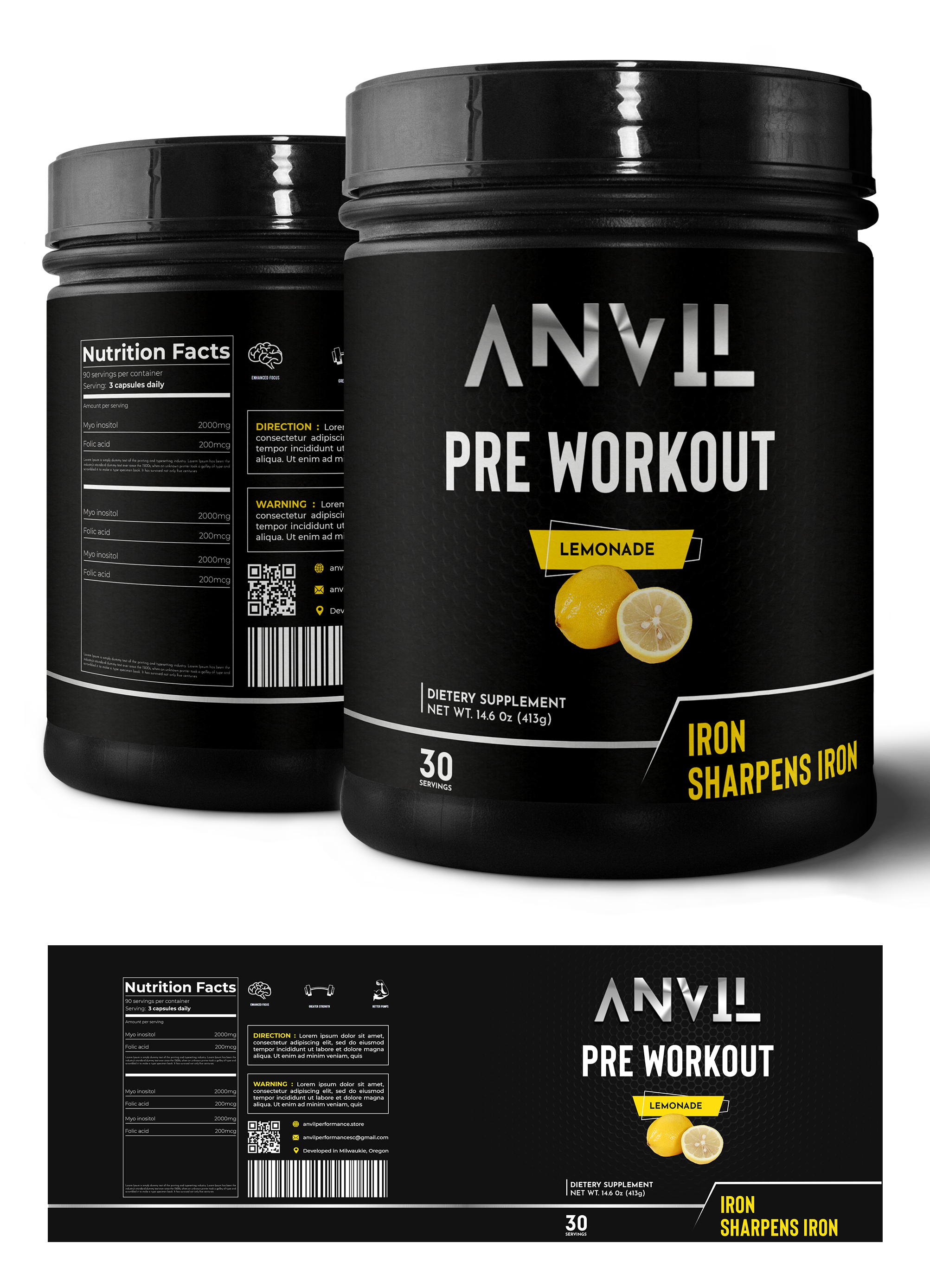
We need a label design for our pre-workout tub. Our company name is Anvil Performance, we would like to emphasize the product's clinically dosed, science-based, transparent formula. We would like the label to mention our slogan "Iron Sharpens Iron." We would like you to experiment with colors and color schemes; the photo included is colorful, but that's not necessarily what we are looking for. We would like our main font & color scheme to match our theme of grittiness and boldness. We would like you to include how it boosts energy, enhances focus, creates bigger pumps, and elongates endurance. (Preferably on the back written vertically aside the supplement facts.) Photo 1 (Ghost) is the guideline for the overall idea of what the pre-workout should look like, excluding color scheme and font. Photo 2(Outwork Nutrition) is how we'd like to present the energy, focus, pumps, & endurance. This label shows the ingredients next to the supplement facts, however we'd like to show the boosted energy, enhanced focus, bigger pumps, and elongated endurance. The final design should communicate boldness, grit, but we would like it to remain uncluttered and clean looking.
Zielmarkt/( -märkte)
Our target market is primarily males who workout in the gym.
Zu verwendende Schriftarten
Andere Schriftarten erwünscht:
- Blanka
Sehen und fühlen
Jeder Schieber zeichnet eine der Charakteristiken der Marke des Kunden aus sowie den Stil, den euer Logo widerspiegeln sollte.
Elegant
Fett
Spielerisch
Ernst
Traditionel
Modern
Sympatisch
Professionell
Feminin
Männlich
Bunt
Konservativ
Wirtschaftlich
Gehobenes
Anforderungen
Schön zu haben
- Can incorporate the logo attached if you would like.