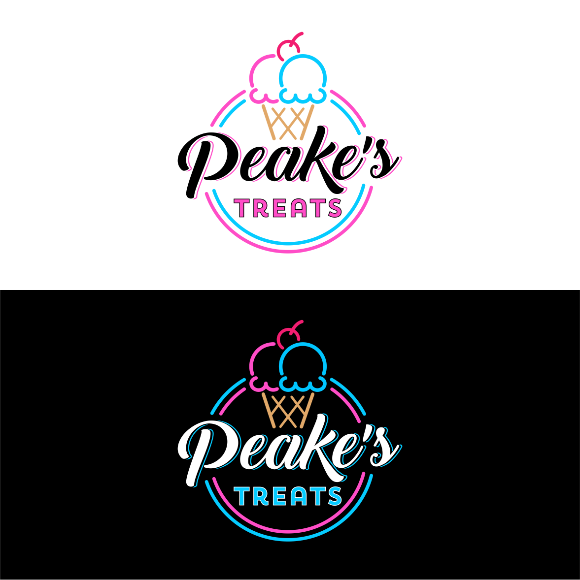
Peake's Kitchen need a "Peake's Treats" logo for the new ice cream scoop parlour
Wollen Sie auch einen Job wie diesen gewinnen?
Dieser Kunde bekam 92 Logo-Designs von 39 Designern. Dabei wurde dieses Logo-Design Design von design.picnic als Gewinner ausgewählt.
Kostenlos anmelden Design Jobs finden-
 NZ$250
-
 92 Designs
-
 39 Designer
Logo-Design Kurzbeschreibung
We are an established gourmet kitchen in Kiwiana New Zealand, under the name of "Peake's Kitchen". Peake is our last name and also symbolises being at the top or highest point of something. We in turn focus on hand made flavoursome and exciting creations, which also display a vibrant spectrum of colour, using seasonal produce, microgreens and edible flowers.
After a successful year of focusing on the "Savoury Side" of our business, we are now expanding our brand to include a complimenting "Sweet Treats " ice cream parlour section of the establishment. We will be featuring gourmet ice cream scoop sundaes in a cone (not soft served) with sauce, sprinkles and a cherry on top.
We would like the brands colours of blue and pink (rather than peach) to be included and similar font style for the "Peake's" text of "Back to Black Demo". The kitchen part was "Gilroy font" but this is up for experimentation of other font types for the "Treats" text. The logo will be used to create branded products, signage, a neon sign, merchandise and more. Let your creative juices flow and help us stand out!
We will include both the white version and black background versions of our current/ original savoury logo for reference. Even using similar aspects of the current logo in the new logo could be considered in the design process. An Ice cream cone with the Peake's Kitchen logo integrated into the design (without the knife and spatula) is a possible idea. The original logo had blue and peach but we have now gone with a more "PINK" tone to create that 80s neon effect, but do not have this version on file. We definitely portray a funky retro vibe and even have an old school free to play arcade machine for the kids to play on in the dining space.
Check us out at www.peakeskitchen.com
Aktualisierungen
Need extra days to review
Zielmarkt/( -märkte)
Families and Foodies
Industrie/Einheitstyp
Ice Cream Parlour
Logo Text
Peake's Treats
Logo Stile, die Sie interessieren können
Emblem-Logo
Logo eingeschlossen in einer Form
Pictorial / Combination-Logo
Ein reales Objekt (Text optional)
Abstraktes Logo
Begrifflich / symbolisch (Text optional)
Zu verwendende Schriftarten
Andere Schriftarten erwünscht:
- back to black demo
Farben
Vom Kunden ausgewählte Farben für das Logo Design:
Sehen und fühlen
Jeder Schieber zeichnet eine der Charakteristiken der Marke des Kunden aus sowie den Stil, den euer Logo widerspiegeln sollte.
Elegant
Fett
Spielerisch
Ernst
Traditionel
Modern
Sympatisch
Professionell
Feminin
Männlich
Bunt
Konservativ
Wirtschaftlich
Gehobenes
Anforderungen
Muss haben
- A classic looking ice cream in a cone (NOT SOFT SERVE ICE CREAM), Ice cream parlour style
Schön zu haben
- An ice cream cone with one pink scoop and one blue scoop. An Ice cream cone with the Peake's Kitchen logo intergrated into the design (without the knife and spatula)
Sollte nicht haben
- SOFT SERVE ICE CREAM CONES