Website redesign for a national printing company
Wollen Sie auch einen Job wie diesen gewinnen?
Dieser Kunde bekam 32 Web-Designs von 10 Designern. Dabei wurde dieses Web-Design Design von rightway als Gewinner ausgewählt.
Kostenlos anmelden Design Jobs finden-
 US$370
-
 32 Designs
-
 10 Designer
Web-Design Kurzbeschreibung
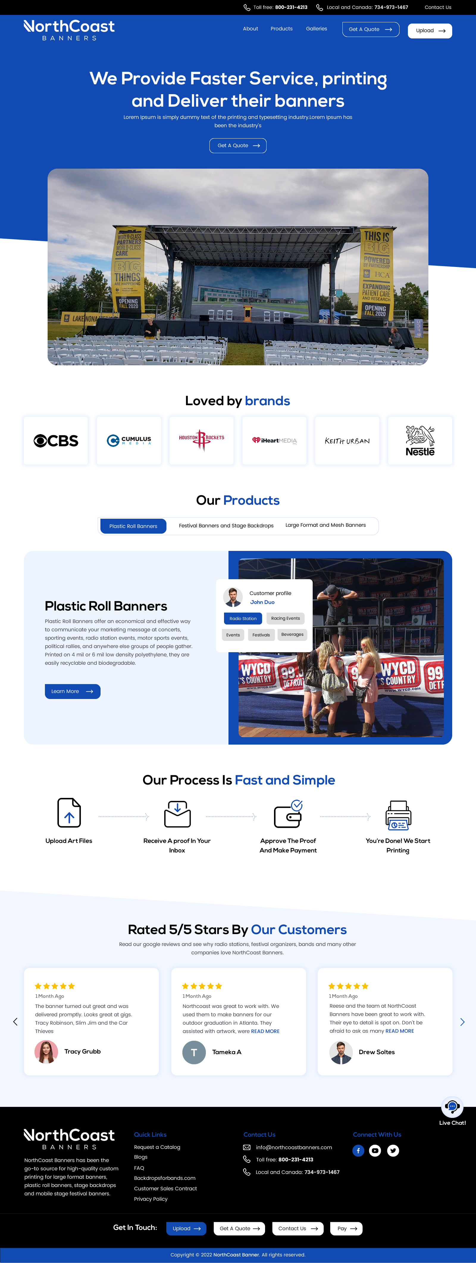
Our current website is dated and boring: northcoastbanners.com
We are looking for a fresh, modern design. We need a clean, minimal design that is also elegant, really shows off large, bright photos of our banners in action and POPS. Our goal is to showcase our beautiful banners, while also giving the user the confidence in our company that we will provide friendly, fast service, fast printing, and deliver their banners on time for their event.
I want a nice flow to the website, the design should tie in well with the printing feel. Here is an example of clean, beautiful design that ties in to the industry - https://www.dixa.com/ - notice how the buttons are like chat icons, for example.
More examples:
Nice clean design https://www.hotjar.com/
https://unbounce.com/ nice and clean, but it POPS really well.
I like https://www.logikcull.com/
https://www.cience.com/ gorgeous site, clean, modern
Beautiful, simple, clean, modern - https://gocardless.com/en-us/
These websites are not from the print industry, that’s because most printers don’t have good websites - they are more focused on local businesses, referrals, not really online marketing.
But keep in mind in your design that we need to give the feel that we are printing their banners beautifully, fast, with great service.
https://www.trustpilot.com/ so clean, bold, clear to the user what the company does. Love this simple yet elegant design.
https://www.g2.com/ - so pretty! And still so simple and obvious to the user what to do on their site.
https://monday.com/
https://robinhood.com/us/en/ big and bold - yet super nicely designed with so many nice touches
https://mailchimp.com/ - also clean, simple, and so obvious to the user to take action and contact the company
Aktualisierungen
I just updated the job brief, and you can also view it in full here - https://docs.google.com/document/d/1Wkt6XPXLVc2hwAbm4uPwiEhrpN-0W76qT35aFDbKFYQ/edit?usp=sharing
Added Wednesday, 04 January 2023
Zielmarkt/( -märkte)
Please read this customer persona - https://docs.google.com/document/d/1Wkt6XPXLVc2hwAbm4uPwiEhrpN-0W76qT35aFDbKFYQ/edit?usp=sharing
Industrie/Einheitstyp
Printing
Anzahl benötigter Seiten
1 page
Sehen und fühlen
Jeder Schieber zeichnet eine der Charakteristiken der Marke des Kunden aus sowie den Stil, den euer Logo widerspiegeln sollte.
Elegant
Fett
Spielerisch
Ernst
Traditionel
Modern
Sympatisch
Professionell
Feminin
Männlich
Bunt
Konservativ
Wirtschaftlich
Gehobenes
Anforderungen
Muss haben
- Nice flow to the website, the design should tie in well with the printing feel. Here is an example of clean, beautiful design that ties in to the industry - https://www.dixa.com/ - notice how the buttons are like chat icons, for example.
Sollte nicht haben
- No filters on the images, we want large, beautiful images.