PanoScape - Software Company Logo Rebrand
Wollen Sie auch einen Job wie diesen gewinnen?
Dieser Kunde bekam 133 Logo-Designs von 79 Designern. Dabei wurde dieses Logo-Design Design von Dynopoint als Gewinner ausgewählt.
Kostenlos anmelden Design Jobs finden- Garantiert
-
 US$150
-
 133 Designs
-
 79 Designer
Logo-Design Kurzbeschreibung
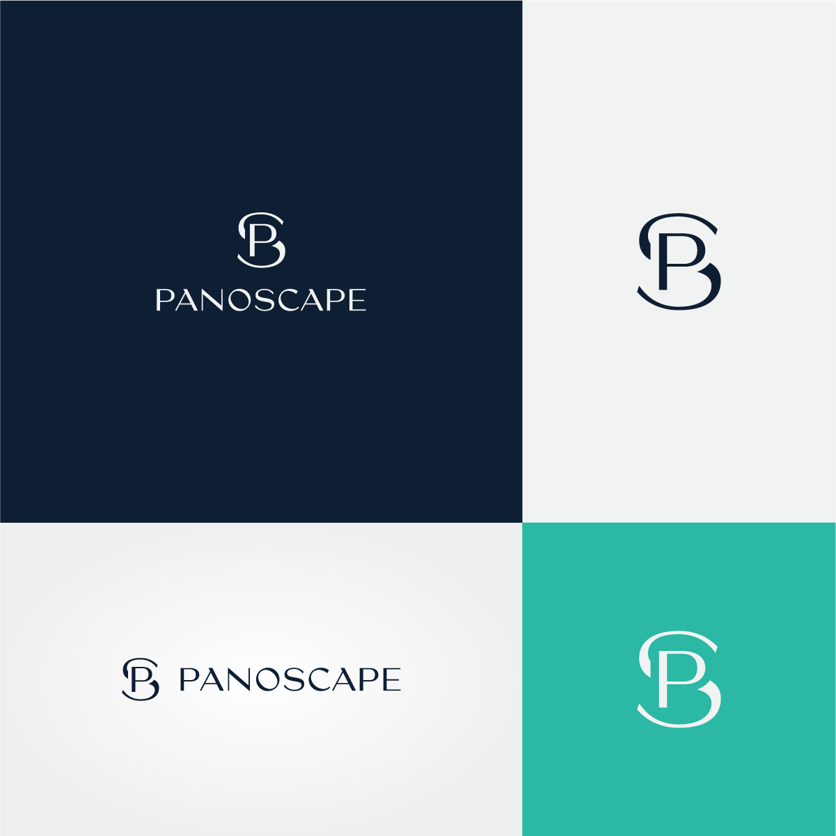
We are looking to rebrand our company logo, at present it is just text based. Our new logo would be great to include an Icon of some sorts along with the company name. Colors we want to move away from orange and look at a color palette using potentially dark blue as the main color but open to other color ways. We have played around with the idea of using the leaf from the state tree of Illinois as the icon. We also like the idea of an intertwined figure of eights as the icon, or using the P & S as an icon but created in an elegant way. The new logo wants to be elegant and minimalist. Please check out our website www.panoscape.com to see what we do, but at heart we are a software development company.
Industrie/Einheitstyp
Software Development
Logo Text
PanoScape
Logo Stile, die Sie interessieren können
Pictorial / Combination-Logo
Ein reales Objekt (Text optional)
Abstraktes Logo
Begrifflich / symbolisch (Text optional)
Lettermark-Logo
Kurzwort oder Buchstaben-Logo (nur Text)
Zu verwendende Schriftarten
Sehen und fühlen
Jeder Schieber zeichnet eine der Charakteristiken der Marke des Kunden aus sowie den Stil, den euer Logo widerspiegeln sollte.
Elegant
Fett
Spielerisch
Ernst
Traditionel
Modern
Sympatisch
Professionell
Feminin
Männlich
Bunt
Konservativ
Wirtschaftlich
Gehobenes
Anforderungen
Muss haben
- Icon & Text