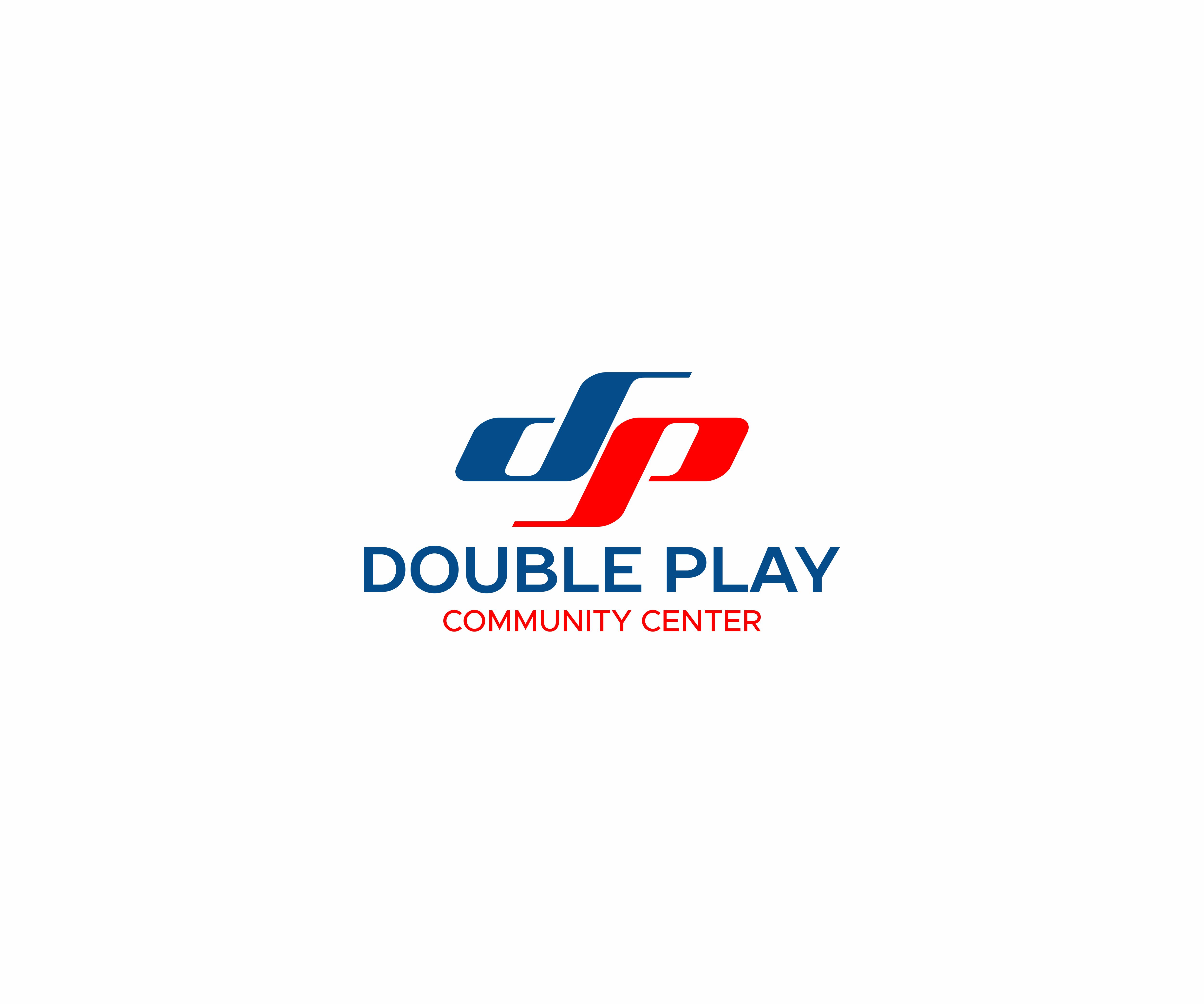
Double Play Community Center Logo
Wollen Sie auch einen Job wie diesen gewinnen?
Dieser Kunde bekam 41 Logo-Designs von 21 Designern. Dabei wurde dieses Logo-Design Design von Avilash als Gewinner ausgewählt.
Kostenlos anmelden Design Jobs finden- Garantiert
-
 US$250
-
 41 Designs
-
 21 Designer
Logo-Design Kurzbeschreibung
Currently the community center has a very busy, masculine and sports oriented brand because it previously focused solely on sports. Now there is a more expansive offering including enrichment programs (art, music, mental wellness, etc.) so we're looking to create a logo that can create a new identity that is more simple, more clear and appeals to a broader audience (more feminine but not totally feminine). Needs to strong enough to maintain the connection to existing sports members, but needs to also encompass the new offerings and be more welcoming of women which represent a large amount of the new members coming in. Right now the community center offers a fitness center, personal training, fitness classes, art classes of all types, dance classes, health and wellbeing classes (yoga, meditation) and also has a teen center and senior center offering where groups can gather. To transition the center from it's sports/male oriented origins into the more inclusive offerings of attracting more women and offering wellness options as well we've come up with the tagline... do more. learn more. be more. Because the brand is now more than sports (what it's currently known for). But we AREN'T looking for a wellness green leaf logo. We've tossed around different symbols and because the center does so much it is easy for the logo to get really overwhelming when using symbols. So we've focused on trying to do a monogram using the initials D and P, but haven't hit on anything original enough yet. So we're open to a monogram logo, or a logo that creatively shows with image/symbols or a single image symbol that it's a community center with a lot to offer to all ages.
Logo Text
DOUBLE PLAY COMMUNITY CENTER
Logo Stile, die Sie interessieren können
Pictorial / Combination-Logo
Ein reales Objekt (Text optional)
Abstraktes Logo
Begrifflich / symbolisch (Text optional)
Lettermark-Logo
Kurzwort oder Buchstaben-Logo (nur Text)
Zu verwendende Schriftarten
Farben
Vom Kunden ausgewählte Farben für das Logo Design:
Sehen und fühlen
Jeder Schieber zeichnet eine der Charakteristiken der Marke des Kunden aus sowie den Stil, den euer Logo widerspiegeln sollte.