Redesign aesthetics for 5 existing pages & keep the same UX
Wollen Sie auch einen Job wie diesen gewinnen?
Dieser Kunde bekam 137 Web-Designs von 13 Designern. Dabei wurde dieses Web-Design Design von Sbss als Gewinner ausgewählt.
Kostenlos anmelden Design Jobs finden- Garantiert
-
 US$370
-
 137 Designs
-
 13 Designer
Web-Design Kurzbeschreibung
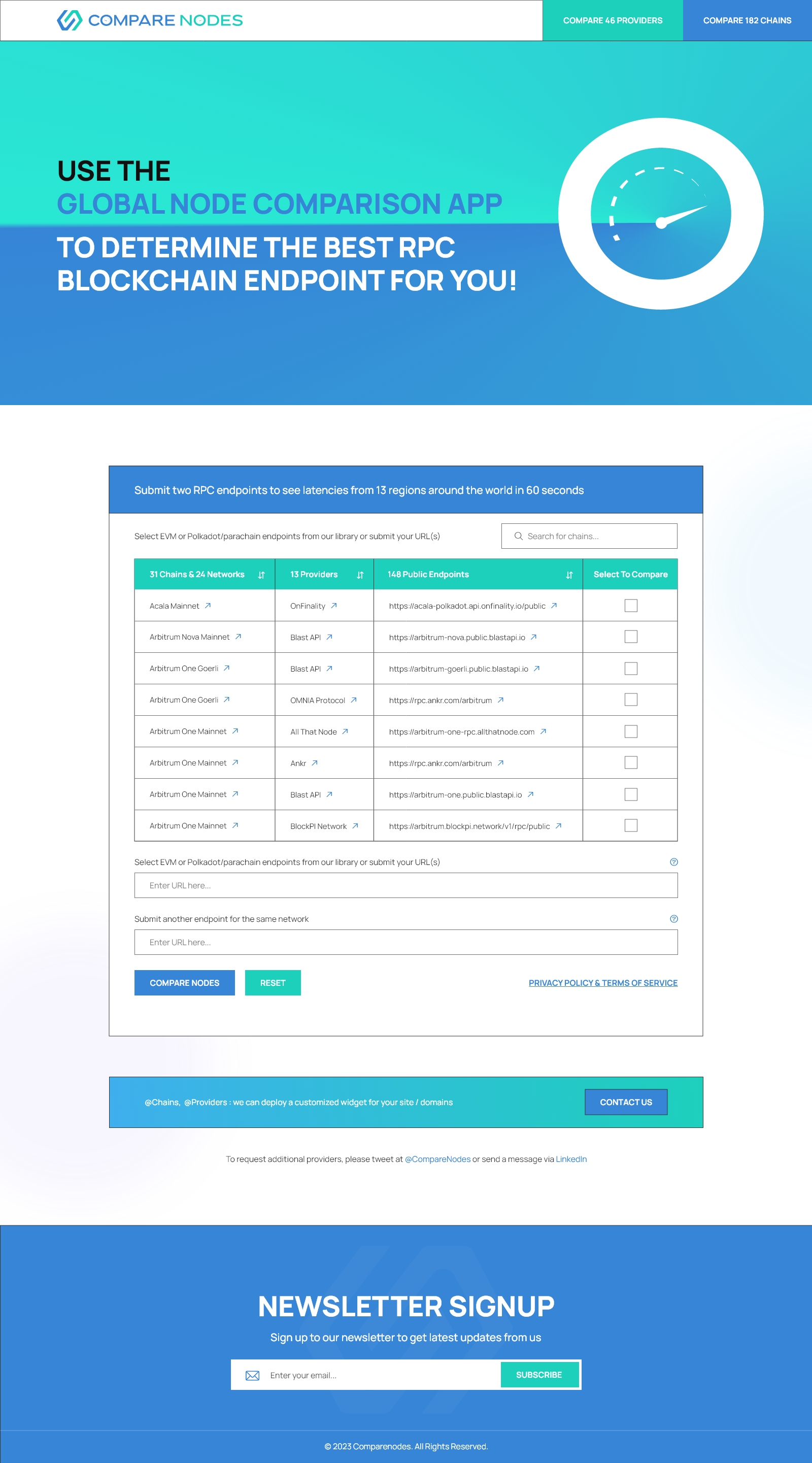
I have a working website and I need a redesign for 5 pages;
Please think of the 5 pages as the entire site;
I want to keep the structure of each page and the “navigation” as it is now;
1. Goal is to change ONLY the aesthetics: colors and styling; Please keep the max-width of the content area the same; breakpoints the same;
2. Please pick a new color palette; The palette you pick needs a red color but the red color can be used only for the error messages in the application form (landing page);
3. Please design a header: same for all pages; In today’s header there are two links/buttons (“Compare 45 Providers”, “Compare 162 Chains”) — these need to be designed as a two selections in the top level menu;
4. Please design a footer: same for all pages; email submission should go into the footer;
5. Please apply the new colors to the logo — you can decide the color arrangement for the logo; but it needs to use two colors in the logomark to show the “C” vs. “N”; The font (family) in the logo is "Blink Twice Regular";
6. Feel free to change fonts, font-sizes, font-weights; but keep the text in the same relative positions to each other (top to bottom); Some repositioning of text is OK;
7. Each page currently has a hero image. You can reduce it, or remove it, or change the colors OR replace with another image or images OR replace it with gradients etc.;
8. You can redesign icons/glyphs for “Verified” and “Not Verified” (so that they are “flat”);
Please note:
a. I don’t like drop shadows much;
b. I prefer flat more than 3d;
c. I like more: elegant, serious, professional, colorful.
To access the existing site you must use id + pw;
ID: admin
PW: Ph57n5
The 5 pages for re-design are:
https://dev.comparenodes.com/
https://dev.comparenodes.com/providers/
https://dev.comparenodes.com/chains/
https://dev.comparenodes.com/chains/ethereum/
https://dev.comparenodes.com/providers/quicknode/
Also, these are some of the sites that I like a lot:
https://www.composer.trade/
https://www.rated.network/?network=mainnet&view=pool&timeWindow=1d&page=1
https://v2.poktscan.com/
https://www.0x.org/
https://www.taskade.com/
https://www.subscan.io/
https://app.artemis.xyz/dashboard
https://mojito.xyz/
https://www.nodies.org/
https://base.org/
https://interchain.io/
https://bandprotocol.com/
Aktualisierungen
Need extra days to review
Zielmarkt/( -märkte)
Tech, developers, crypto
Industrie/Einheitstyp
Tech, crypto, developer tools
Anzahl benötigter Seiten
4 page
Zu verwendende Schriftarten
Sehen und fühlen
Jeder Schieber zeichnet eine der Charakteristiken der Marke des Kunden aus sowie den Stil, den euer Logo widerspiegeln sollte.
Elegant
Fett
Spielerisch
Ernst
Traditionel
Modern
Sympatisch
Professionell
Feminin
Männlich
Bunt
Konservativ
Wirtschaftlich
Gehobenes
Anforderungen
Muss haben
- New color palette
Schön zu haben
- maybe gradients would work better in place of the current hero images?
Sollte nicht haben
- Less drop shadows please