"Cleandress" company Logo Rebranding
Wollen Sie auch einen Job wie diesen gewinnen?
Dieser Kunde bekam 123 Logo-Designs von 70 Designern. Dabei wurde dieses Logo-Design Design von aglstd als Gewinner ausgewählt.
Kostenlos anmelden Design Jobs finden- Garantiert
-
 US$150
-
 123 Designs
-
 70 Designer
Logo-Design Kurzbeschreibung
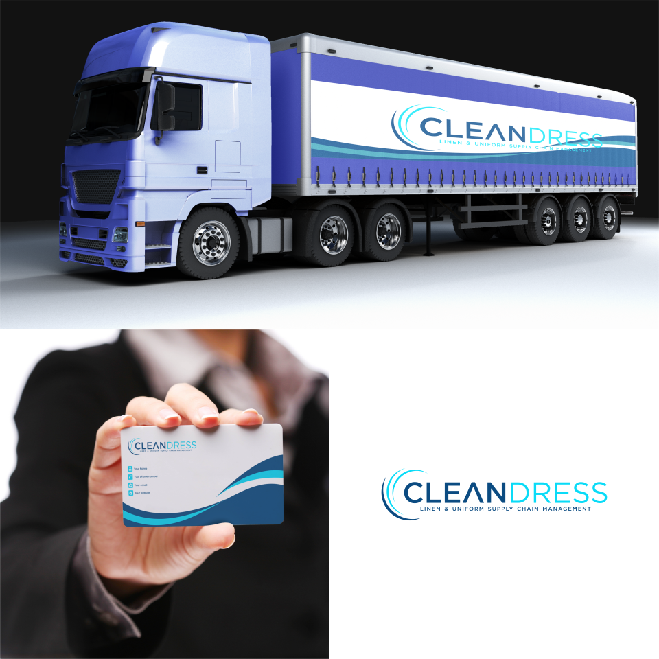
I would like a rebranding of an existing logo that has been around for 20+ YEARS (LOGO ATTACHED)
The company supplies linens to the hospitality industry (hotels and restaurants)
Its uniqueness is offering RFID technology that can basically track linens throughout a hotel or even beyond the confines of the business.
I am looking to freshen up the look and feel and modernize. possibly incorporating an RFID element in the logo.
The color scheme should remain bluish and should not steer away to much from the existing palate.
The font should definitely use a makeover and be modernized.
I am not looking for another downloadable template with a washing machine and bubbles
I am looking for a clean, corporate, modern look that can be used on cards, trucks, and more
Thanks in advance
Dan
Aktualisierungen
Hey All
Just to clarify the company name is "Cleandress" One word. I am looking for something very different from the current logo. Except for the color scheme that can remain with those bluish Pantones
Thank you
Added Wednesday, 05 April 2023
Zielmarkt/( -märkte)
sophisticated hotels and restaurants
Industrie/Einheitstyp
Linen & uniform supply and RFID tracking
Logo Text
"Linen Supply Chain Management"
Logo Stile, die Sie interessieren können
Emblem-Logo
Logo eingeschlossen in einer Form
Zu verwendende Schriftarten
Farben
Vom Kunden ausgewählte Farben für das Logo Design:
Sehen und fühlen
Jeder Schieber zeichnet eine der Charakteristiken der Marke des Kunden aus sowie den Stil, den euer Logo widerspiegeln sollte.
Elegant
Fett
Spielerisch
Ernst
Traditionel
Modern
Sympatisch
Professionell
Feminin
Männlich
Bunt
Konservativ
Wirtschaftlich
Gehobenes
Anforderungen
Muss haben
- clear and corporate look
Schön zu haben
- RFID incorporated somewhere in the logo
Sollte nicht haben
- not too similar to the old logo