Film/TV Prep Company seeks Logo
Wollen Sie auch einen Job wie diesen gewinnen?
Dieser Kunde bekam 20 Grafik-Designs von 9 Designern. Dabei wurde dieses Grafik-Design Design von simple mind als Gewinner ausgewählt.
Kostenlos anmelden Design Jobs finden- Garantiert
-
 US$210
-
 20 Designs
-
 9 Designer
Grafik-Design Kurzbeschreibung
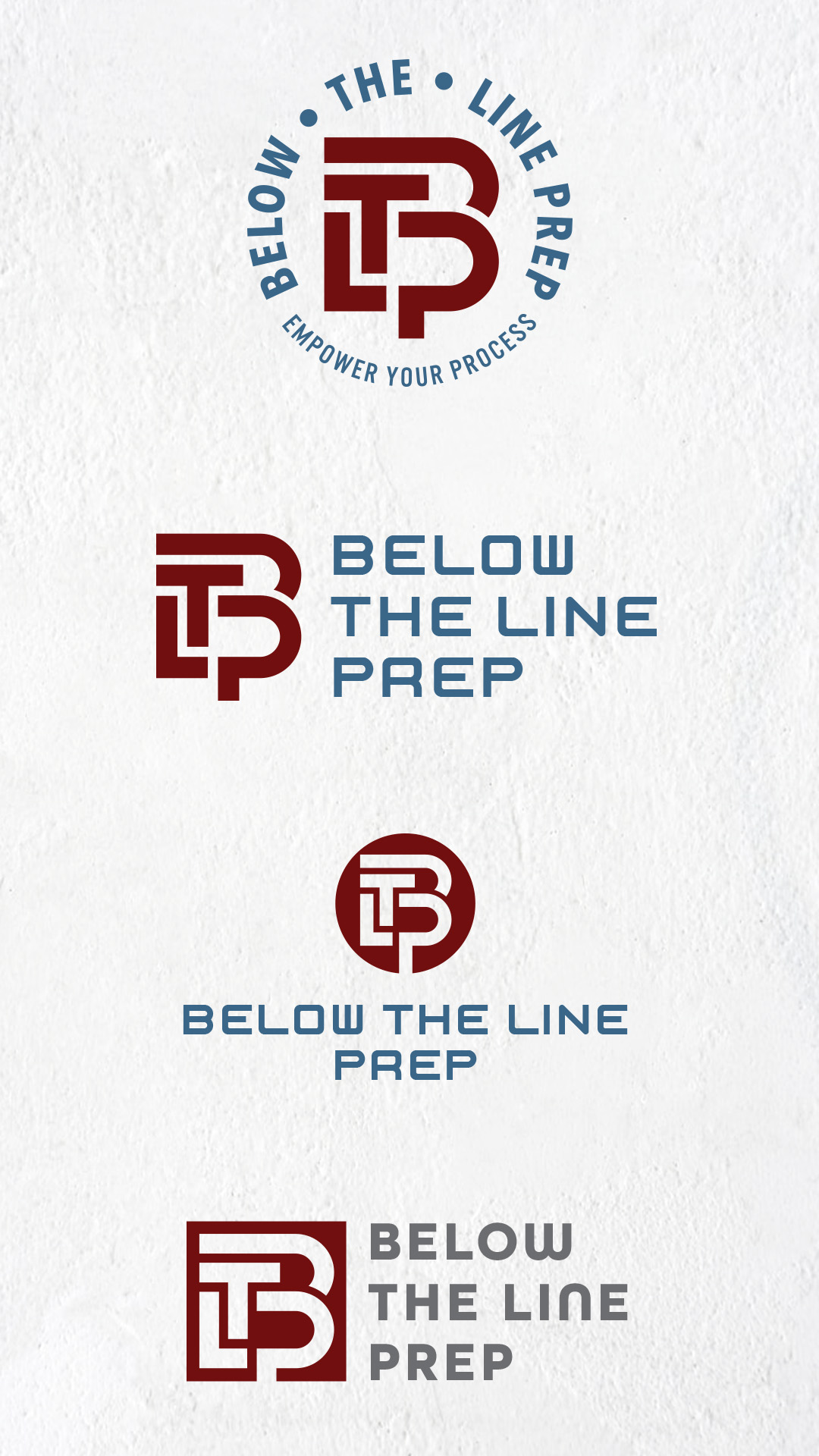
After years in the TV/Film industry, we are changing the landscape and hoping to niche down our work. This company is focusing on ONLY the pre-production for film/TV projects. We're trying to fix it in pre! not post. ;) Paperwork/research heavy, computer, remote-driven work is our company. We will take on a concierge-type business sense in that companies can hire us to complete specific tasks, so they can put their time to other parts of the project.
We have a couple slogan options:
"When time is running out, we join in."
"Empower your process."
Our company will be called "Below-The-Line Prep" or for short "BTL Prep". When creating a film or TV show, you have an Above-The-Line budget & everything else is BTL. We'll focus on all prep tasks remotely for the BTL of the show. Schedule, budget, location permits, onboarding/hiring crew, travel booking needs, and more.
I want the company logo to feel simplistic & modern. The files attached are ideas I've been toying with:
• Trial 5 - Was a simple letter-based logo, but it looks possibly too block & I got feedback that it looked "busy".
• Simplified Logo - Was trying to go more unique and ambiguous of a logo stamp/image look vs the straight forward lettering.
• Clock_Keyboard - was my fun unique take, replace a laptop screen with an alarm clock, but I'd like the numbers of the clock to be budget codes (attached as Chart of Accounts) & the hand of the clock to be a checkmark (as in task done).
Colors - Fall colors. Deep reds, blues, purples, greens, etc. are ideal for this company. My other company uses pastels - so trying to keep separation.
As you can see, instead of hyphens I used dots in Trial 5. "Below • The • Line" vs "Below-The-Line" - felt cleaner for the image. You can take luxury with in between punctuation as well.
Thank you for taking the time to submit it if you do! I need your professional eyes to show me the opportunities I'm missing.
Aktualisierungen
I didn't finish this brief & when I posted it today, it's still showing the dates from back in January. So, I need new dates started today through next week.
Sehen und fühlen
Jeder Schieber zeichnet eine der Charakteristiken der Marke des Kunden aus sowie den Stil, den euer Logo widerspiegeln sollte.
Elegant
Fett
Spielerisch
Ernst
Traditionel
Modern
Sympatisch
Professionell
Feminin
Männlich
Bunt
Konservativ
Wirtschaftlich
Gehobenes
Anforderungen
Muss haben
- Fall, deep, rich colors. I use pastels for another company, need separation.
Schön zu haben
- Slogan, but not needed. Focus should be logo.
Sollte nicht haben
- Does not need TV/Film icons as we may expand to events.