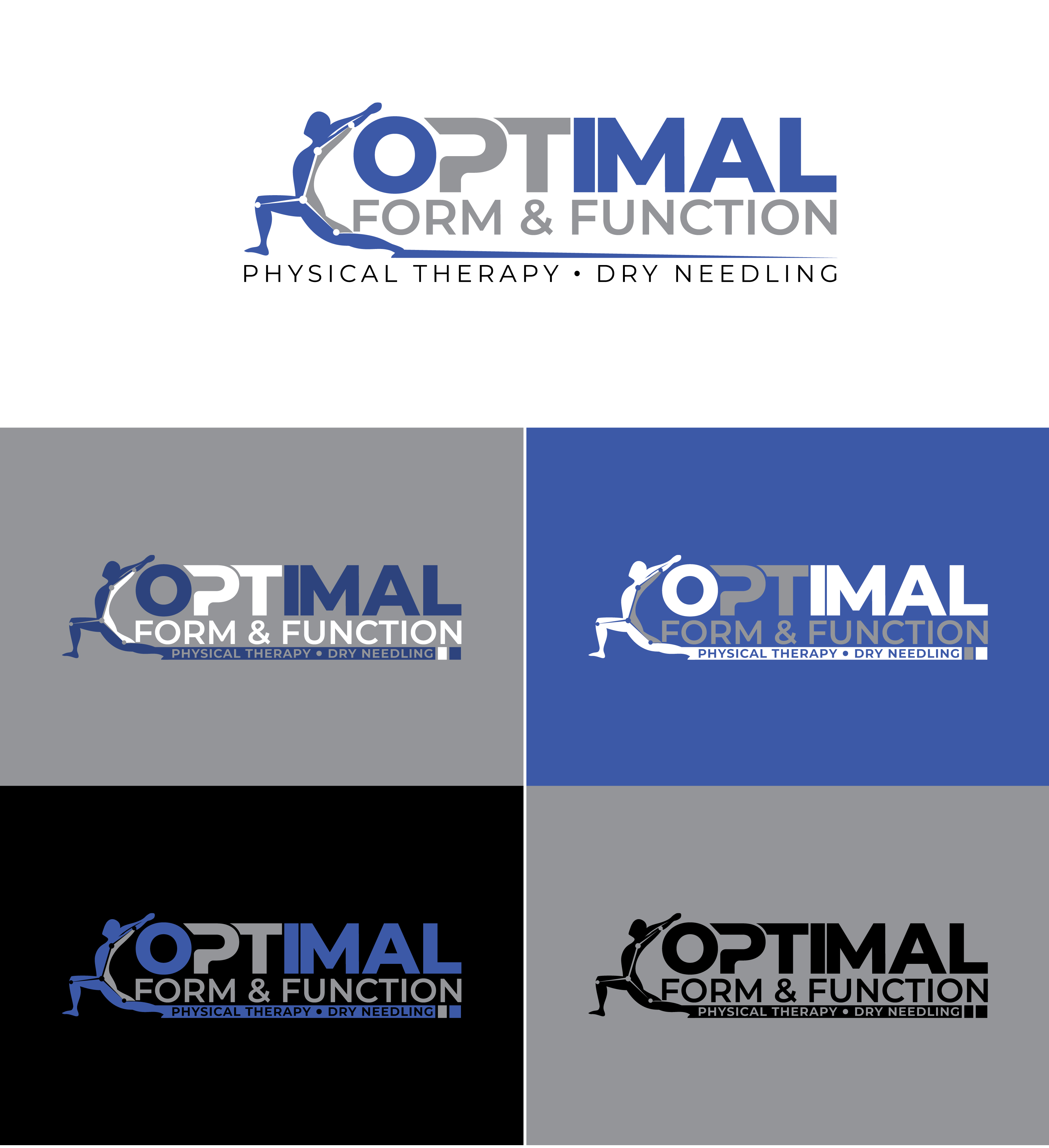
Logo Design For a Physical Therapy Clinic
Wollen Sie auch einen Job wie diesen gewinnen?
Dieser Kunde bekam 231 Logo-Designs von 104 Designern. Dabei wurde dieses Logo-Design Design von Maya_ als Gewinner ausgewählt.
Kostenlos anmelden Design Jobs finden-
 US$300
-
 231 Designs
-
 104 Designer
Logo-Design Kurzbeschreibung
I need a logo for my start up physical therapy practice. I have been a PT for 20 years and I am board certified in orthopedics and dry needling. I am aiming to provide one-on-one PT for the patients.
This logo will be used for my patient portal for my electronic medical records, website, and any promo materials.
This will be for a health care clinic/medical facility. So I hope the logo comes across as working well within that industry.
Attached is a sample of what I made with word. I do like that color scheme. I would like the emphasis of the Logo to be on the word "Optimal." If that makes sense.
If "One-on-One Physical Therapy" can be worked into the logo that would be sweet, but not necessary.
I would like a logo that is bold in that it stands out from the run of the mill logos most PT practices have, but not so bold that it is shouting. We are friendly, not scary. It should be strong, but not menacing. It should convey that this is a specialty clinic with highly skilled therapists providing well above average care to the patients in a personal setting.
Low on the priority list: If there was a way to showcase compassion and skill into the logo that would be a bonus, but not necessary.
Aktualisierungen
Gathering more feedback
Zielmarkt/( -märkte)
A good percentage of my patient population will be from Medicare, but I do want to attract cash based clients or those with out of network benefits. These are people recovering from an injury or a surgery in need of PT or Physio.
Industrie/Einheitstyp
Health Care - Physical Therapy - Orthopedics/Geriatrics/Sports
Logo Text
Optimal Form & Function
Farben
Der Designer kann die Farben des Designs frei wählen
Sehen und fühlen
Jeder Schieber zeichnet eine der Charakteristiken der Marke des Kunden aus sowie den Stil, den euer Logo widerspiegeln sollte.
Elegant
Fett
Spielerisch
Ernst
Traditionel
Modern
Sympatisch
Professionell
Feminin
Männlich
Bunt
Konservativ
Wirtschaftlich
Gehobenes
Anforderungen
Sollte nicht haben
- A person/diagram of a person running inside of a circle. Too many clinics have that type of logo. Not a fan of two hands holding a heart or anything like that. Again too many clinics in my area have that logo design.