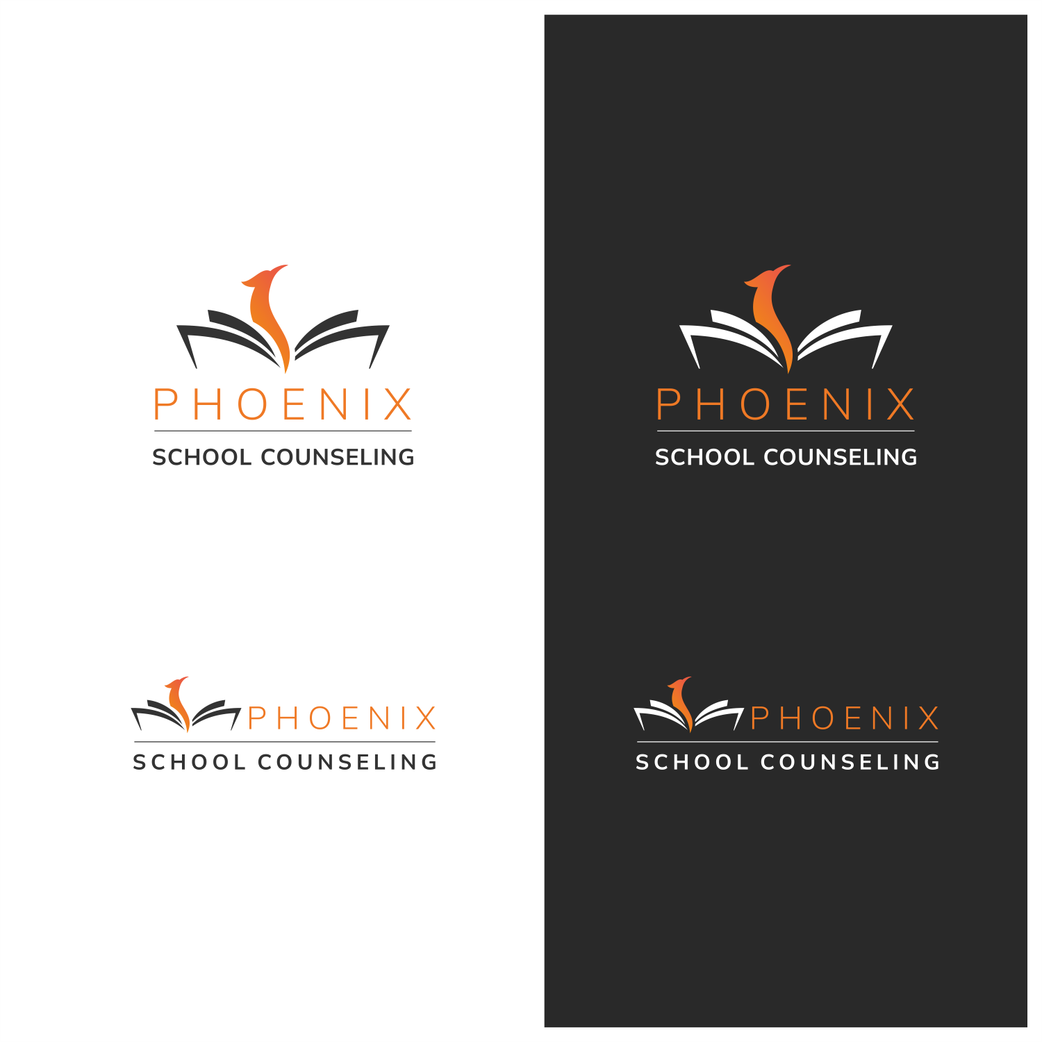
New logo/branding for Phoenix School Counseling - for elementary and middle school

Wollen Sie auch einen Job wie diesen gewinnen?
Dieser Kunde bekam 261 Logo-Designs von 116 Designern. Dabei wurde dieses Logo-Design Design von ThiagoB als Gewinner ausgewählt.
Kostenlos anmelden Design Jobs finden- Garantiert
Logo-Design Kurzbeschreibung
Overview:
- Name: Phoenix School Counseling
- Location: Minneapolis-St. Paul metro area, Minnesota
- Target Audience: Non-public elementary, middle schoolers, parents, teachers, students, mental health professionals
Brand Background:
Phoenix School Counseling is a highly regarded counseling service dedicated to enhancing the well-being and educational experience of students in non-public schools across the Minneapolis-St. Paul metro area. Led by Dr. Jules Nolan, a trusted expert in the field, the company offers personalized counseling, engaging presentations, and valuable research-based resources to support parents, teachers, and mental health professionals in creating a thriving learning environment. The name "Phoenix" symbolizes the idea of renewal, growth, and transformation, reflecting the positive impact the counseling services have on the educational community. Although we'd like a very modern, simple, clean, inviting take on a phoenix.
Project Objectives:
1. Design a new logo that captures the essence of Phoenix School Counseling's expertise, compassion, and commitment to supporting non-public schools.
2. Create a brand identity that conveys professionalism, credibility, and approachability, reflecting the company's research-based strategies and resources.
Brand Personality:
- Compassionate
- Trustworthy
- Supportive
- Professional
- Knowledgeable
Design Guidelines:
- Color Palette: Warm and welcoming colors that evoke a sense of comfort, hope, and growth, while also remaining professional. Consider using a mix of calming blues and vibrant, uplifting tones like orange, yellow, or red. Limit the palette to a maximum of five colors.
- Typography: Choose a clean and modern typeface that balances professionalism and approachability. The font should be easily legible and versatile for various applications.
- Imagery: Incorporate modern elements related to the mythical bird "Phoenix" as a symbol of renewal and transformation. Consider subtle phoenix-inspired imagery, but keep it relevant to the counseling context. Integrate imagery related to growth, learning, and support. This could include symbols like open books, sprouting plants, or hands reaching out in support.
- Logo Usage: Ensure the logo is adaptable to different mediums, such as digital, print, merchandise, and presentation materials.
Desired Deliverables:
1. Primary Logo: A unique and impactful logo that embodies Phoenix School Counseling's expertise and commitment to supporting non-public schools.
2. Secondary Logo (optional): A simplified version of the primary logo for use in smaller spaces or as a watermark.
3. Color Palette: Defined set of colors for consistent branding across all materials.
4. Typography: Specified typefaces for use in marketing materials and communications.
Current logo attached - we do not want to keep the color or realism of the phoenix.
Zielmarkt/( -märkte)
Non-public elementary, middle, and high schools, parents, teachers, students, mental health professionals
Industrie/Einheitstyp
Mental health/counseling
Logo Text
Phoenix School Counseling
Logo Stile, die Sie interessieren können
Pictorial / Combination-Logo
Ein reales Objekt (Text optional)
Abstraktes Logo
Begrifflich / symbolisch (Text optional)
Wortmarke-Logo
Word oder namensbasiertes Logo (nur Text)
Zu verwendende Schriftarten
Farben
Vom Kunden ausgewählte Farben für das Logo Design:
Sehen und fühlen
Jeder Schieber zeichnet eine der Charakteristiken der Marke des Kunden aus sowie den Stil, den euer Logo widerspiegeln sollte.
Elegant
Fett
Spielerisch
Ernst
Traditionel
Modern
Sympatisch
Professionell
Feminin
Männlich
Bunt
Konservativ
Wirtschaftlich
Gehobenes
Anforderungen
Muss haben
- Modern, light and airy (potentially subtle) elements related to birds - not necessarily a phoenix, we want it to be approachable/soft. Warm and welcoming colors that evoke a sense of comfort, hope, and growth, while also remaining professional.
Schön zu haben
- Bubbly, fun, approachable colors and lines.
Sollte nicht haben
- No dark backgrounds. No focus on orange logo or realistic phoenix - should not resemble current logo in that regard.