

 Aktualisieren
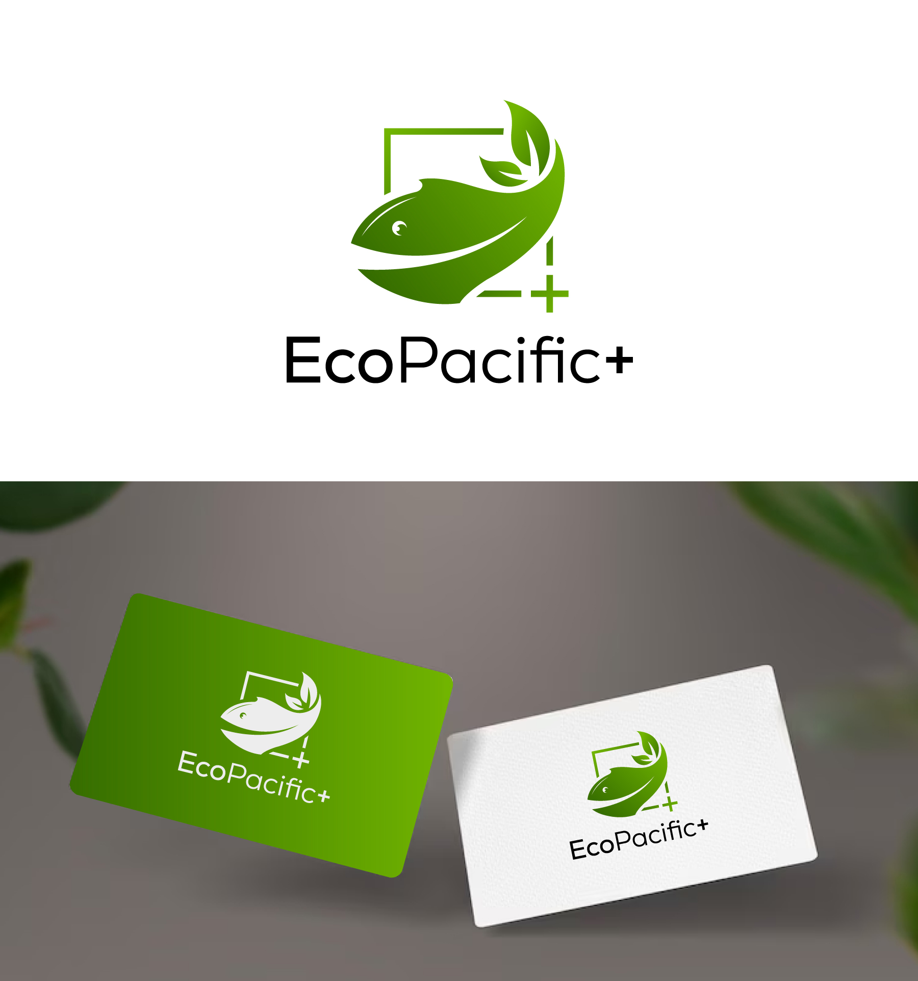
EcoPacific+, international conservation organization seeks to redesign its logo
Wollen Sie auch einen Job wie diesen gewinnen?
Dieser Kunde bekam 165 Logo-Designs von 94 Designern. Dabei wurde dieses Logo-Design Design von debdesign als Gewinner ausgewählt.
Kostenlos anmelden Design Jobs finden
- Garantiert
-
 US$150
-
 165 Designs
-
 94 Designer
Logo-Design Kurzbeschreibung
We are a small group of professionals but with great impact on the sea and its resources. For example, we have trained more than 600 fishermen in several countries to treat turtles that get hooked with good techniques, we have developed projects for the sustainability of fishing, we seek to integrate all actors from the fisherman to the final consumer of fish.
We have two logos, one homemade, which was the first one we made, and another more elaborate one. The idea behind the logo is that We call ourselves EcoPacific+ because we work with an ecosystem approach mainly in the Pacific of Latin America but we go beyond, that's why we use the symbol +. We use colors from the ocean but also from nature. We use EcoPacific in English and EcoPacifico in Spanish so it is easy to switch from one language to the another and the logo design can play around with the "o" at the end.
We seek to merge the logos into a single logo, simple, bold, although the word is long, and a graphic that can be recognized with or without text. Current logos are attached.
Our target audience includes NGOs, Government, fishing sectors and international donors. The logo will be used on social media, website, materials and also for printing on T-shirts and other items. Also, attached you may find some logos as a reference
Zielmarkt/( -märkte)
NGOs, Government, fishing sectors and international donors
Logo Text
EcoPacific+
Logo Stile, die Sie interessieren können
Abstraktes Logo
Begrifflich / symbolisch (Text optional)



Sehen und fühlen
Jeder Schieber zeichnet eine der Charakteristiken der Marke des Kunden aus sowie den Stil, den euer Logo widerspiegeln sollte.


