Executive Search Company Logo
Wollen Sie auch einen Job wie diesen gewinnen?
Dieser Kunde bekam 19 Logo-Designs von 3 Designern. Dabei wurde dieses Logo-Design Design von Kryss Denmar als Gewinner ausgewählt.
Kostenlos anmelden Design Jobs finden- Garantiert
-
 £80
£80
-
 19 Designs
-
 3 Designer
Logo-Design Kurzbeschreibung
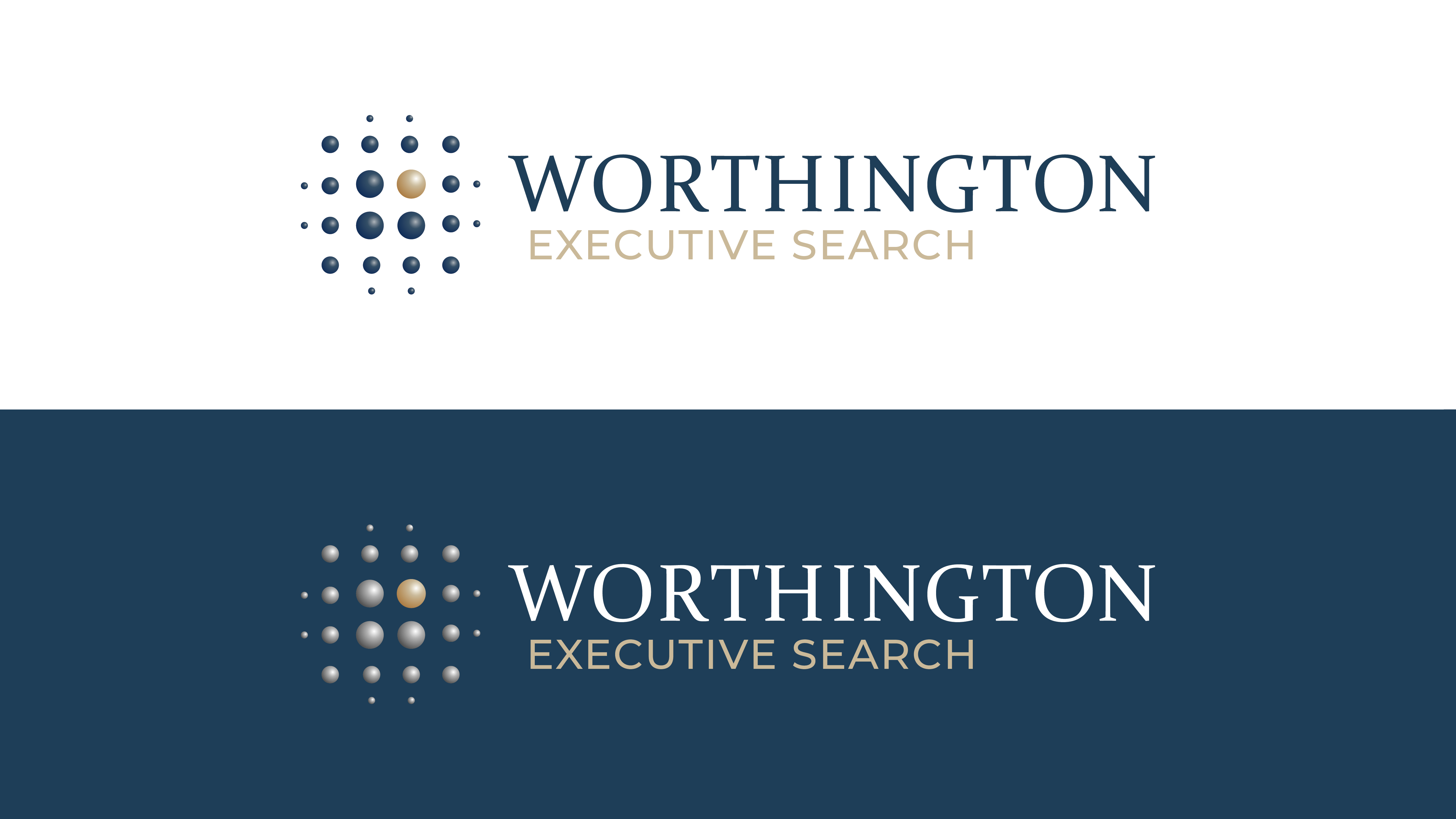
Company logo for Worthington Executive Search as follows:
2x logos.
1st LOGO: See attached logo with dots:
- Position the dots logo to the left of the typing, rather than above, and remove the surrounding lines. The top and bottom of the dots can be higher/lower than the typing of the name. But not too much so. Slightly smaller proportionately than on the attached image.
- Type WORTHINGTON and underneath EXECUTIVE SEARCH in smaller letters. Justify Worthington and Executive Search to the left so that they both start on the same vertical.
- Type WORTHINGTON in a similar font to the attached image, but without the bulb at the top end of the G. So a slightly cleaner font.
- White background.
- WORTHINGTON and just ONE large dot in a 'dirty blue' colour.
- EXECUTIVE SEARCH and all remaining dots in a tan colour.
2nd LOGO:
- Same as above, however, do not position the dots in a geometric pattern. Find a way to position them in the same area, but in a non-geometric, asymmetric manner. They do not need to be dots, can be a different shape. Then can be all the same size or slightly different.
- As before, put them all in the tan colour other than one, which goes in the blue.
The idea is that the blue dot/shape signifies having 'Searched' and identified the preferred candidate (company is executive search).
- Include one final option where all the dots are in the blue and just one of the 4x large ones is in the tan colour, so the reverse of before, to compare how it looks. Also in this one have the words EXECUTIVE SEARCH centralised under Worthington rather than justified to the left.
Thank you.
Zielmarkt/( -märkte)
Financial Services
Industrie/Einheitstyp
Financial Services
Logo Text
WORTHINGTON EXECUTIVE SEARCH
Logo Stile, die Sie interessieren können
Abstraktes Logo
Begrifflich / symbolisch (Text optional)
Zu verwendende Schriftarten
Farben
Vom Kunden ausgewählte Farben für das Logo Design:
Sehen und fühlen
Jeder Schieber zeichnet eine der Charakteristiken der Marke des Kunden aus sowie den Stil, den euer Logo widerspiegeln sollte.
Elegant
Fett
Spielerisch
Ernst
Traditionel
Modern
Sympatisch
Professionell
Feminin
Männlich
Bunt
Konservativ
Wirtschaftlich
Gehobenes
Anforderungen
Muss haben
- See notes