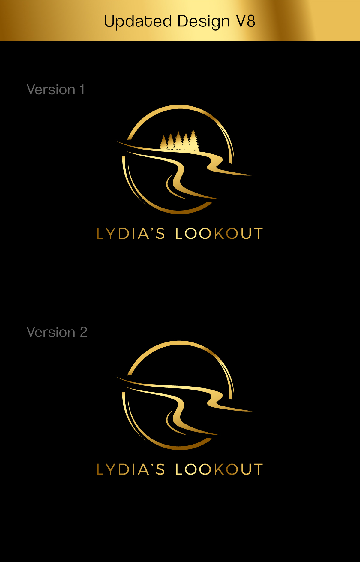
Logo for Lydia’s Lookout
Wollen Sie auch einen Job wie diesen gewinnen?
Dieser Kunde bekam 123 Logo-Designs von 50 Designern. Dabei wurde dieses Logo-Design Design von apik. als Gewinner ausgewählt.
Kostenlos anmelden Design Jobs finden-
 C$150
C$150
-
 123 Designs
-
 50 Designer
Logo-Design Kurzbeschreibung
Company Name: Lydia’s Lookout
Function: Hosting Micro Weddings
Logo Theme: Classy, Romantic, intimate
We would like a logo that takes advantage of the double L in the company’s name. Currently, my idea is a ribbon that turns like calligraphy to form the L s ,and weaves its way through 2 gold wedding bands. I am providing a rough sketch to give you the idea but it could change somewhat if you have another idea.
1. I do want to keep the double Ls (lower L is offset a bit to the right) as you see in the first pic I have provided below
2. the rest of the words should be smaller but in perhaps a simple calligraphic font?
3. Where I have positioned the rings seems awkward… do you have other ideas?
4. I’m uncertain as to where and how the beginning and end of the ribbon should be…. Suggestions?
5. I’m not sure about colour, but the whole effect should be soft…
6. I very much like the softness of the second pic I have provided here… but the ribbon should show up just a little bit more. I also like the hint of pearls in the design
7. This logo will become part of promotional materials so it needs to blend with backgrounds
Logo Text
Lydia’s Lookout