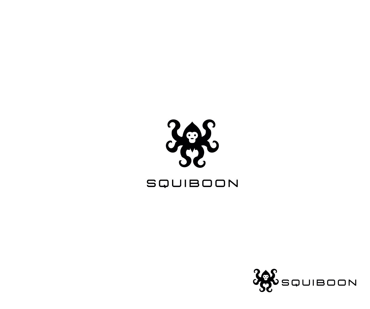
Creative and Inspiring Logo for AI startup: Squiboon

Wollen Sie auch einen Job wie diesen gewinnen?
Dieser Kunde bekam 158 Logo-Designs von 66 Designern. Dabei wurde dieses Logo-Design Design von Artknyte als Gewinner ausgewählt.
Kostenlos anmelden Design Jobs findenLogo-Design Kurzbeschreibung
We need a logo for a new startup called Squiboon.
Squiboon is an Artificial Intelligence Facilitator for face-to-face group conversations.
Our purpose is to enable new forms of communication, enhanced by - not replaced by - AI.
Squiboon embodies the principles of inclusive design: it is desirable and delightful to all users and reaches new levels of accessibility. It can be used by the elderly, by people with cognitive impairment, by those with sensory impairment. BUT this doesn’t mean it should look like it belongs in a hospital. It should look and feel aspirational, welcoming and delightful, not stigmatising or patronising.
Squiboon uses cutting edge generative and conversational AI to host positive conversations between people. We are currently building a prototype, which consists of a Talking Stick and Docking Station. Behind the scenes, there’s a powerful software platform, which can generate stimulating media on a communally-located screen and produce insightful summaries and metrics.
Our initial target is a B2B model in the health sector, with a focus on healthy ageing. However, there are many other future use cases for our technology, so we need something with broad appeal.
A key feature is the ability to opt in and out of being recorded. Squiboon (unlike Alexa and Siri) will only listen when given explicit permission (via an intuitive gesture).
Why Squiboon?
The name comes from research into animal communication patterns. (Squiboon’s CEO is a psychologist and is fascinated with animal behaviour!)
Squid: says a lot but no one’s listening
Baboon: excellent listener but has little to say
Squiboon: the optimal communicator
Literal or Abstract
Not sure yet. We’d like to see a spectrum. We want some conceptual thinking and some experimentation with interpretations of the Squiboon concept.
At the pragmatic end, we need a solid logo that’s going to work in a range of contexts (digital, print and on hardware devices). At the literal end, it would be interesting to explore what a Squiboon - and the universe where it exists - looks like.
Be great to see three ideas across the range: one very abstract, clean and subtle; one very literal; one somewhere in the middle.
Application
The main aim here is to get a great logo idea. Once we have this, we’d like to see it applied to digital, for example, a web page or a Tailwind theme. As mentioned, it also needs to work on our Talking Stick and Docking Station hardware.
Considerations
AI – A USP but also something that causes fear, concern and technical alienation. Our brand must find a way to reconcile these two points
Must appeal to wide variety of audiences (including care home staff, residents, families)
Competitors’ branding is either tech, clinical or personable, we need all 3
Care home staff want to better understand and care for their residents. Squiboon needs to be seen as an ally to that not a replacement. Can reduce their stress and make them better at their job.
Squiboon can help with positive PR and CQC ratings – this means an element of professionalism must temper the need to convey fun. We want meaningful and engaging.
Squiboon must be trusted. So important for all audiences. Squiboon can enable residents to be happy and safe.
Squiboon: Taking Stick is a brand product, the Squiboon brand will go on to do more than just the talking stick and the brand visuals must but futureproofed from that point of view.
Technology is to support, not replace, human-to-human interactions
Aktualisierungen
Gathering more feedback
Logo Text
squiboon
Zu verwendende Schriftarten
Sehen und fühlen
Jeder Schieber zeichnet eine der Charakteristiken der Marke des Kunden aus sowie den Stil, den euer Logo widerspiegeln sollte.