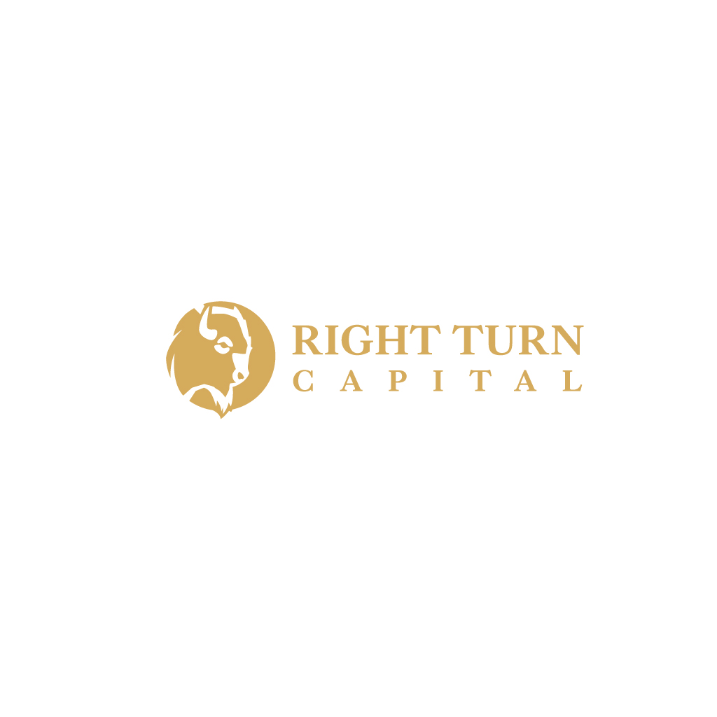
Right Turn Capital (Commercial Real Estate Fund) with clear instructions.
Wollen Sie auch einen Job wie diesen gewinnen?
Dieser Kunde bekam 9 Logo-Designs von 3 Designern. Dabei wurde dieses Logo-Design Design von JohnnyCactus als Gewinner ausgewählt.
Kostenlos anmelden Design Jobs finden-
 US$110
-
 9 Designs
-
 3 Designer
Logo-Design Kurzbeschreibung
This is going to be a logo for a commercial real estate investment fund.
The name right turn is in reference to one of my father’s stories about making the “right” decision as it relates to integrity.
The symbol I’m using is a Bison (not a buffalo) because it’s the only animal that turns into a storm knowing that’s the quickest way through and always meeting challenges head on. I’d like either a full body bison walking to the right, or a bison head facing to the right. I’m drawn to geometrical designs, but open as long as they don’t look too cheap and can easily go on apparel.
My last name is king, so if there’s any way to put a king crown on the head, that would be great but not as the cost of a good simple logo.
I also liked the bison walking on a simple arrow as a clean simple look. If it’s higher quality than the free ones below I’m more than happy to pay.
Zielmarkt/( -märkte)
Investors that would invest into my fund.
Industrie/Einheitstyp
Commercial Real Estate Investments
Logo Text
“Right Turn Capital” three words underneath or suggested location or slogan is Prosperity, Unity, Resilience
Logo Stile, die Sie interessieren können
Figuren-Logo
Logo mit Abbildung oder Zeichen
Wortmarke-Logo
Word oder namensbasiertes Logo (nur Text)
Zu verwendende Schriftarten
Farben
Vom Kunden ausgewählte Farben für das Logo Design:
Sehen und fühlen
Jeder Schieber zeichnet eine der Charakteristiken der Marke des Kunden aus sowie den Stil, den euer Logo widerspiegeln sollte.
Elegant
Fett
Spielerisch
Ernst
Traditionel
Modern
Sympatisch
Professionell
Feminin
Männlich
Bunt
Konservativ
Wirtschaftlich
Gehobenes
Anforderungen
Muss haben
- A bison, or bison head facing to the right as you look at it. Prefer geometrical designs as long as they aren’t too simple. Strongly prefer the colors black and gold, with small hints of red (relates to the bison) as a thin border around text or the symbol.
Schön zu haben
- With the last name King, in honor of my family I’d love to explore putting a crown on top of the head, but only if it doesn’t look cheesy.
Sollte nicht haben
- Bright colors, prefer black and gold with hints of red in outlines or accents.