 Aktualisieren
Design a Mobile First Website for a Salad Resturant
Wollen Sie auch einen Job wie diesen gewinnen?
Dieser Kunde bekam 91 Web-Designs von 14 Designern. Dabei wurde dieses Web-Design Design von Mahrus als Gewinner ausgewählt.
Kostenlos anmelden Design Jobs finden
-
 US$230
-
 91 Designs
-
 14 Designer
Web-Design Kurzbeschreibung
** WEBSITE LIKE AN APP, NOT LANDING PAGE **
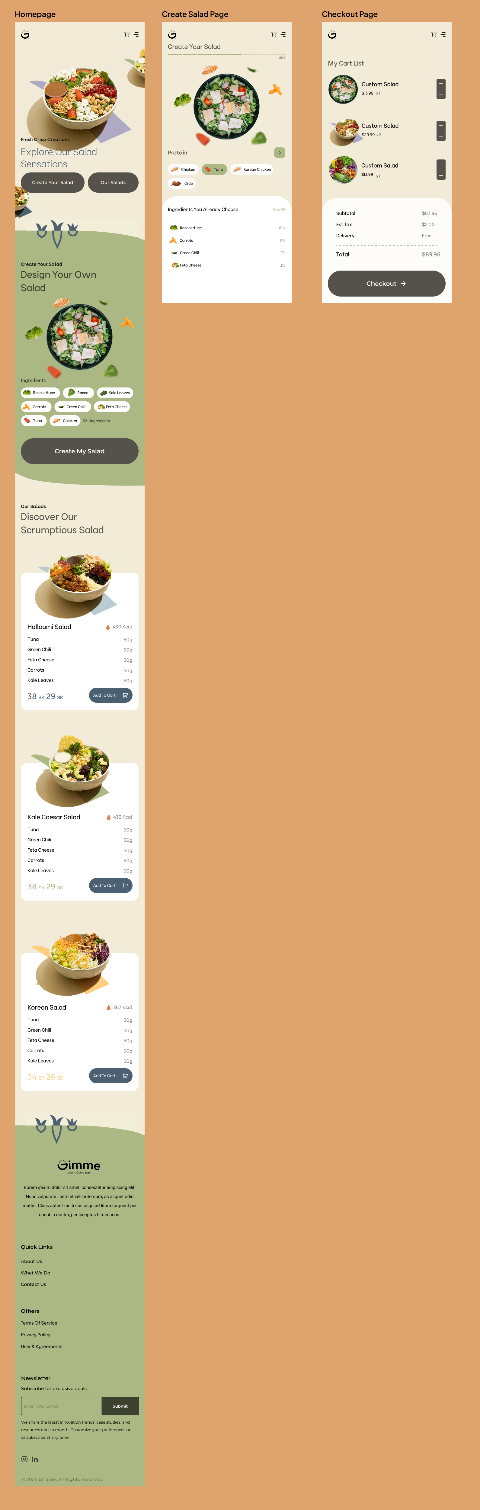
1. Homepage
Objective: Introduce the brand and direct visitors to either start creating their custom salad or explore the menu of pre-designed salads.
Design Elements:
Clean and minimalistic layout with high-quality images of fresh salads.
Two prominent buttons: "Create Your Salad" and "Our Salads".
Brief welcome message that highlights the freshness and quality of ingredients.
2. Create Your Salad Page
Objective: Allow customers to design their salad from a list of ingredients.
Design Elements:
Interactive, step-by-step builder interface where customers can select ingredients. Each ingredient category (like greens, proteins, toppings, dressings) should be a separate step in the process.
Visual representation of their salad being built as they select ingredients.
Information icons next to each ingredient for dietary information (e.g., vegan, gluten-free, calories).
Option to save favorite combinations or reorder past salads.
Clear price updates as they add or remove ingredients.
3. Our Salads Page
Objective: Showcase a list of pre-designed salad options that customers can quickly choose from.
Design Elements:
Grid layout with images and brief descriptions of each pre-designed salad.
Include customer reviews and ratings for each salad.
Easy "Add to Cart" option from this page.
4. Cart and Checkout Page
Objective: Streamline the checkout process with minimal steps.
Design Elements:
Summary of order with options to modify quantities or remove items.
Simple form for entering delivery details, with the ability to remember details for returning customers.
Secure payment gateway integration.
A confirmation screen with estimated delivery time and order tracking capabilities.
5. Mobile Optimization
Approach: Since this is a "Mobile First Design", ensure that:
The website is responsive and elements like buttons, text, and images scale properly across different devices.
Touch-friendly interfaces with large tap targets for ease of use on mobile devices.
Fast loading times by optimizing images and using mobile-first coding practices.
Aktualisierungen
Low designer entries
Zielmarkt/( -märkte)
Food
Industrie/Einheitstyp
Food
Anzahl benötigter Seiten
4 page
Sehen und fühlen
Jeder Schieber zeichnet eine der Charakteristiken der Marke des Kunden aus sowie den Stil, den euer Logo widerspiegeln sollte.
Elegant
Fett
Spielerisch
Ernst
Traditionel
Modern
Sympatisch
Professionell
Feminin
Männlich
Bunt
Konservativ
Wirtschaftlich
Gehobenes
Anforderungen
Muss haben
- Modren Design, Mobile First