Vehicle marking design - URBAN PUB
Wollen Sie auch einen Job wie diesen gewinnen?
Dieser Kunde bekam 25 Car Wrap-Designs von 9 Designern. Dabei wurde dieses Car Wrap-Design Design von LAXMI DESIGNHUB als Gewinner ausgewählt.
Kostenlos anmelden Design Jobs finden- Garantiert
-
 US$110
-
 25 Designs
-
 9 Designer
Car Wrap-Design Kurzbeschreibung
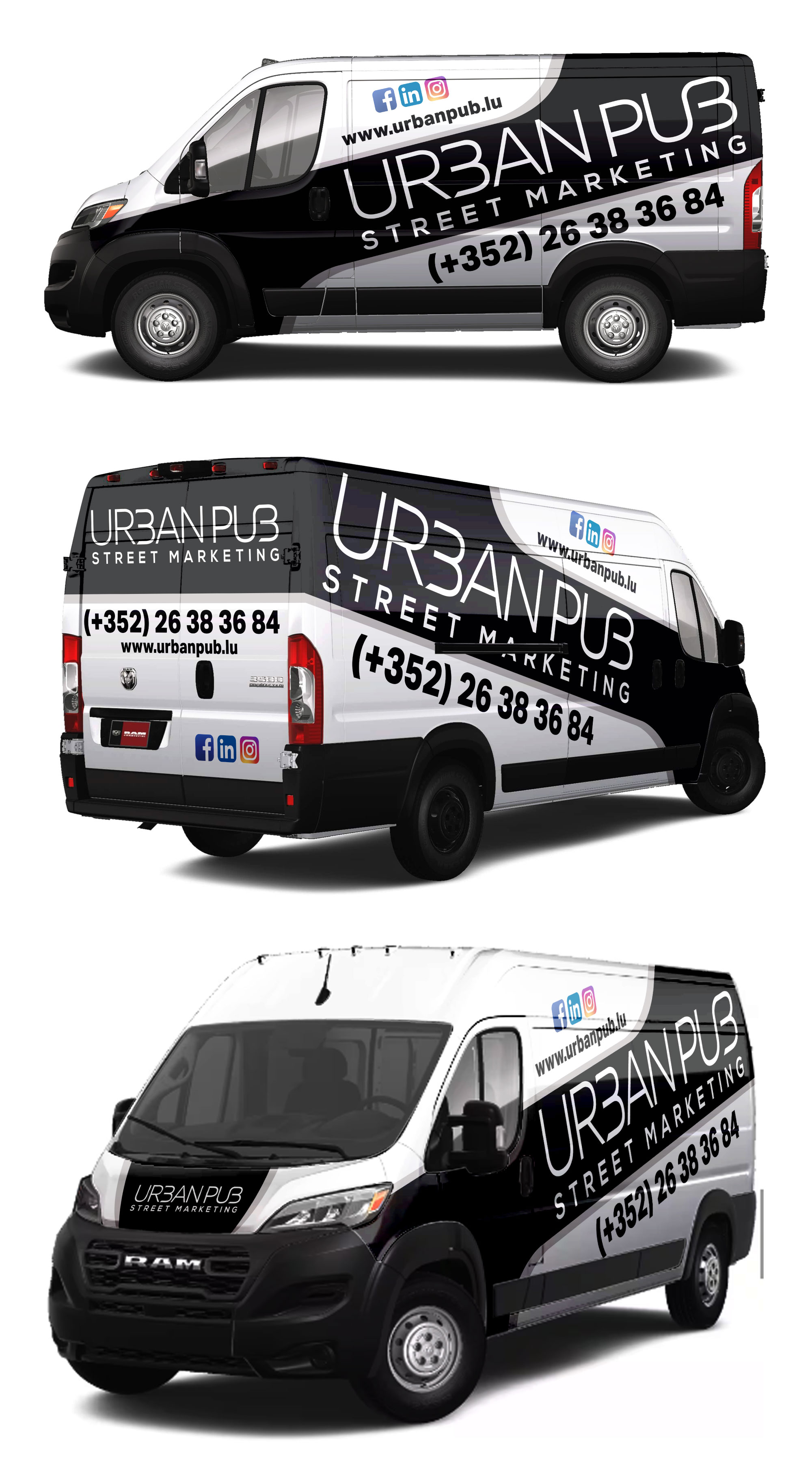
Company presentation
Project: Create a visual for the marking of our company van
Name: URBAN PUB
URBAN PUB is an agency specializing in Street Marketing; we offer original communication media to our clients with the provision of staff.
Website: www.urbanpub.lu
Graphic instructions:
The objective will be to create a visual on the different sides of the vehicle: Front, sides, back and top. The vehicle is basic white in color. We want something very graphic and design, so don't limit yourself in creation. We want a significant covering of the vehicle.
Vehicle template: see attachment (Opel Movano Fg L2H2 3.5 120ch BlueHDi)
Below are simply the instructions to follow:
Elements to appear:
- URBAN PUB logo + tagline (see attachment) => you can use the LOGO without tagline but the logo with the tagline must be present
- Text: STREET MARKETING => this text must appear
- Website: urbanpub.lu or www.urbanpub. read
- Telephone number: 26 38 36 84 or (+352) 26 38 36 84
- Social networks: integrate Facebook / LinkedIn / Instagram pictograms
Main colors: BLACK (#010101) and WHITE (this will therefore be that of the vehicle)
Secondary color: GRAY (#818385)
Main typography: Muller (see attachment)
Secondary typography: Nexa (see attachment)
Examples of visuals that we like (optional
): (see attachments)
Aktualisierungen
Things we like: big lettering, graphic work, we want something out of the ordinary. Given that it is a street marketing activity, the image conveyed must be fun, a bit street art. When we see the van we have to say: Wow!
The things we don't like: we don't want to overload the visuals, we want something sober and readable. This means that we want to favor graphic elements over text. We want a certain amount of work and reflection on graphic work.
Added Friday, 17 May 2024
Sehen und fühlen
Jeder Schieber zeichnet eine der Charakteristiken der Marke des Kunden aus sowie den Stil, den euer Logo widerspiegeln sollte.
Elegant
Fett
Spielerisch
Ernst
Traditionel
Modern
Sympatisch
Professionell
Feminin
Männlich
Bunt
Konservativ
Wirtschaftlich
Gehobenes
Anforderungen
Muss haben
- Not too overloaded
Schön zu haben
- Very large lettering. For example you can use the U and the P which are the abbreviations of URBAN PUB.