

 Aktualisieren
Design a logo for a new non-profit company.
Wollen Sie auch einen Job wie diesen gewinnen?
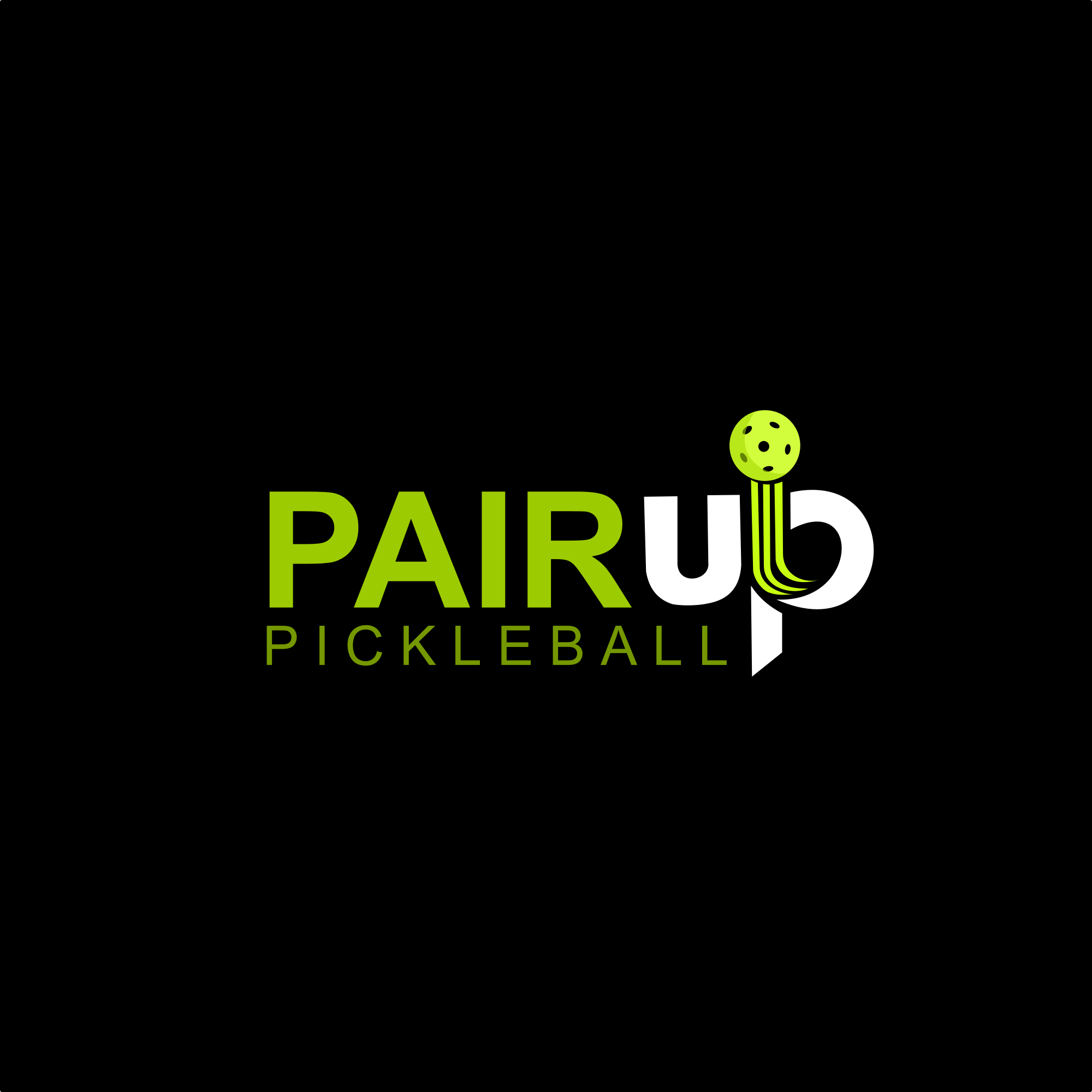
Dieser Kunde bekam 161 Logo-Designs von 68 Designern. Dabei wurde dieses Logo-Design Design von alitjuara als Gewinner ausgewählt.
Kostenlos anmelden Design Jobs finden
- Garantiert
-
 US$150
-
 161 Designs
-
 68 Designer
Logo-Design Kurzbeschreibung
We need a logo design for a new non-profit company based in Dallas called PAIRup Pickleball. We're focused on using pickleball to create life experiences and skills for people with intellectual disabilities and learning challenges.
Our acronym is: Pickleball of America Instruction & Recreation
There's a bit of nostalgia and familiar resonance to the name PAIRup. It evokes the old phrase "Everybody Pair Up Now", from our school days. It was something we were told during team activities or during recess or whatever. Seems like we're STILL told to do this in pickleball drills. It conveys community, cooperation, and inclusivity. The word "inclusivity" is important because it suggests that everyone is included and no one is left behind. As one of our values, it highlights our commitment to ensuring that every one of our athletes has a partner, a mentor and a friend to support them and UPLIFT them. It also implies a spirit of teamwork and support between instructors, participants, and their peers.
We love the branding possibilities of utilizing the word "up". We like it because the word "up" in PAIRup conveys a sense of upward movement, growth, and progress. Going back to our goal of UPLIFTING young athletes, helping them reach new heights both on and off the court.
Zielmarkt/( -märkte)
Educators (,especially in special education), Community Activists, Pickleball Players, Young People
Industrie/Einheitstyp
Sports, Education
Logo Text
PAIRup Pickleball
Logo Stile, die Sie interessieren können
Abstraktes Logo
Begrifflich / symbolisch (Text optional)



Figuren-Logo
Logo mit Abbildung oder Zeichen
Lettermark-Logo
Kurzwort oder Buchstaben-Logo (nur Text)



Zu verwendende Schriftarten


Farben
Vom Kunden ausgewählte Farben für das Logo Design:
Sehen und fühlen
Jeder Schieber zeichnet eine der Charakteristiken der Marke des Kunden aus sowie den Stil, den euer Logo widerspiegeln sollte.
Elegant
Fett
Spielerisch
Ernst
Traditionel
Modern
Sympatisch
Professionell
Feminin
Männlich
Bunt
Konservativ
Wirtschaftlich
Gehobenes
Anforderungen
Muss haben
- We like the idea of incorporating a graphic or image of a pickleball
Schön zu haben
- We love the branding possibilities of utilizing the word "up". We like it because the word "up" in PAIRup conveys a sense of upward movement, growth, and progress. Going back to our goal of UPLIFTING young athletes, helping them reach new heights both on and off the court. We also like the idea of putting our acronym in small type below the logo somewhere, but it's not mandatory. As far as the word "up" goes, it would be nice to do something abstract with the shape of a pickleball paddle and see if there's a way to incorporate a "u" or an "up" as part of it. Maybe even a paddle that's positioned sideways without the top drawn on it (abstract) to make a "u". I don't know.
Sollte nicht haben
- we don't much like crazy neon colors, unless it's the neon color of a pickleball


