

 Aktualisieren
Multis (Betting App)
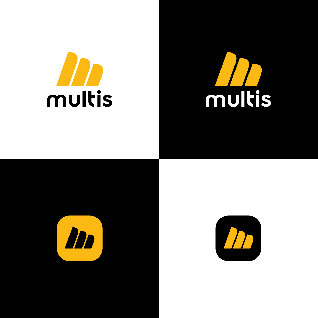
Wollen Sie auch einen Job wie diesen gewinnen?
Dieser Kunde bekam 450 Logo-Designs von 165 Designern. Dabei wurde dieses Logo-Design Design von MX-Design als Gewinner ausgewählt.
Kostenlos anmelden Design Jobs finden
- Garantiert
-
 A$300
A$300
-
 450 Designs
-
 165 Designer
Logo-Design Kurzbeschreibung
Objective:
We need a logo that resonates with 27-37 year old Australian punters who use our wagering application, "Multis." The logo should reflect our brand's values of professionalism, simplicity, and a no-fuss approach.
Target Audience:
Demographic: 27-37 year old Australians
Interests: Sports betting, horse racing, wagering, and gambling
Style Preferences: Professional, sleek, simple, to the point, no unnecessary embellishments
Design Style:
Tone: Professional yet approachable
Style: Sleek, modern, and minimalistic
Imagery: Open to abstract or symbolic representations, no overly complex elements
Color Palette:
We are open to exploring various color palettes but have a preference for yellow and black as they convey energy, excitement, and sophistication. Feel free to suggest alternatives that align with our brand values.
Usage:
The logo will be used on our mobile application, website, social media, and marketing materials. It should be versatile enough to work in both digital and print formats.
Additional Notes:
The logo should be easily recognizable and memorable.
We prefer a design that works well in both color and monochrome versions.
No complex gradients or overly intricate details.
In an ideal world, the logo should integrate iconography into the word Multis, for example:
1. Integrating a 'stacking' element of design, weaved into the letter M (given this brand is centred around stacking/combining multiple bets for better odds.
2. Integrating a tick icon into the word in a way that is subtle yet brings the design to life

Aktualisierungen
UPDATE:
With regards to design- I would like to flag that minimal iconography is preferred.
Ideally, we would like to integrate design elements into the word Multis itself. Some ideas around this could be:
1. Integrating a tick into the word
2. Integrating a 'stacking' design feature into the M. Given the brand is centered around the stacking / combining of multiple bets, this is a really strong design angle to take.
Added Wednesday, 21 August 2024
Low design quality
Zielmarkt/( -märkte)
27-37 year old Australian males
Industrie/Einheitstyp
betting
Logo Text
Multis
Logo Stile, die Sie interessieren können
Abstraktes Logo
Begrifflich / symbolisch (Text optional)



Farben
Der Designer kann die Farben des Designs frei wählen
Sehen und fühlen
Jeder Schieber zeichnet eine der Charakteristiken der Marke des Kunden aus sowie den Stil, den euer Logo widerspiegeln sollte.
Elegant
Fett
Spielerisch
Ernst
Traditionel
Modern
Sympatisch
Professionell
Feminin
Männlich
Bunt
Konservativ
Wirtschaftlich
Gehobenes
Anforderungen
Muss haben
- Black, Blue, Grey, White colour scheme. A logo/Icon integrated with the M to be used on apps. Thinking perhaps 📈 incorporated or cheering like 🙌