

 Aktualisieren
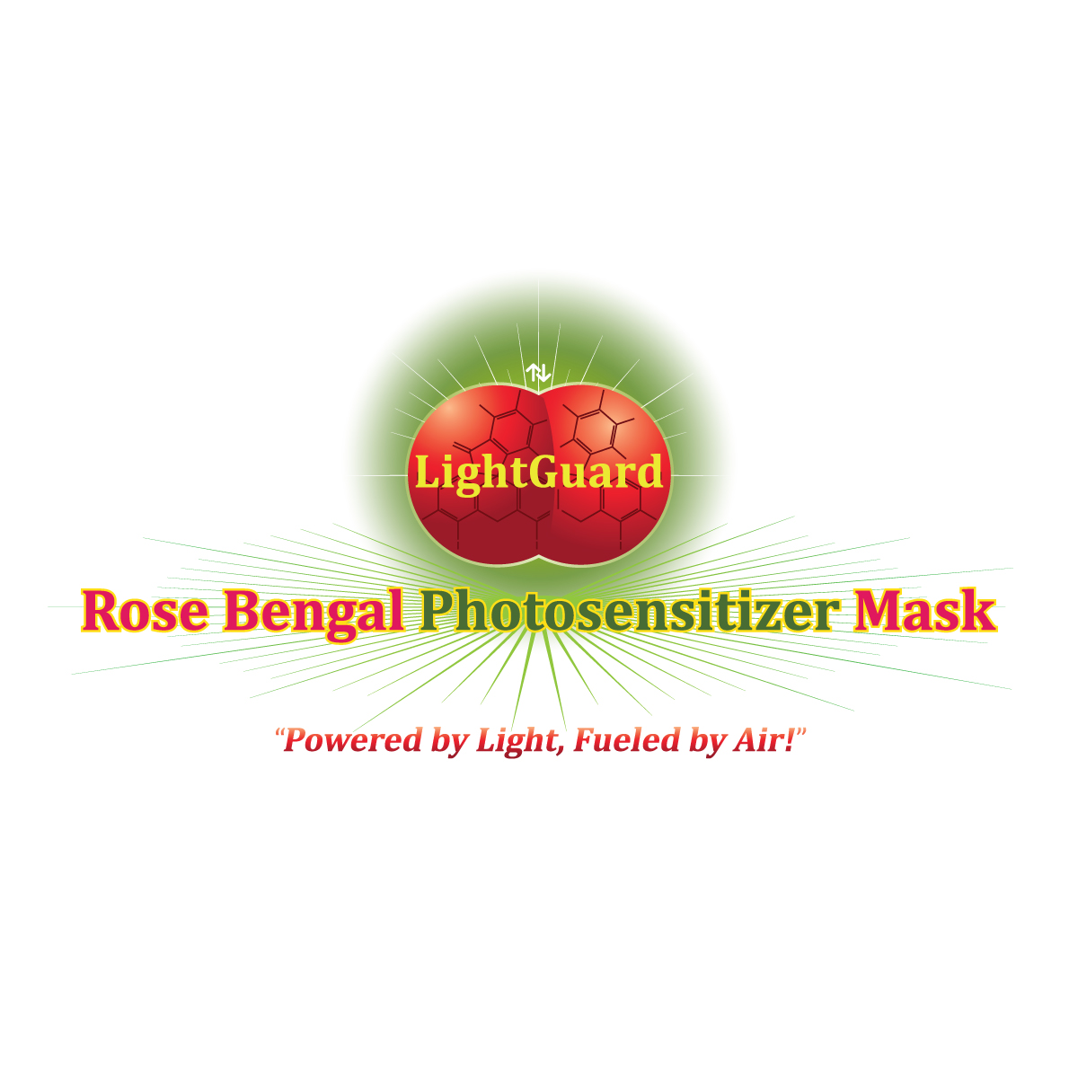
LightGuard Rose Bengal Photosensitizer Mask
Wollen Sie auch einen Job wie diesen gewinnen?
Dieser Kunde bekam 278 Logo-Designs von 40 Designern. Dabei wurde dieses Logo-Design Design von riya.mitra07j als Gewinner ausgewählt.
Kostenlos anmelden Design Jobs finden
- Garantiert
-
 US$150
-
 278 Designs
-
 40 Designer
Logo-Design Kurzbeschreibung
I need a logo design for our business that is marketing products that have rose bengal in them. Rose bengal is a photosensitizer that produces singlet oxygen, when it comes into contact with green light. Singlet oxygen deactivates viruses and kills bacteria upon contact. It is a health and wellness product that is listed as an alternative supplement. The product is called LightGuard Rose Bengal Photosensitizer Mask.
The color scheme for this logo is to have green, rose bengal, and a photograph, or some realistic design for the sun. I am interested in using a photograph for the sun, if there are any publicly available images that are suitable. It might be better to have the "Rose Bengal Photosensitizer Mask" text in the rose bengal color. Finally, my business associate thinks a light green color should be the starting point for the sun's rays. Though, we are open to different shades. I just want to make sure a green is incorporated into the logo.
I am open to multiple designs for this logo. However, a current idea that has piqued my interest is having overlapping binary suns like the attached singlet oxygen1.png graphic with LightGuard written across the suns and placed directly behind and above the “Rose Bengal Photosensitizer Mask” text. There should be a gradient of green/light green light that extends from the suns and casts a drop shadow in black on the text. I would like to see the text displayed on one line as well as on two lines to determine which is best. This idea should make the logo appear to be three dimensional, while having a simple two dimensional text arrangement. It would make the logo more compact than placing the sun(s) above and to the left or right. This is just a thought. I am not set on it.
The following are some alternative ideas I have about different concepts for this logo:
If a graphic design of the sun(s) is used, I want there to be a sun with a spherical shape to show depth. I do not want just a circle. Inside the sun should be the words "LightGuard". Please look at the files LG-2 and LG-3 that I have attached. I have a webpage file, .png and .svg of each attached with the exception of LG-2. I have not been able to get a .svg of LG-2 that is not corrupted. Regarding LG-2, I like the way the LightGuard text does not wrap around the sphere. LightGuard in LG-3 wraps around the sphere and tends to make the eye focus on the sphere more than the words LightGuard. I think at this point it is best to have a sphere that has the words LightGuard written straight across it. I also do not like the drop shadow around LightGuard in LG-2. It is not clean and the blue color is not what I want. I think a black is needed.
Regarding the sun as a sphere, I like the both LG-2 and LG-3. The dept of LG-3 is interesting. However, I do like that LG-2 is more of a circle with depth that a defined sphere. I tend to lean toward the shape of the sun in LG-2. Though, I am now more of the opinion that a more realistic version of the sun is necessary. So, a photograph may be needed.
Also, LG-2 and LG-3 have blue light emanating from them. This was when I was considering a different color scheme. I want this light to be green now. I like the design of the light emanating from both of these. I do not like how the light at the top of LG-2 has so much white in it. It detracts from the border of the sphere too much.
The green light from this sun should have a green gradient that shines down onto the words "Rose Bengal Photosensitizer Mask". This text can be on one or two lines. This text should have an outline in black that is part of a drop shadow from the green light to show depth and the affect of the green light on the text. An early concept of the logo using blue light is in the pdf attachment "Document_2024-08-31_110824."
I am open to different placements of the sun relative to the text. I had thought previously it should be up and to the left or right of the text. Though, this is not final. See next paragraph for more on this.
I do not have a font I want used at the moment. Though, I do like the font that is used for LightGuard in LG-2 and LG-3.
I hope this helps for a staring point. Please let me know if you have any questions.

Aktualisierungen
Need a couple of days before selecting a winner
Zielmarkt/( -märkte)
Health and Wellness, Travelers,
Industrie/Einheitstyp
Health and Wellness
Logo Text
LightGuard Rose Bengal Photosensitizer Mask
Logo Stile, die Sie interessieren können
Pictorial / Combination-Logo
Ein reales Objekt (Text optional)



Zu verwendende Schriftarten

Farben
Vom Kunden ausgewählte Farben für das Logo Design:
Sehen und fühlen
Jeder Schieber zeichnet eine der Charakteristiken der Marke des Kunden aus sowie den Stil, den euer Logo widerspiegeln sollte.
Elegant
Fett
Spielerisch
Ernst
Traditionel
Modern
Sympatisch
Professionell
Feminin
Männlich
Bunt
Konservativ
Wirtschaftlich
Gehobenes
Anforderungen
Muss haben
- A gradient of green light from the suns to the text.


