Logo Redesign for 'Nook' - A Niche Nursery Brand with a Focus on Comfort and Playfulness
Wollen Sie auch einen Job wie diesen gewinnen?
Dieser Kunde bekam 330 Logo-Designs von 80 Designern. Dabei wurde dieses Logo-Design Design von Red. als Gewinner ausgewählt.
Kostenlos anmelden Design Jobs finden- Garantiert
-
 A$150
A$150
-
 330 Designs
-
 80 Designer
Logo-Design Kurzbeschreibung
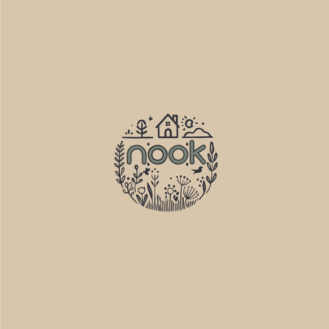
We need a redesigned logo for our nursery brand, Nook, which provides a nurturing, high-quality environment for very young children. Nook targets parents from creative, finance, psychology, medical, and charity sectors who seek a boutique childcare experience focused on home-cooked nutrition and active community engagement.
The current logo, originally designed for our company "étoile" (which we will upload as a reference), no longer aligns with our vision. We also have a draft idea for the "Nook" logo (uploaded as well), but it feels too busy and lacks the simplicity we desire. We envision a new design that conveys a sense of comfort, safety, curiosity, and natural warmth, creating a cozy and welcoming impression suitable for our high-end clientele.
Key Design Requirements:
Style: We’re aiming for a hand-drawn, child-like yet clean look that feels warm and inviting. The logo should incorporate a handwritten or casual font style to keep it approachable and friendly.
Symbols: Use simple, meaningful elements—examples could include a house (representing safety and homeliness). A child figure or other playful elements are also welcome if they enhance the brand’s story. Birds, woodland, trees, plants, hollows or home, books, children… NO STAR.
Color Scheme: Integrate natural colors, specifically a soft teal (e.g., HEX #3fd7d7 or #6dd2c7), to replace any existing black elements and evoke a calming, organic feel.
Inspiration:
Artists & Style: We are inspired by the illustrative styles of Tom Gauld, Lisa Stickley, and Suzanne Pink, as well as the imaginative imagery from The Little Prince.
Inspirational Logos: We admire the simplicity, organic feel, and natural color palette of the "Casa Natura" logo, which captures the warmth and approachability we aim for.
The final design should embody a sense of childhood wonder, safety, and creativity while aligning with our brand’s boutique, community-focused ethos.
Aktualisierungen
We've decided to get rid of the star component. That’s a leftover from the Etoile logo.
Other motifs might instead be from nature: birds, woodland, trees, plants, hollows or home, books, children.
Thanks!
Added Sunday, 10 November 2024
Hello, we have not been able to go through all design and would need extra time! Thank you so much
Logo Text
nook
Sehen und fühlen
Jeder Schieber zeichnet eine der Charakteristiken der Marke des Kunden aus sowie den Stil, den euer Logo widerspiegeln sollte.
Elegant
Fett
Spielerisch
Ernst
Traditionel
Modern
Sympatisch
Professionell
Feminin
Männlich
Bunt
Konservativ
Wirtschaftlich
Gehobenes
Anforderungen
Schön zu haben
- birds, woodland, trees, plants, hollows or home, books, children…
Sollte nicht haben
- No stars