Logo for orthopedic practice with sub-logos for extremities
Wollen Sie auch einen Job wie diesen gewinnen?
Dieser Kunde bekam 111 Logo-Designs von 31 Designern. Dabei wurde dieses Logo-Design Design von Sibyle als Gewinner ausgewählt.
Kostenlos anmelden Design Jobs finden-
 €110
€110
-
 111 Designs
-
 31 Designer
Logo-Design Kurzbeschreibung
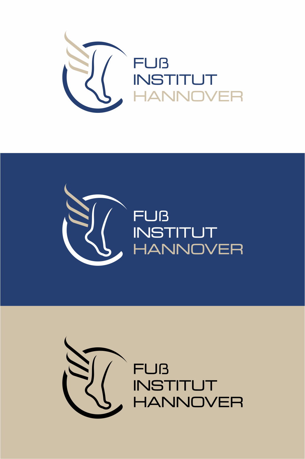
We would like to modernize our existing logo, get it in different formats, for print, web, etc. For this purpose, "sub-logos" are to be created in the same design concept on the topic of upper extremities (image of an arm), spine, lower extremities (image of a leg) and a foot. The basic design currently envisages a "little man" with wings, as an idea that the treatment makes you mobile again. For the foot, the basic idea would be a stylized Hermes foot. Primarily it should only be a graphic logo, if text can be easily integrated this would be: Orthopaedic Practice Nordstadt (abbreviation OPN) and Foot Institute Hanover.
The design should be modern and minimalist. The base color should be blue, the individual extremities could have different colors.
Zielmarkt/( -märkte)
Patients for Orthopedic Practice
Logo Text
s.o.
Zu verwendende Schriftarten
Farben
Vom Kunden ausgewählte Farben für das Logo Design:
Sehen und fühlen
Jeder Schieber zeichnet eine der Charakteristiken der Marke des Kunden aus sowie den Stil, den euer Logo widerspiegeln sollte.
Elegant
Fett
Spielerisch
Ernst
Traditionel
Modern
Sympatisch
Professionell
Feminin
Männlich
Bunt
Konservativ
Wirtschaftlich
Gehobenes
Anforderungen
Muss haben
- recognition value, clarity