Update brand for hockey development and apparel line
Wollen Sie auch einen Job wie diesen gewinnen?
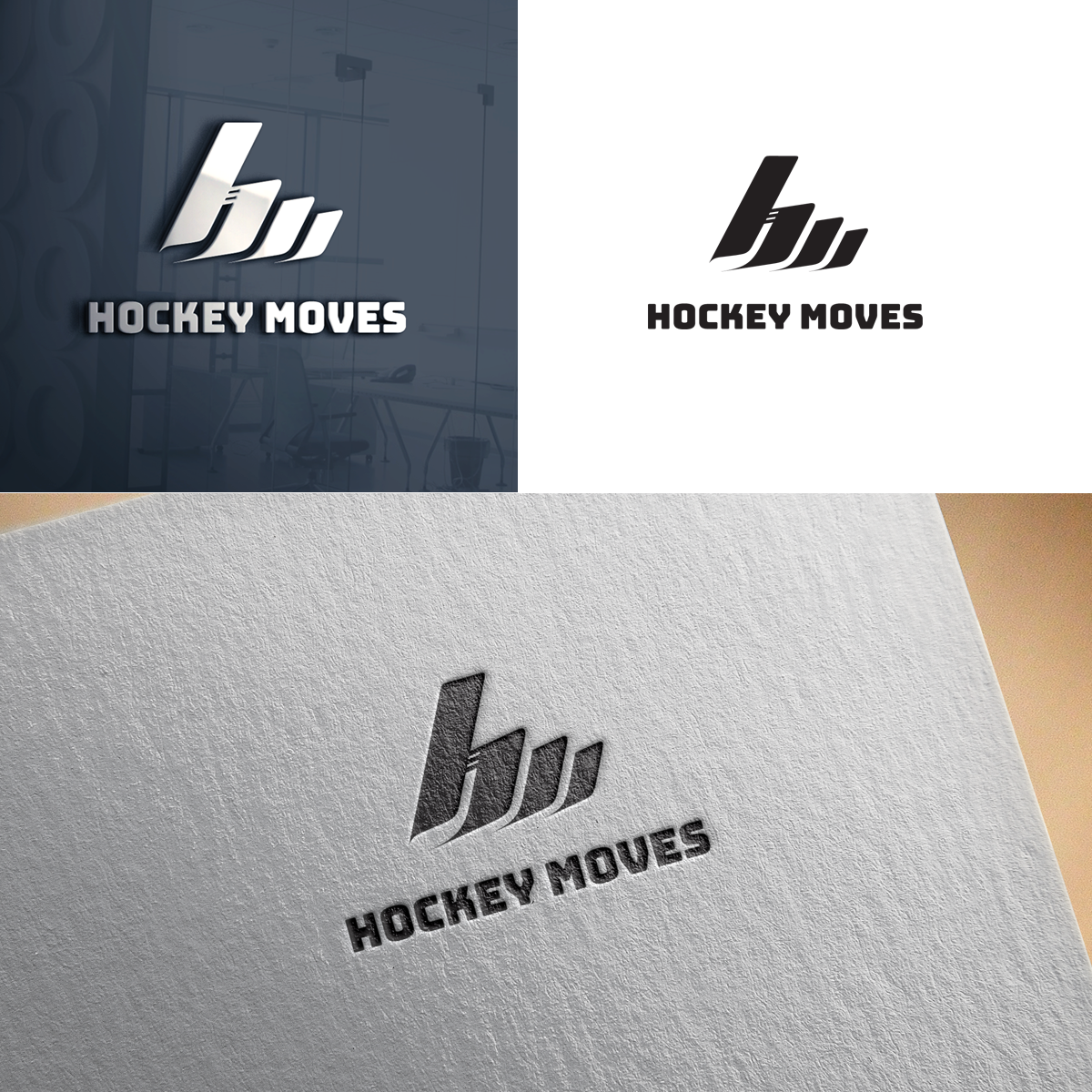
Dieser Kunde bekam 124 Logo-Designs von 44 Designern. Dabei wurde dieses Logo-Design Design von bijuak als Gewinner ausgewählt.
Kostenlos anmelden Design Jobs finden-
 C$300
C$300
-
 124 Designs
-
 44 Designer
Logo-Design Kurzbeschreibung
Hockey Moves provides development through summer camps, small-group skill-building, and PA day and holiday hockey clinics. We currently sell merchandise in person. Teeshirts, hoodies, toques, ballcaps.
We would like to establish a Hockey Moves apparel line alongside our development business; partly to sell in-person, but also to sell online to hockey players in general.
Our current logo is acceptable for a local business, but we would like a more sophisticated logo that would work better for an apparel line. Something simplified.
Howie's Hockey Tape rebranded recently. They still use their original logo, but they now have a cleverly simple icon: an "h" that looks like it's made out of tape. That's the kind of simple communication we'd love to see in this new branding. The logo does NOT need to communicate "Hockey Development", but would be great if it communicated "Hockey MOVES". This will be a brand for hockey lovers.
Our current logo uses the font bungee for the wordmark. We're open to changing that if someone provided something better. Again, we're aiming for sophistication, simplicity, while communicating movement, athleticism, love for hockey.
Less is more?
Thanks!
Logo Text
Hockey Moves