Logo Design for "Good Land Realty Co."
Wollen Sie auch einen Job wie diesen gewinnen?
Dieser Kunde bekam 234 Logo-Designs von 93 Designern. Dabei wurde dieses Logo-Design Design von Subha Islam Designs als Gewinner ausgewählt.
Kostenlos anmelden Design Jobs finden- Garantiert
-
 US$150
-
 234 Designs
-
 93 Designer
Logo-Design Kurzbeschreibung
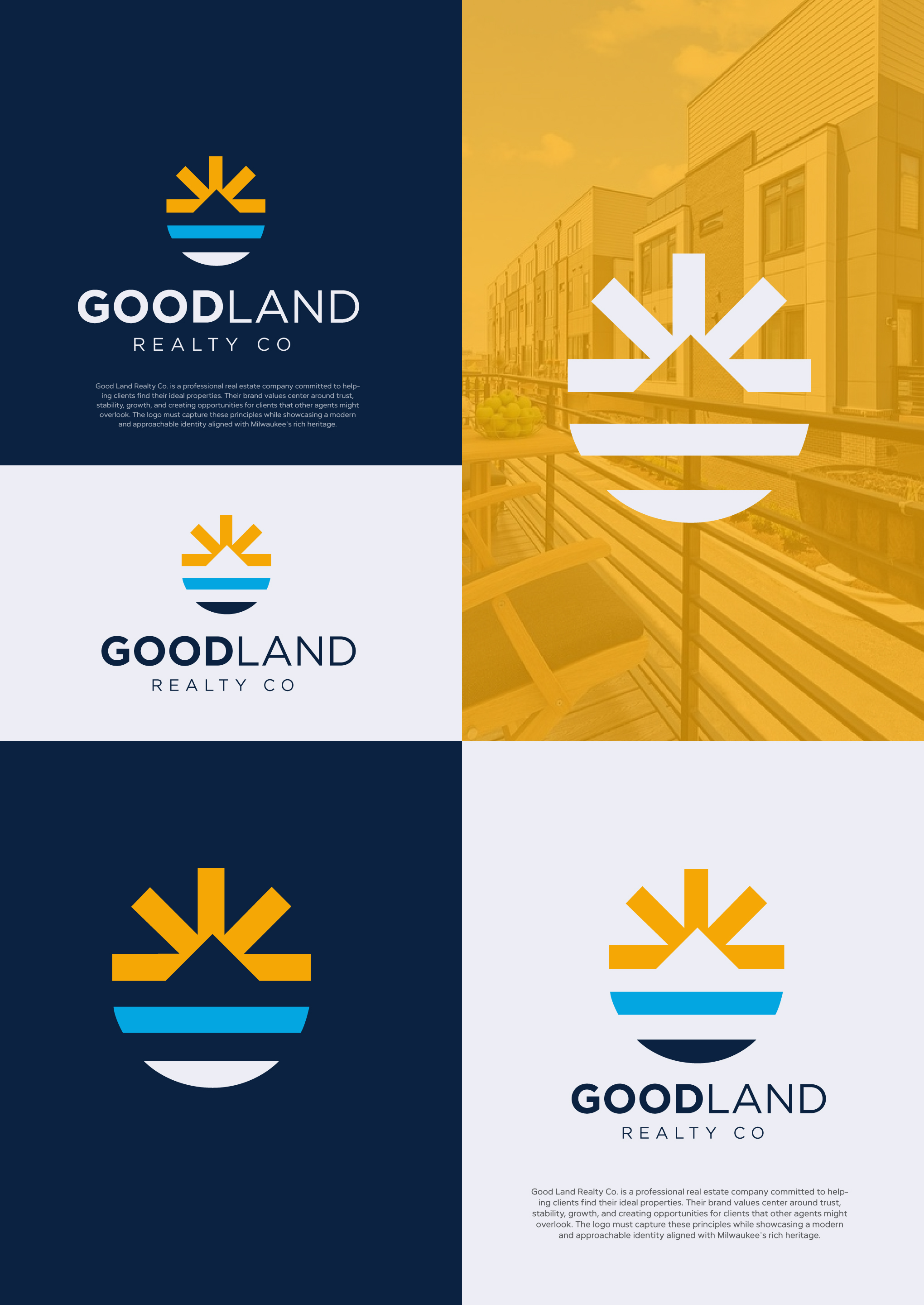
Good Land Realty Co. is a professional real estate company committed to helping clients find their ideal properties. Their brand values center around trust, stability, growth, and creating opportunities for clients that other agents might overlook. The logo must capture these principles while showcasing a modern and approachable identity aligned with Milwaukee's rich heritage.
I was thinking of a logo similar to the people's flag of Milwaukee, but open to you're interpretation and imagination! I prefer a logo that each element having a meaning. For instance, the 7 counties we serve, the sun rising from Lake Michigan, etc.
Here are random logos and such that I've liked through the years, just to show my style:
https://pin.it/1VdJtPzOP
Attachments:
*Logo Colors of RE/MAX
*Green, gold, brown (earth?) colors I also like
*People flag colors.
*Old logo
Zielmarkt/( -märkte)
A person who is ready to buy or sell real estate in the greater Milwaukee area.
Industrie/Einheitstyp
Real Estate, Realty, Residential Properties, Commercial Real Estate, Property Investments, Real Estate Transactions, Homebuyers and Sellers, Business Leasing and Sales, Professional Services, RE/MAX Affiliation
Logo Text
Good Land Realty Co.
Logo Stile, die Sie interessieren können
Emblem-Logo
Logo eingeschlossen in einer Form
Pictorial / Combination-Logo
Ein reales Objekt (Text optional)
Abstraktes Logo
Begrifflich / symbolisch (Text optional)
Zu verwendende Schriftarten
Andere Schriftarten erwünscht:
- Clean and easy to read for digital and print media.
Sehen und fühlen
Jeder Schieber zeichnet eine der Charakteristiken der Marke des Kunden aus sowie den Stil, den euer Logo widerspiegeln sollte.
Elegant
Fett
Spielerisch
Ernst
Traditionel
Modern
Sympatisch
Professionell
Feminin
Männlich
Bunt
Konservativ
Wirtschaftlich
Gehobenes
Anforderungen
Muss haben
- A (circular?) clean, geometric design. A minimalistic, modern style that is versatile and scalable. Fonts similar to Gotham
Schön zu haben
- "Est. 2004" and/or "www.mke.re" || A stylized sun and /or horizon to symbolize optimism, growth, an. Elements that subtly represent land. A clean, clear mark that integrates seamlessly with RE/MAX materials and digital platforms (e.g., Zillow, Realtor.com). Eye pleasing next to the RE/MAX balloon and/or typeface logos.
Sollte nicht haben
- Overly intricate or busy designs that detract from clarity. Designs that heavily rely on housing or building icons, as the logo must also represent commercial real estate. Fonts or elements that appear outdated or overly traditional. I'm also not a fan of the "four boxes" that represent a window. I see that everywhere.