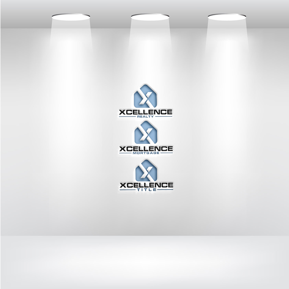
Xcellence Logo Refinement – Custom Typography & Layout
Wollen Sie auch einen Job wie diesen gewinnen?
Dieser Kunde bekam 220 Logo-Designs von 90 Designern. Dabei wurde dieses Logo-Design Design von falcon f9 als Gewinner ausgewählt.
Kostenlos anmelden Design Jobs finden- Garantiert
-
 US$300
-
 220 Designs
-
 90 Designer
Logo-Design Kurzbeschreibung
We are refining our logo for Xcellence Realty, Xcellence Mortgage, and Xcellence Title, focusing primarily on custom typography and word positioning. The house icon is finalized and should not be changed.
Our main goal is to create a modern, digital-first font that enhances our brand identity and makes Xcellence immediately recognizable as a large-scale, technology-driven real estate platform.
Important Notes – Please Read Before Submitting Designs:
-Do not modify the house icon—this element is set.
-We need a unique, custom font—not something off-the-shelf.
-There are three separate logos, each for an individual company:
Xcellence Realty
Xcellence Mortgage
Xcellence Title
-We are also exploring a primary brand rebrand to Xcellence.com, so please provide a version of the logo with this name.
-Additionally, we want to see a version that combines all three names in one logo for branding purposes: Xcellence Realty, Mortgage & Title.
Typography & Font Design Requirements:
-Custom, Modern, Digital-First Typeface:
-We do not want an off-the-shelf font—this must be a fully custom or heavily modified typeface.
-The letters should have a natural, well-balanced flow that makes the name feel unique, polished, and cohesive.
-We are uploading references from Wayfair and Renuity because we liked how their fonts have subtle connections between letters (e.g., how Wayfair connects “y” and “f” or how Renuity connects “t” and “y”).
-However, our design does not necessarily have to do this—we are open to creative solutions, but only if they feel natural and not forced.
-If there is a way to creatively connect certain letters or create a natural flow between elements, we would love to see it. But if it doesn’t work or feels forced, then a clean, custom font with a strong visual identity is the priority.
Balance in Font Weight & Layout:
-Each of the three logos (Xcellence Realty, Xcellence Mortgage, and Xcellence Title) should be designed individually and not combined into a single stacked layout.
-We do not want "Xcellence" in bold while "Realty," "Mortgage," or "Title" is too thin—it creates too much contrast.
-Instead, both parts should complement each other in size, weight, and spacing so they appear strong together.
-The font weight should be designed in a way that neither part overpowers the other, while still keeping the emphasis on “Xcellence.”
Text Positioning & Spacing:
-The layout should flow naturally and feel balanced rather than looking too "squared" or rigid.
-Avoid making the design look like a blocky rectangle—there should be a natural visual movement to the text.
Versions We Need:
Xcellence Realty (standalone logo)
Xcellence Mortgage (standalone logo)
Xcellence Title (standalone logo)
Xcellence.com (without Realty, Mortgage, or Title—brand evolution concept)
Xcellence Realty, Mortgage & Title (one version that includes all three names for branding purposes, but this is not the primary logo structure)
What to Avoid:
❌ No modifications to the house icon.
❌ No off-the-shelf fonts—this must be a custom or heavily modified typeface.
❌ No script, cursive, or overly decorative fonts—this should be modern, clean, and digital-friendly.
❌ No extreme contrast in weight between "Xcellence" and the second word (Realty, Mortgage, Title).
❌ Do not combine all three names (Realty, Mortgage, Title) in a stacked layout as the main logo—each must be its own logo.
❌ No forced letter connections—if a natural flow works, great, but nothing should look awkward or unnatural.
❌ No overly squared or blocky layouts—we want structure, but also a sense of movement and flow.
Design Inspiration:
Wayfair & Renuity: Modern, custom typography with subtle connections that make the font unique.
Zillow, Homes.com, Compass: Clean, digital-first real estate branding that moves away from small brokerage aesthetics.
Western Union: A strong example of how two words can balance each other visually.
Final Notes:
This is a refinement project, not a full redesign. The typography and layout need to feel modern, digital-first, and highly recognizable.
We know that our current design is close, but not quite where we want it. We like parts of it, but we need to tweak and refine it further to achieve the right balance.
We are uploading references from Wayfair and Renuity not because we need to replicate their exact approach, but because we liked how their fonts feel unique and interconnected. If a similar natural connection works for our name, great—but if it doesn’t, we are primarily looking for a custom, polished font that flows well.
Please read this description carefully before submitting designs. We are looking for high-quality, technology-forward typography solutions, not just font swaps or simple layout changes
Color Palette: Please use the same colors as the current logo:
-Black
-White
-Blue (Hex: #79B3DF)
Thank you, and we look forward to seeing your work!
Logo Text
please see description