Waterloo Region Suicide Prevention Council -Fundraiser-The Spark Challenge
Wollen Sie auch einen Job wie diesen gewinnen?
Dieser Kunde bekam 112 Logo-Designs von 60 Designern. Dabei wurde dieses Logo-Design Design von Asad Shaikh als Gewinner ausgewählt.
Kostenlos anmelden Design Jobs finden- Garantiert
-
 C$150
C$150
-
 112 Designs
-
 60 Designer
Logo-Design Kurzbeschreibung
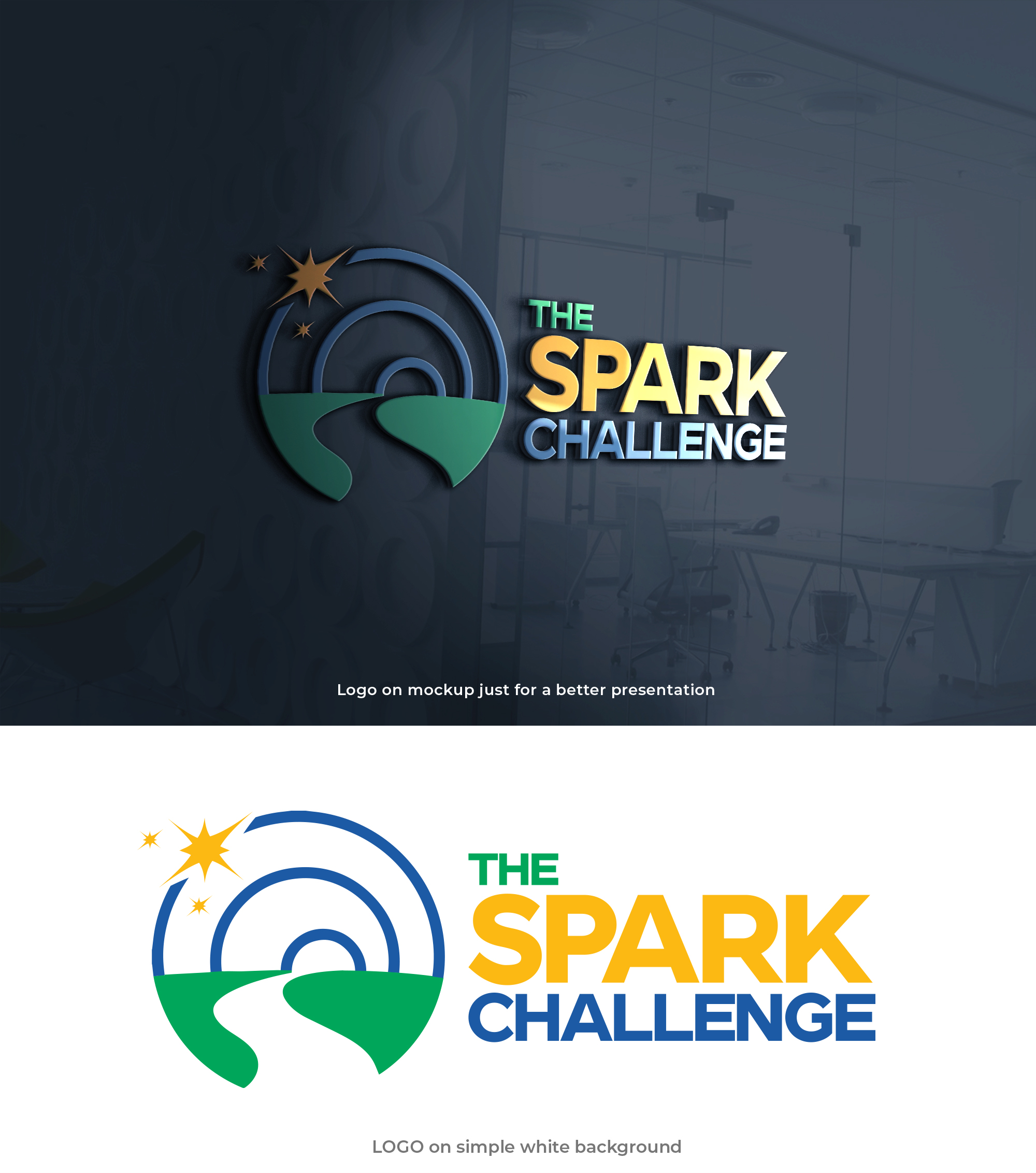
WRSPC will be launching an online fundraiser called The Spark Challenge. I have attached the current logo, and we are wondering if there is some way to add spark/light to this current logo to use in the campaign. Or if you have any other ideas for branding this campaign with a logo feel free to show us. Additionally if you had any ideas about changing this logo, we would be open to a change of the logo, both to have one that is a stand alone and one that incorporates a spark or some light in it.
Here is a description of the current logo and what it means:
Our new logo honors the previous one by incorporating the ‘s’ shaped pathway in the foreground. This pathway represents the Council’s work in suicide prevention and our commitment to journey alongside our community and those with lived experience of suicide. The pathway can also be interpreted as a river; this river serves as a reminder of the importance of upstream prevention work. In our work, this means understanding and addressing the factors that may cause someone to think of suicide and act on those thoughts. Finally, the three blue rings at the top of the logo represent our three areas of work: hope, help and healing, also understood as suicide prevention, intervention, and postvention.
Logo Text
“The Spark Challenge” if that can be associated with the logo and not make it too crowded
Sehen und fühlen
Jeder Schieber zeichnet eine der Charakteristiken der Marke des Kunden aus sowie den Stil, den euer Logo widerspiegeln sollte.