UI Improvement for SwimTech app
Wollen Sie auch einen Job wie diesen gewinnen?
Dieser Kunde bekam 44 App-Designs von 9 Designern. Dabei wurde dieses App-Design Design von WebPixel als Gewinner ausgewählt.
Kostenlos anmelden Design Jobs finden- Garantiert
-
 US$150
-
 44 Designs
-
 9 Designer
App-Design Kurzbeschreibung
We are looking for a talented UI/UX designer to REFINE and enhance the visual design of our mobile application, SwimTech. The app is fully functional, but we need a designer to improve its aesthetics by specifying design elements such as fonts, colors, spacing, and component styles.
Your task will be to analyze the CURRENT UI and provide detailed design specifications that will make the app more visually appealing, modern, and user-friendly.
TODO:
Review the existing SwimTech app design (see attachments) and identify areas for visual improvement.
Provide a detailed UI style guide, including:
Typography (font choices, sizes, and weights)
Color palette (primary, secondary, and accent colors)
Component styling (buttons, forms, icons, and interactive elements)
Spacing and layout guidelines (margins, paddings, and alignment)
Ensure the design remains clean, modern, and professional while maintaining usability and accessibility.
Provide design mockups or visual examples (if possible) to illustrate the proposed changes.
Deliverables:
A UI Style Guide (PDF or Figma file) with specifications on fonts, colors, spacing, and UI components.
Optionally, before/after mockups or examples demonstrating the improvements.
Ideal Designer:
Strong experience in mobile UI/UX design.
Understanding of modern design trends and best practices.
Ability to communicate design choices clearly for easy developer implementation.
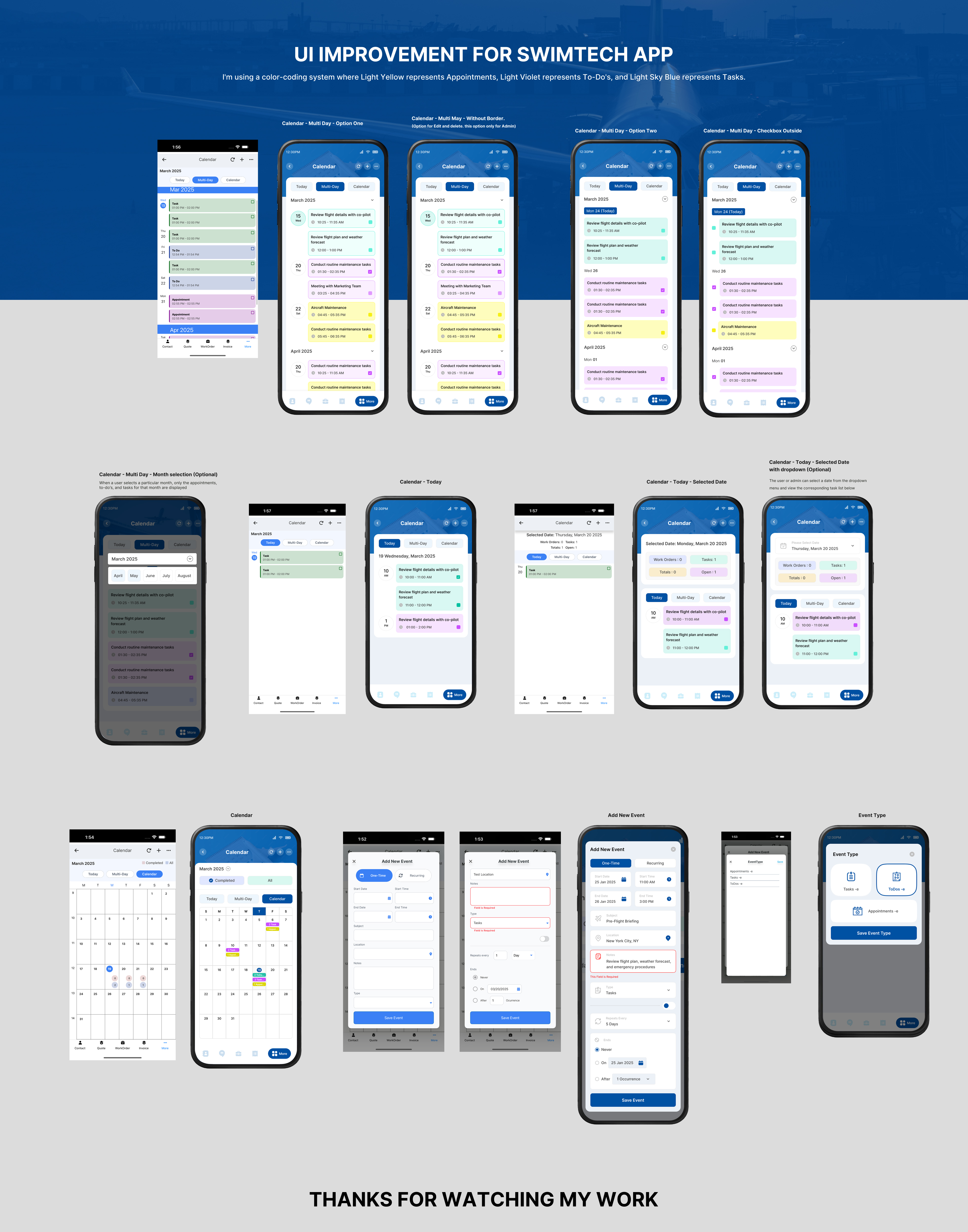
I have attached 7 images showcasing the main UI screens used in the SwimTech app. These screens need visual enhancements to improve their overall look and user experience.
The images represent the current design in three key modes:
LIST Mode – Displays data in a structured list format.
READ Mode – Shows detailed information when a user selects an item.
ADD/EDIT Mode – Allows users to input or modify information.
Additionally, there is a ‘MORE’ page, which serves as a menu listing other features of the application.
Task Objective:
Please refine and improve these UIs to create a more modern, visually appealing, and user-friendly experience. Focus on typography, colors, spacing, and component styling to ensure a cohesive and polished design.
Farben
Vom Kunden ausgewählte Farben für das Logo Design:
Sehen und fühlen
Jeder Schieber zeichnet eine der Charakteristiken der Marke des Kunden aus sowie den Stil, den euer Logo widerspiegeln sollte.