Company Logo Design Update - 40th business anniversary accounting firm
Wollen Sie auch einen Job wie diesen gewinnen?
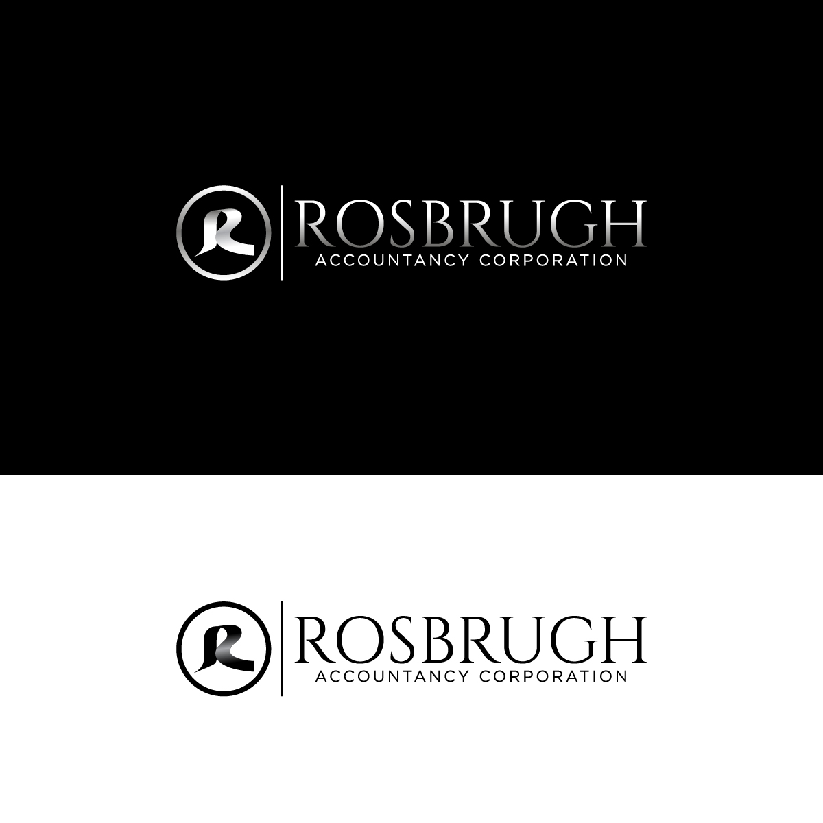
Dieser Kunde bekam 99 Logo-Designs von 44 Designern. Dabei wurde dieses Logo-Design Design von Barish Design als Gewinner ausgewählt.
Kostenlos anmelden Design Jobs finden- Garantiert
-
 US$240
-
 99 Designs
-
 44 Designer
Logo-Design Kurzbeschreibung
We are a family owned small public accounting firm and have an old company logo that we own. The logo consists of an adding machine tape in the shape of the capital letter "R" with numbers on it.
For use on social media and a web site, it would be great to get this logo updated/redesigned to whatever the current digital standards/formats are.
For use in making custom merchandise, I imagine the numbers on the adding machine tape would have to be removed for the logo to work.
And a third random thought is that having a logo w/ special text commemorating the anniversary (e.g. 1985-2025 or 40th anniversary or ...?) or combining new and old logos might be nice. But this third random thought isn't all that important.
I have a jpg file of the logo (uploaded) as well as a file with an ai extension.
Perhaps this is really hiring for three logos?
This will be a wonderful surprise for my parents. Both of whom are still working full time in the business all these years later. Thanks for your help.
Industrie/Einheitstyp
Public accounting / tax preparers
Logo Text
"R" or "r" or "Rosbrugh Accountancy Corporation" or "1985-2025" or "40th anniversary"
Sehen und fühlen
Jeder Schieber zeichnet eine der Charakteristiken der Marke des Kunden aus sowie den Stil, den euer Logo widerspiegeln sollte.