Enlighten - Self Development Mobile App
Wollen Sie auch einen Job wie diesen gewinnen?
Dieser Kunde bekam 49 App-Designs von 15 Designern. Dabei wurde dieses App-Design Design von Pylyp Haivoronskyi als Gewinner ausgewählt.
Kostenlos anmelden Design Jobs finden- Garantiert
-
 US$300
-
 49 Designs
-
 15 Designer
App-Design Kurzbeschreibung
Basic Instructions
1. please create an android app screen design for me, in figma, for my new app “Enlighten” based on this pencil drawing (Subjects.jpg)
2. Create the color pallet based on the colors of the logo (#fcd354 and #5dc9b7) and also add shades based on these colors based on material design.
3. the background should be white.
4. Use material design
Get Inspired by duolingo design and headspace design
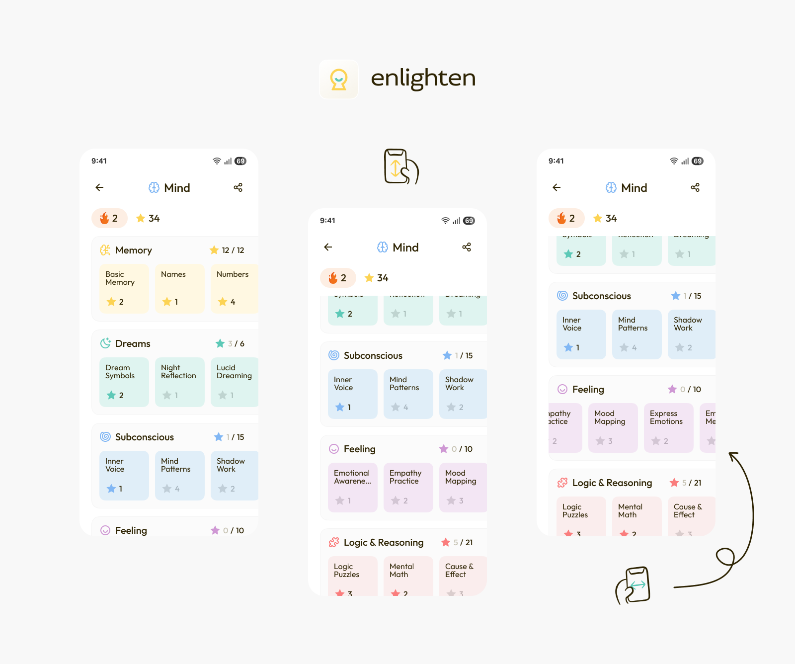
These are the directions i provided for the programmer on how this screen will work:
top bar:
back icon on left (show if you are in a category and press to go back one category)
name of the field in middle in bold
share icon for sharing the current subject on the right before the drop down menu
3 dot icon on the right (drop down menu)
2nd top bar:
fire icon on left for streak (how many days straight did you do a lesson)
star icon a bit after it (how many lessons did you pass)
circles section:
each category will get a section
each category will have a small star with a number that shows how many stars the user has from that category
each category will have an icon before it
under each category there will be circles for all the subjects under that category
scroll horizontally to see more subjects
each subject will have the amount stars gained from it (like the circles of the fields in the fields screen)
scroll down to see more fields with their subjects
note that the order of the subjects and categories should be based on the practial/spiritual score that the user has been assigned based on the initial wizard
More Notes
1. the scribbles in the circles under the following categories (Dreams, Sub-Concious, Feeling)) are just place filers. Please add example content based on the content in the circles that are under “Memory” category
2. There are more sections after Feeling so users should be able to scroll down to see more sections
3. There are more categories to the right so under each section
Final Thoughts
Maybe its better to have rounded cornered squares instead of circles. You choose what you think is best.
After you have created the Subjects screen and I like it, then I'll give you instructions for the other 5 screens.
Zielmarkt/( -märkte)
general public, adults 18-80
Zu verwendende Schriftarten
Sehen und fühlen
Jeder Schieber zeichnet eine der Charakteristiken der Marke des Kunden aus sowie den Stil, den euer Logo widerspiegeln sollte.