Logo and Wordmark for INNOTEVO
Wollen Sie auch einen Job wie diesen gewinnen?
Dieser Kunde bekam 107 Logo-Designs von 46 Designern. Dabei wurde dieses Logo-Design Design von Fashion.Studio als Gewinner ausgewählt.
Kostenlos anmelden Design Jobs finden-
 €110
€110
-
 107 Designs
-
 46 Designer
Logo-Design Kurzbeschreibung
INNOTEVO is a one-person venture.
It was founded not to grow, but to give structure to work that spans beyond code.
While the founder is a software developer by profession, the core activity of INNOTEVO is the development of technical and systemic concepts – ideas that address how technology, nature, and human thought can interlock meaningfully.
INNOTEVO is not a product lab or a startup. It is a platform for clarity:
A space where mechanisms are designed,
where structures are thought through,
and where ideas are treated as systems.
The visual identity should reflect this:
depth without pretension, and structure without rigidity.
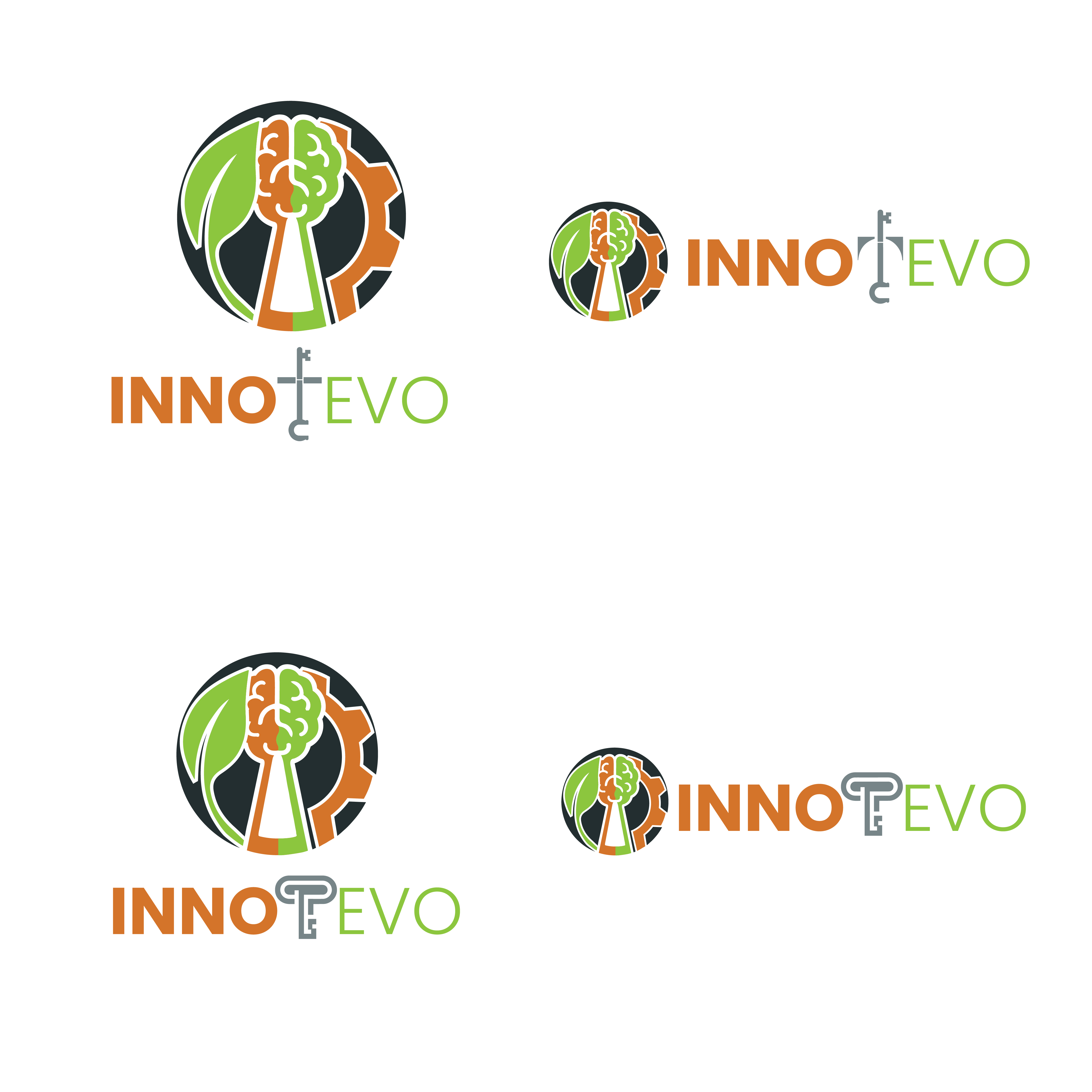
1. Logo / Symbol Mark
The goal is to develop a symbol that expresses three core domains:
- Nature
- Technology
- Mind
What I appreciate about the previously used AI-generated example was primarily its three-part circular structure – three segments suggesting the thematic areas, unified by a keyhole in the center. This image serves as a general reference for structure, not a blueprint for the final design.
🔧 Design Notes:
A segmented circle with three visual domains is welcome, but not required.
The representation of Nature, Technology, and Mind may use abstract forms, visual metaphors, or symbolic arrangements.
The icons from the AI draft (leaf, gear, brain) are not prescriptive. Designers are encouraged to explore more fitting, original visualizations of these domains.
The keyhole at the center may be included – but only if it integrates subtly and meaningfully.
Important: The AI draft includes a large key embedded in the circle – this should not be included in the design. Only the keyhole is conceptually relevant.
There is no fixed color scheme. The design may be monochrome or use restrained color combinations – but should maintain a calm, minimal, and professional tone.
2. Wordmark – “INNOTEVO”
The wordmark should function independently from the logo and stand on its own in various contexts (e.g., presentations, documents, websites).
The name is conceptually divided:
INNO = innovation, systems, structure
EVO = evolution, growth, natural development
The “T” between them should act as a subtle visual key – not decorative, but architecturally integrated into the design.
🖋 Typography Notes:
Typographic distinction between “INNO” and “EVO” is welcome (e.g., through weight, form, or rhythm), provided the whole remains balanced.
No specific font families are prescribed. The designer is free to choose typographic styles that embody the respective characters of INNO (structured, technical) and EVO (organic, natural).
The “T” as a stylized key should be understated, not playful – an abstract visual element that supports the identity rather than drawing attention to itself.
Summary
INNOTEVO is not just a technical entity –
It’s a way of thinking. A platform for design, logic, and sustainable ideas.
What’s needed is a logo and wordmark that embody this mindset:
calm, precise, structured.
Not loud. Not trendy. Not ornamental.
A visual identity that speaks through coherence and concept – not noise.
Logo Text
Innotevo