

 Aktualisieren
Apothecary
Wollen Sie auch einen Job wie diesen gewinnen?
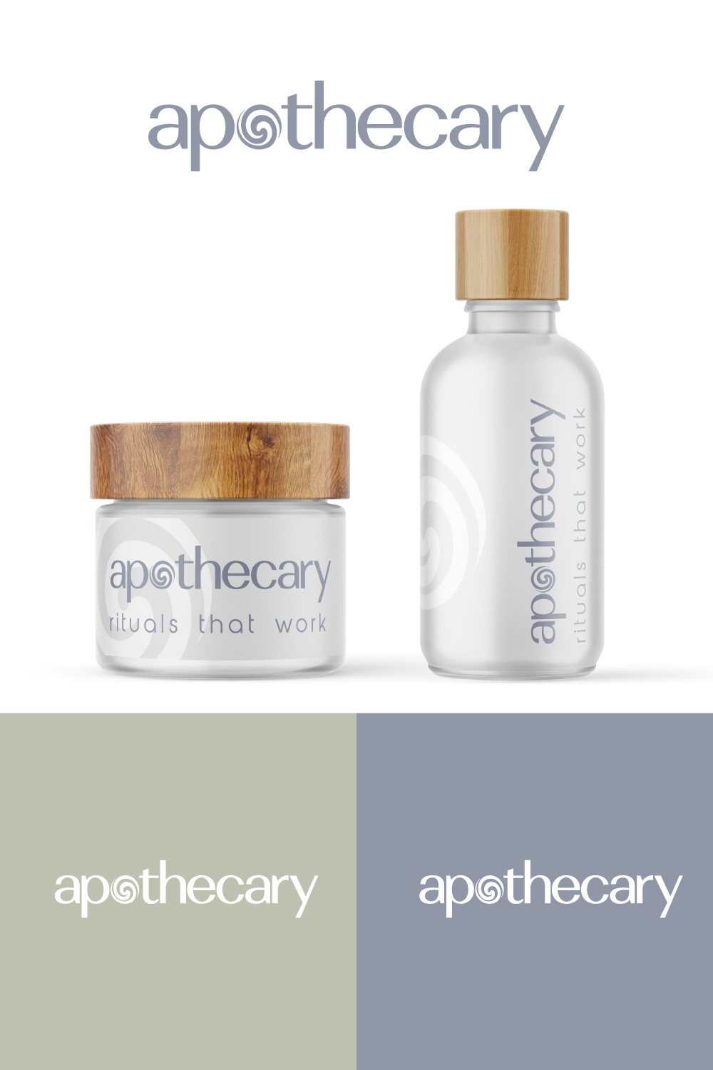
Dieser Kunde bekam 126 Logo-Designs von 60 Designern. Dabei wurde dieses Logo-Design Design von Sergio Coelho als Gewinner ausgewählt.
Kostenlos anmelden Design Jobs finden
-
 US$150
-
 126 Designs
-
 60 Designer
Logo-Design Kurzbeschreibung
domain is joinapothecary.com
🌱 Join Apothecary Brand Guide
🧠 Brand Essence
Name Meaning: “Join” evokes community, accessibility, and inclusion. “Apothecary” brings in roots of holistic healing + modern wellness.
Positioning: Soft science meets minimal luxury. An apothecary reimagined for Gen Z and Millennials. Functional, clean, warm.
👥 Target Audience
Age: 22–38
Values: wellness routines, aesthetics, clean living
Shopping habits: Subscriptions, Instagram/TikTok discovery, DTC-friendly
They want:
To feel better without looking like they’re “on medication”
Accessible but premium wellness
Vibe-driven + lifestyle integration
🧩 Brand Voice & Messaging
Tone Example
Calm “Take a breath. This is for you.”
Empowering “You’re not broken. You’re balancing.”
Inclusive “Everyone’s healing looks different.”
Intelligent “Clinically formulated, naturally made.”
✨ Tagline Options
“Soft science. Strong results.”
“Rituals that work.”
“Gentle medicine. Bold you.”
🎨 Visual Identity
Color Palette: Soft Neutrals + Trust Accents
Color Name Hex Use
Cloud White #F9F8F4 Backgrounds, space
Eucalyptus Gray #D3D7D3 Containers, borders
Soft Charcoal #3C3C3C Typography
Nude Sand #E8DDD3 CTA buttons
Sage Green #A4C3A2 Accents, icons
Blush Clay #D7A89E Seasonal promos, UGC frames
📦 Packaging Style
Frosted glass or refillable pouches
Embossed logo in soft charcoal or sage
Rounded label corners, lowercase text
Stickers for refills → “this is what’s working”
Logo Text
Apothecary