Waroe is researched based optimism
Wollen Sie auch einen Job wie diesen gewinnen?
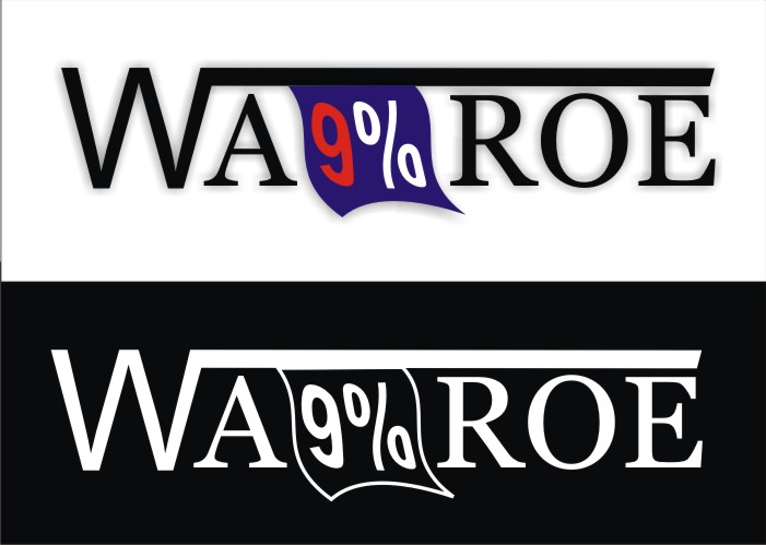
Dieser Kunde bekam 39 T-Shirt-Designs von 5 Designern. Dabei wurde dieses T-Shirt-Design Design von dekyra als Gewinner ausgewählt.
Kostenlos anmelden Design Jobs finden- Garantiert
-
 US$140
-
 39 Designs
-
 5 Designer
T-Shirt-Design Kurzbeschreibung
Waroe, as a fashion statement, is about moving past old ideas into a new and exciting future. Letters should be bold and attractive. Some of the ideas I have include separating WA and ROE... But there should be a horizontal line, at the top, starting from the last line of the letter W and extending all the way to the letter E.
The horizontal line can be creatively used to hang a flag between WA and ROE, an American flag, the flag does not have to be the familiar American flag, it can be anything that has a red,white and blue feel to it, sort of the way Tommy Hilfiger uses the red/white and blue (But do not copy their logo, that will not be accepted). The flag is hanging vertically or horizontally BUT instead of stars, lets have the number 9 with % signs. It can be one number 9 with a % sign or multiple 9%s, what ever gives us a great design at the end.
The idea is to call attention upon the 9% while at the same time creating a separation between WA and ROE to help with promoting the correct pronunciation. Or if you think you have your own better idea, I am open. In the end, I want it to be attractive and for people to want to know what the movement is all about.
Aktualisierungen
Project Deadline Extended
Added Wednesday, May 02, 2012
The flag does not necessary have to be an exact copy of the American flag, it can be something like a tommy-hillfigrish design where the red, white and blue are creatively put together. In fact, this may help in finding a spacious area for the 9%...
Added Thursday, May 03, 2012
Zielmarkt/( -märkte)
This t-shirt design is for a way of thinking...it is for the positive and optimistic not for a specific demographics.
Industrie/Einheitstyp
Fashion
Sehen und fühlen
Jeder Schieber zeichnet eine der Charakteristiken der Marke des Kunden aus sowie den Stil, den euer Logo widerspiegeln sollte.
Elegant
Fett
Spielerisch
Ernst
Traditionel
Modern
Sympatisch
Professionell
Feminin
Männlich
Bunt
Konservativ
Wirtschaftlich
Gehobenes
Anforderungen
Muss haben
- 9% written in creative and subtle way. Written in bold letters. Exciting and uplifting feel to the design with a clean and professional appearance.
Sollte nicht haben
- should not be messy or too bold.