Business Logo Upgrade - Knight Industrial Brake and Clutch Co. -
Wollen Sie auch einen Job wie diesen gewinnen?
Dieser Kunde bekam 105 Logo-Designs von 45 Designern. Dabei wurde dieses Logo-Design Design von Bibi Studio als Gewinner ausgewählt.
Kostenlos anmelden Design Jobs finden-
 A$150
A$150
-
 105 Designs
-
 45 Designer
Logo-Design Kurzbeschreibung
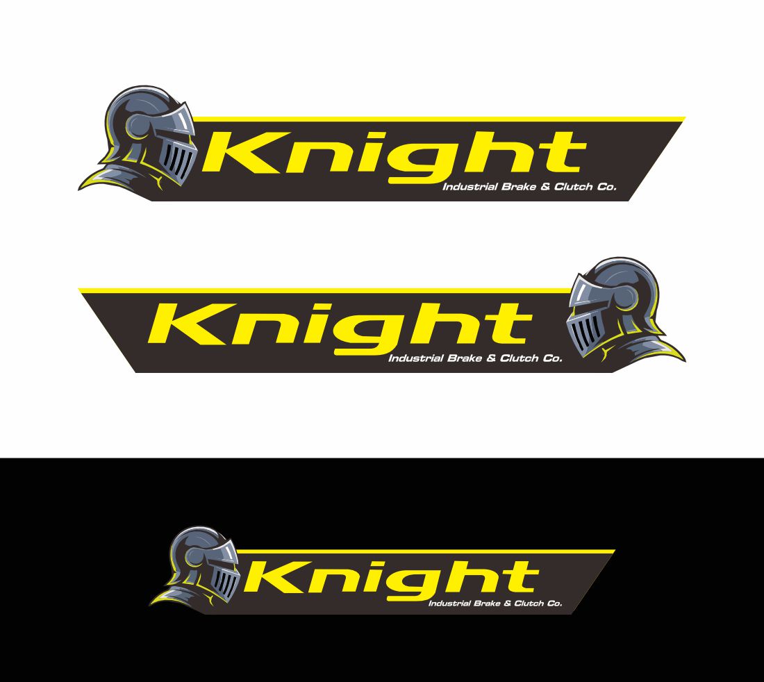
Originally the business logo was a knight on a horse with a jousting stick. Version two became a knight chess piece.
We would like to return to the Knight in amour - but this time helmet only. The knight armor represents the strength and resilience of our products, but also us as we watch over our customers as protectors and the last line of defense their brakes
The text and colours we do NOT want to change as this is our brand that is very recognizable. I have created a knight helmet, but something is not quite right. We want the knight helmet to be simple, so it looks good from a business card size all the way up to being on the side of a large truck or pickup/ute
It needs to stand out on the side of a white truck and not blend in on the side of a black vehicle either.
The Fluro yellow in the text along with some Fluro orange are required as these are our corporate colours.
I have uploaded our old logo and new logo that is not quite right - the helmet needs to face into the name -
We would also like a video of our knight helmet spinning horizontally 360 degrees to use for social media. Black background - sparling helmet with wording from logo bellow
Industrie/Einheitstyp
Industrial brakes and clutches
Logo Text
Knight Industrial Brake and Clutch Co. (not to be changed)
Farben
Vom Kunden ausgewählte Farben für das Logo Design:
Sehen und fühlen
Jeder Schieber zeichnet eine der Charakteristiken der Marke des Kunden aus sowie den Stil, den euer Logo widerspiegeln sollte.
Elegant
Fett
Spielerisch
Ernst
Traditionel
Modern
Sympatisch
Professionell
Feminin
Männlich
Bunt
Konservativ
Wirtschaftlich
Gehobenes
Anforderungen
Sollte nicht haben
- Dont not change the Text in the logo