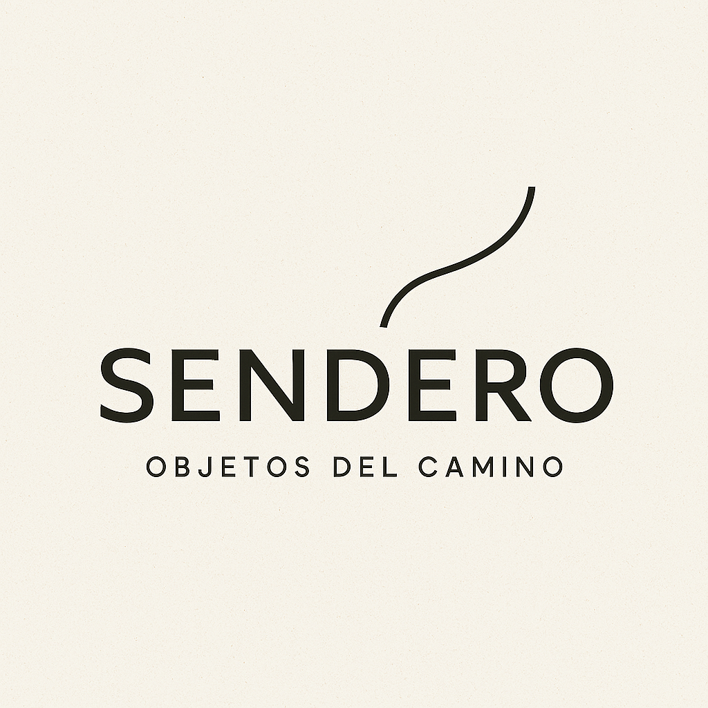
Logo Design for "Sendero" – Contemporary Design Shop

Wollen Sie auch einen Job wie diesen gewinnen?
Dieser Kunde bekam 364 Logo-Designs von 158 Designern. Dabei wurde dieses Logo-Design Design von Abou Blessing als Gewinner ausgewählt.
Kostenlos anmelden Design Jobs findenLogo-Design Kurzbeschreibung
Logo Brief – Sendero: Objetos del camino (Objects of the Path)
Name & Meaning
Sendero is the Spanish word for path.
The full name, Sendero: Objetos del camino (Objects of the Path), emphasizes that every object is part of a journey — carrying memory, technique, and trajectory that guide us toward the essential.
Design note: Visually, the word Sendero should have more weight, prominence, and presence than Objetos del camino. The subtitle should act as a complement, not as the protagonist.
Concept
Sendero is a curated project of design objects, where each piece is both footprint and direction.
The path (Sendero) symbolizes transformation and discovery: what changes along the way and what is revealed in the act of walking.
The logo should not rely on obvious symbols (like a road or trail), but instead express movement, intimacy, and discovery in a minimal, conceptual, and refined manner.
Values & Identity
Sophisticated yet intimate: cultural capital, aesthetic refinement, and timeless design.
More than objects: Sendero celebrates experience, storytelling, and resonance.
Strong visual identity: distinctive, adaptable, memorable, avoiding clichés.
Tone & Feel for the Logo
Minimal but not cold: clean, elegant, warm, with subtle human presence.
Evocative and timeless rather than trendy.
Should balance craft tradition and contemporary clarity.
Colors
Palette should feel organic, cultural, and sophisticated.
Goal: transmit calmness, intimacy, and refinement without sterility.
Aktualisierungen
Designs look the same
Zielmarkt/( -märkte)
Design-savvy, culturally curious individuals who seek unique, artisanal and contemporary objects for their lifestyle and home. Primary Target Market: Design-conscious consumers in their late 20s to 40s. Based mainly in urban areas (Mexico City and international audiences). Interested in art, design, craftsmanship, and unique curated objects. Mid to high income, willing to invest in meaningful, well-designed pieces. Value authenticity, storytelling, and cultural depth in the products they purchase.
Industrie/Einheitstyp
A curated design store/ Objects, Art & Design Shop
Logo Text
Sendero: Objetos del camino
Logo Stile, die Sie interessieren können
Wortmarke-Logo
Word oder namensbasiertes Logo (nur Text)
Zu verwendende Schriftarten
Sehen und fühlen
Jeder Schieber zeichnet eine der Charakteristiken der Marke des Kunden aus sowie den Stil, den euer Logo widerspiegeln sollte.
Elegant
Fett
Spielerisch
Ernst
Traditionel
Modern
Sympatisch
Professionell
Feminin
Männlich
Bunt
Konservativ
Wirtschaftlich
Gehobenes
Anforderungen
Muss haben
- The logo must include the brand name: Sendero. Clean, minimal, and timeless design (avoid trends that may look outdated fast). Should reflect ideas of journey, path, craftsmanship, and curation without being literal (no obvious icons like footprints or road signs). Versatile: must work in black & white and color, across digital and print. Scalable: should look good in small applications (social media, packaging tags) and large formats (website headers, posters). Typography-driven or with subtle abstract symbol — avoid overly decorative or complicated graphics. Must evoke sophistication, cultural depth, and modernity.
Schön zu haben
- A subtle abstract icon or symbol that can stand alone (for social media avatar, favicon, or stamps). Inspiration from organic forms (lines, textures, or curves that evoke movement, growth, or nature). A sense of timeless craftsmanship — could be hinted through typography style (serif or custom lettering with character). Neutral, earthy, or muted tones in the palette (if designers propose colors). A design that feels global yet rooted, contemporary but with a sense of heritage. Possibility to adapt into a wordmark + symbol system, giving flexibility across brand applications. Subtle nods to path, travel, or collection — interpreted in a poetic and non-literal way.
Sollte nicht haben
- No literal or cliché symbols (e.g., boots, compasses, arrows, mountains, road signs). No overused artisan tropes (e.g., weaving patterns, pottery icons, cliché “handmade” textures). Avoid anything cheap-looking. No overly ornate or baroque fonts that compromise readability. No corporate tech/finance aesthetic (too cold, geometric, or impersonal). No clipart-style illustrations or stock-like visuals. No logos that feel rustic in a “souvenir shop” way — avoid folkloric stereotypes. No designs that lock the brand into one cultural reference; it should feel timeless and universal.